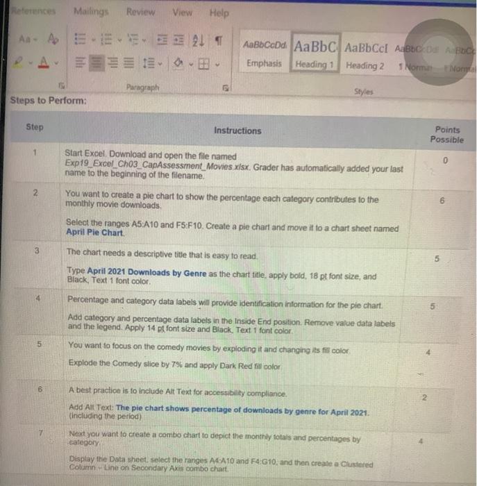
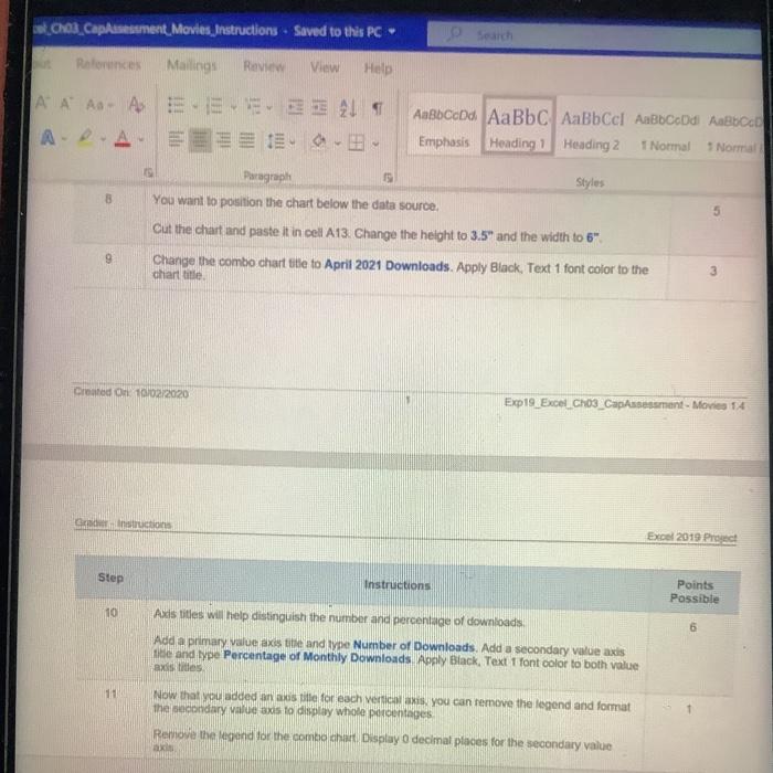
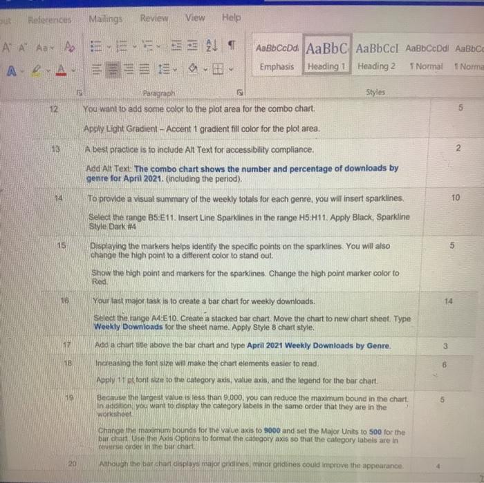
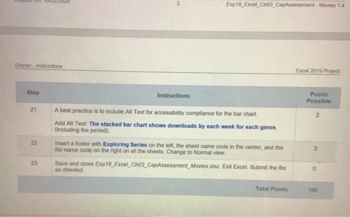
References Mailings Review View Help As - Ap... 21 AaBb CcDd Aa Bbc AaBbcc AaBbc OS ACE Emphasis Heading 1 Heading 2 NomNom Paragraph Styles Steps to Perform: Step Instructions Points Possible 1 0 2 Start Excel Download and open the file named Exp19_Excel_Cho3_CapAssessment_Movies xlsx. Grader has automatically added your last name to the beginning of the filename. You want to create a pie chart to show the percentage each category contributes to the monthly movie downloads Select the ranges A5:A10 and F5:F10. Create a pie chart and move it to a chart sheet named April Pie Chart 6 3 5 The chart needs a descriptive title that is easy to read. Type April 2021 Downloads by Genre as the chart title, apply bold, 18 pt font size, and Black, Text 1 font color, Percentage and category data labels will provide identification information for the pie chart. Add category and percentage data labels in the inside End position. Remove value data labels and the legend. Apply 14 pt font size and Black. Text 1 font color You want to focus on the comedy movies by exploding it and changing its fil color Explode the Comedy slice by 7% and apply Dark Red il color ch B 2 A best practice is to include Alt Text for accessibility compliance. Add Alt Text: The pie chart shows percentage of downloads by genre for April 2021 including the period) Next you want to create a combo chart to depict the monthly totals and percentages by category Display the Datasheet. Select the ranges A4 A10 and F4G10, and then create a Clustered Column-Line on Secondary Axis combo chart. T CI, Capasesteet, Movies, Instructions. Saved to this PC Rotoninom Mailings Review View Help A A A A E. E E 219 2A AaBbCcDc AaBbc AaBbCcl AaBbco di AaBbc Emphasis Heading 1 Heading 2 T Normal Normal Paragraph Styles You want to position the chart below the data source Cut the chart and paste it in cell A13. Change the height to 3.5" and the width to 6" Change the combo chart title to April 2021 Downloads. Apply Black, Text 1 font color to the chart title. 3 Created On 10/02/2020 Exp19 Excel Cho3_Capresament - Movies 14 Constructions Excel 2019 Pro Step Instructions Points Possible 10 Axis titles will help distinguish the number and percentage of downloads Add a primary value axis tibe and type Number of Downloads. Add a secondary value axis Aide and type Percentage of Monthly Downloads Apply Black, Text 1 font color to both value axistes 11 Now that you added an auspille for each vertical. You can remove the legend and format thie nusxis to display whole pecoentages Remove the legend for the combo Display decimal places for the secondary value Sut References Mailings Review View Help A A A A ADA AaBbCcDd AaBbc AaBbCcl AaBbCcDd AaBbc Emphasis Heading 1 Heading 2 T Normal T Norma Styles Paragraph You want to add some color to the plot area for the combo chart. 12 2 14 10 Apply Light Gradient - Accent i gradient fill color for the plot area. A best practice is to include All Text for accessibility compliance. Add Alt Text: The combo chart shows the number and percentage of downloads by genre for April 2021. (including the period). To provide a visual summary of the weekly totals for each genre, you will insert sparklines. Select the range B5:E11. Insert Line Sparklines in the range H5:411. Apply Black Sparkline Style Dark 4 Displaying the markers helps identity the specific points on the sparklines. You will also change the high point to a different color to stand out. Show the high point and markers for the sparklines. Change the high point marker color to 15 vo Red 16 14 17 3 Your last major task is to create a bar chart for weekly downloads. Select the range A4:10. Create a stacked bar chart Move the chart to new chart sheet. Type Weekly Downloads for the sheet name. Apply Style 8 chart style. Ada a chart title above the bar chart and type April 2021 Weekly Downloads by Genre. Increasing the font size will make the chart elements easier to read. Apply 11 tont size to the category axis, value axis, and the legend for the bar chart Because she largest value is less than 9.000 you can reduce the maximum bound in the chart. In addition you want to display the category labels in the same order that they are in the 58 19 5 worksheet Change the maximum bounds for the value axis to 9000 and set the Major Units to 500 for the bar chart One the Axis Options to format the category axis so that the category labels are in reverse order in the bar chart 20 Although the barchart displays major ordines minorities could improve the appearance, Exp19_Excel_chos_Capssessment - Movies 14 Grador Instructions Excel 2019 Projed Step Instructions Points Possible 2 21 22 A best practice is to include All Text for accessibility compliance for the bar chart Add Al Text. The stacked bar chart shows downloads by each week for each genre. (including the period) Inmert a footer with Exploring Series on the left, the sheet name code in the center, and the file name code on the right on all the sheets. Change to Normal view. Save and close Exp19_Excel_Cho3_CapAssessment Movies.xlsx Ext Excel. Submit the file as directed 23 0 Total Points 100 References Mailings Review View Help As - Ap... 21 AaBb CcDd Aa Bbc AaBbcc AaBbc OS ACE Emphasis Heading 1 Heading 2 NomNom Paragraph Styles Steps to Perform: Step Instructions Points Possible 1 0 2 Start Excel Download and open the file named Exp19_Excel_Cho3_CapAssessment_Movies xlsx. Grader has automatically added your last name to the beginning of the filename. You want to create a pie chart to show the percentage each category contributes to the monthly movie downloads Select the ranges A5:A10 and F5:F10. Create a pie chart and move it to a chart sheet named April Pie Chart 6 3 5 The chart needs a descriptive title that is easy to read. Type April 2021 Downloads by Genre as the chart title, apply bold, 18 pt font size, and Black, Text 1 font color, Percentage and category data labels will provide identification information for the pie chart. Add category and percentage data labels in the inside End position. Remove value data labels and the legend. Apply 14 pt font size and Black. Text 1 font color You want to focus on the comedy movies by exploding it and changing its fil color Explode the Comedy slice by 7% and apply Dark Red il color ch B 2 A best practice is to include Alt Text for accessibility compliance. Add Alt Text: The pie chart shows percentage of downloads by genre for April 2021 including the period) Next you want to create a combo chart to depict the monthly totals and percentages by category Display the Datasheet. Select the ranges A4 A10 and F4G10, and then create a Clustered Column-Line on Secondary Axis combo chart. T CI, Capasesteet, Movies, Instructions. Saved to this PC Rotoninom Mailings Review View Help A A A A E. E E 219 2A AaBbCcDc AaBbc AaBbCcl AaBbco di AaBbc Emphasis Heading 1 Heading 2 T Normal Normal Paragraph Styles You want to position the chart below the data source Cut the chart and paste it in cell A13. Change the height to 3.5" and the width to 6" Change the combo chart title to April 2021 Downloads. Apply Black, Text 1 font color to the chart title. 3 Created On 10/02/2020 Exp19 Excel Cho3_Capresament - Movies 14 Constructions Excel 2019 Pro Step Instructions Points Possible 10 Axis titles will help distinguish the number and percentage of downloads Add a primary value axis tibe and type Number of Downloads. Add a secondary value axis Aide and type Percentage of Monthly Downloads Apply Black, Text 1 font color to both value axistes 11 Now that you added an auspille for each vertical. You can remove the legend and format thie nusxis to display whole pecoentages Remove the legend for the combo Display decimal places for the secondary value Sut References Mailings Review View Help A A A A ADA AaBbCcDd AaBbc AaBbCcl AaBbCcDd AaBbc Emphasis Heading 1 Heading 2 T Normal T Norma Styles Paragraph You want to add some color to the plot area for the combo chart. 12 2 14 10 Apply Light Gradient - Accent i gradient fill color for the plot area. A best practice is to include All Text for accessibility compliance. Add Alt Text: The combo chart shows the number and percentage of downloads by genre for April 2021. (including the period). To provide a visual summary of the weekly totals for each genre, you will insert sparklines. Select the range B5:E11. Insert Line Sparklines in the range H5:411. Apply Black Sparkline Style Dark 4 Displaying the markers helps identity the specific points on the sparklines. You will also change the high point to a different color to stand out. Show the high point and markers for the sparklines. Change the high point marker color to 15 vo Red 16 14 17 3 Your last major task is to create a bar chart for weekly downloads. Select the range A4:10. Create a stacked bar chart Move the chart to new chart sheet. Type Weekly Downloads for the sheet name. Apply Style 8 chart style. Ada a chart title above the bar chart and type April 2021 Weekly Downloads by Genre. Increasing the font size will make the chart elements easier to read. Apply 11 tont size to the category axis, value axis, and the legend for the bar chart Because she largest value is less than 9.000 you can reduce the maximum bound in the chart. In addition you want to display the category labels in the same order that they are in the 58 19 5 worksheet Change the maximum bounds for the value axis to 9000 and set the Major Units to 500 for the bar chart One the Axis Options to format the category axis so that the category labels are in reverse order in the bar chart 20 Although the barchart displays major ordines minorities could improve the appearance, Exp19_Excel_chos_Capssessment - Movies 14 Grador Instructions Excel 2019 Projed Step Instructions Points Possible 2 21 22 A best practice is to include All Text for accessibility compliance for the bar chart Add Al Text. The stacked bar chart shows downloads by each week for each genre. (including the period) Inmert a footer with Exploring Series on the left, the sheet name code in the center, and the file name code on the right on all the sheets. Change to Normal view. Save and close Exp19_Excel_Cho3_CapAssessment Movies.xlsx Ext Excel. Submit the file as directed 23 0 Total Points 100