Question
Start by processing the data. You need to represent them graphically, through bar graphs or histograms, pie charts, cumulative frequency curves or box and whisker
Start by processing the data. You need to represent them graphically, through bar graphs or histograms, pie charts, cumulative frequency curves or box and whisker diagrams. Make sure you choose appropriately given the type of data you are dealing with.
You will also need to do some calculations to investigate the central tendency, dispersion and distribution of the data. You will look at mean, mode and median, quartiles, range and inter-quartile range, as well as standard deviation. You might look at the z-scores of some of the individual pieces of data.
You will need to analyse your findings as you discover them. Interpret the diagrams and the calculations. What does it tell you about the data? What conclusions can you make regarding your original hypothesis? Does your data support the hypothesis?
You should always be aware of potential limitations. How reliable are your conclusions? Is there any potential bias in your data? Are your sample sizes sufficiently large, and were they taken in a way that your sample accurately represents the population?
How might you improve or develop your investigation to make your conclusions more reliable and wide-reaching?
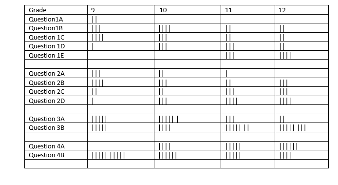
Below is data being referred to, Also I will be giving a detailed review based on quality of answer
---------------------------------------------------------------------------------------------------------------------------------------------
Hypothesis : Students who get more house of sleep have a better focus in class

Step by Step Solution
There are 3 Steps involved in it
Step: 1

Get Instant Access to Expert-Tailored Solutions
See step-by-step solutions with expert insights and AI powered tools for academic success
Step: 2

Step: 3

Ace Your Homework with AI
Get the answers you need in no time with our AI-driven, step-by-step assistance
Get Started


