Question
Tableau Project Maximum Possible Points: 100 points Project Deliverables: 1. Project Report named as LastnameFirstname_ProjectReport with screenshots and interpretations of each visualization/requested element. a. Screenshots
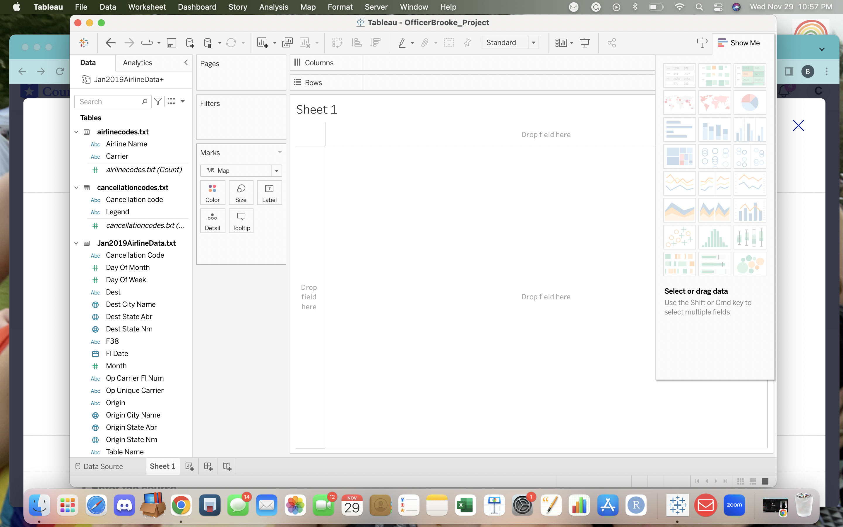
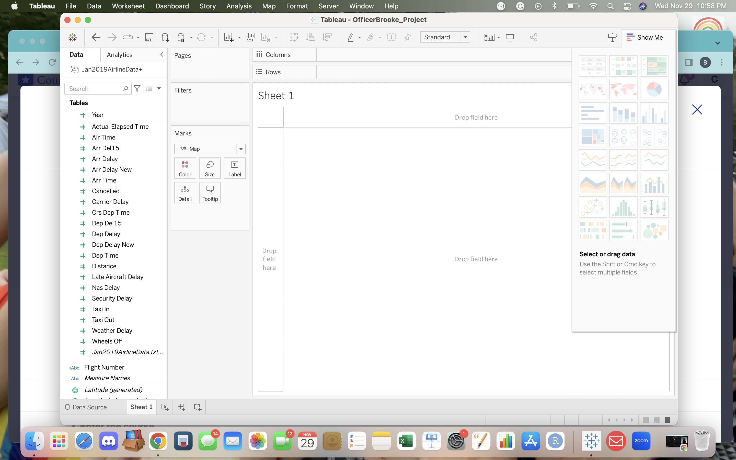
Tableau Project Maximum Possible Points: 100 points Project Deliverables: 1. Project Report named as "LastnameFirstname_ProjectReport" with screenshots and interpretations of each visualization/requested element. a. Screenshots must include the Tableau file name, which is typically located at the top of the screen after a workbook is saved. i. Students will receive a 5-point deduction per visualization (with a maximum total of 25 points) if file name is not included in screenshot(s). 2. Completed Tableau file, named as "LastnameFirstname_Project", and saved as a packaged workbook. a. Failure to submit as a packaged workbook (.twbx) will result in a 25-point deduction on the project. b. For help saving your file as a packaged workbook, click here or see the corresponding class recording. 3. A single Zip folder named as "LastnameFirstname_ BA342TableauProject" containing the Project Report Word file (.docx) and Tableau Packaged Workbook (.twbx) listed above. a. For help zipping a folder in Windows, click here. b. For help zipping a folder in macOS, click here. Note: All student files will be authenticated and compared. Possession of a file that has been constructed or edited by someone other than yourself will result in a zero (0) for the project along with penalties for academic misconduct as noted in the syllabus. Project Instructions: ? Complete prior to creating visualizations: o Join/Union the data - Join/Union the data to include all flights from the two-month period in addition to cancellation codes and airline specific data. o Change a Field Type - Change the data type of Op Carrier Fl Num to string. o Calculated Field - A field that combines (concatenates) Carrier and Op Carrier Flight Num (with no spaces). ? Name your field Flight Number. ? Build the required visualizations - Visualizations must be named as requested for credit - names in parenthesis below. o Failure to name visualizations correctly will result in 0 points for that visualization. ? Interpret your visualization - Below your screenshot, please provide a brief interpretation (report what you learned not what the visualization is showing [e.g., the instructions included below]) of each visualization. o Failure to include your interpretation will result in point deduction, even if the visualization is correct. o Put your interpretations in blue and bold font so they stand out in this document.
2 Other Requirements: ? Tableau: o Use proper formatting ($, number of decimal places, etc.) as applicable. o All columns must have proper headings. o Use meaningful names (alias names) for tabs, any chart axes, column headings, etc. o Resize any columns or charts as needed to demonstrate proper spacing. ? Project Report: o Screenshots must show the following areas of your workbook. All areas must be visible (including the name of the workbook). i. Remember, students will receive a 5-point deduction per visualization (with a maximum total of 25 points) if file name is not included in screenshot(s).
3 Project Report: 1. (Weather Cancelled Flights by Origin) - as a Map (not a Symbols Map) a. Show states with cancelled flights due only to extreme weather and include the count of the cancelled flights due to weather in your visualization. Visualization: Interpretation: 2. (Total Number of Flights by Airline) - as a Packed Bubble a. Show how many carrier flights there were during the entire two-month period by airline name, and display totals in your visualization. i. Remember, some carriers could have the same flight number - make sure you pull flight numbers associated with the carrier. ii. Note: not all packed bubbles will have a total as some are too small to display. Visualization: Interpretation: 3. (Flights delayed 15 minutes or more) - as a Horizontal Bar a. Show how many flights had departure delays of 15 minutes or more during January 2019 by airline name and include labels in visualization. b. Change the color of the bars to vary based on total departure delay (choose something other than the standard color). Visualization: Interpretation: 4. (Average Arrival Delay by Day) - as a Continuous Line a. Show average arrival delay time (for delays only- do not include early arrivals) by airline and by day of week and include average arrival delay as a label in your visualization. Additionally, be sure a legend is present to distinguish between airlines, which is often easiest to do this by color. i. Normally, you would want to show the days of the week as words and not numbers but, numbers are fine for this project. With that, please edit the axis to show numbers 1-7 only and, be sure to include what days the numbers represent in your interpretation. Visualization: Interpretation: 5. (Additional Visualization 1) - as a visualization of your choice
4 a. Use your skills and creativity to construct a visualization that displays/highlights something specific within the airline data. b. You must give your visualization a meaningful name. i. Replace "Additional Visualization 1" with a new name. Visualization: Interpretation: 6. (Additional Visualization 2) - as a visualization of your choice a. Use your skills and creativity to construct a visualization that displays/highlights something specific within the airline data. b. You must give your visualization a meaningful name. i. Replace "Additional Visualization 2" with a new name. Visualization: Interpretation: 7. (Filtered Dashboard) - Create a dashboard using at least four (4) related visualizations. a. Be sure to include visualization 2 (Total Number of Flights by Airline) in your dashboard. i. In this visualization, please add a filter to allow the user to select airline name. ii. If you would like additional assistance creating a Dashboard, click here. b. Please include an interpretation of how you think this dashboard could be used most effectively. Screenshot of Dashboard: Interpretation: 8. (Airline Story) - Create a Story that includes Additional Visualization 1 and 2 (both renamed) + one (1) required visualization of your choosing. a. Include useful captions to explain what information is important and how the three (3) visualizations work together to tell a story. i. Since you will use captions for this element of the project, no interpretation is necessary. b. Format your story in a professional manner. i. If you would like additional assistance creating a story, please click here. Screenshot of Story
Name of all pills


Step by Step Solution
There are 3 Steps involved in it
Step: 1

Get Instant Access to Expert-Tailored Solutions
See step-by-step solutions with expert insights and AI powered tools for academic success
Step: 2

Step: 3

Ace Your Homework with AI
Get the answers you need in no time with our AI-driven, step-by-step assistance
Get Started


