Question
The following graph shows demand for high demand dress shoes in India in red, forecast in blue and months on the x axis and

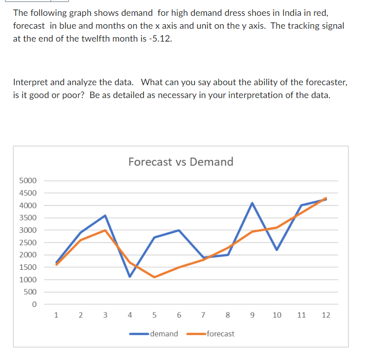
The following graph shows demand for high demand dress shoes in India in red, forecast in blue and months on the x axis and unit on the y axis. The tracking signal at the end of the twelfth month is -5.12. Interpret and analyze the data. What can you say about the ability of the forecaster, is it good or poor? Be as detailed as necessary in your interpretation of the data. 5000 4500 4000 3500 3000 2500 2000 1500 1000 500 0 1 2 3 Forecast vs Demand 4 5 6 7 demand 8 9 -forecast S 10 11 12
Step by Step Solution
There are 3 Steps involved in it
Step: 1
The provided graph plots a comparison between actual demand in red and forecasted demand in blue for high demand dress shoes in India over a period of ...
Get Instant Access to Expert-Tailored Solutions
See step-by-step solutions with expert insights and AI powered tools for academic success
Step: 2

Step: 3

Ace Your Homework with AI
Get the answers you need in no time with our AI-driven, step-by-step assistance
Get StartedRecommended Textbook for
Economics
Authors: R. Glenn Hubbard
6th edition
978-0134797731, 134797736, 978-0134106243
Students also viewed these General Management questions
Question
Answered: 1 week ago
Question
Answered: 1 week ago
Question
Answered: 1 week ago
Question
Answered: 1 week ago
Question
Answered: 1 week ago
Question
Answered: 1 week ago
Question
Answered: 1 week ago
Question
Answered: 1 week ago
Question
Answered: 1 week ago
Question
Answered: 1 week ago
Question
Answered: 1 week ago
Question
Answered: 1 week ago
Question
Answered: 1 week ago
Question
Answered: 1 week ago
Question
Answered: 1 week ago
Question
Answered: 1 week ago
Question
Answered: 1 week ago
Question
Answered: 1 week ago
Question
Answered: 1 week ago
View Answer in SolutionInn App


