

Question
These are the facet bar graphs for daily average number of passengers arrived at O'Hare by month, from 2017 to 2021?What striking feature is apparent
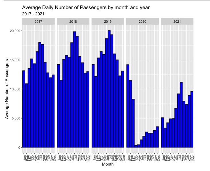
These are the facet bar graphs for daily average number of passengers arrived at O'Hare by month, from 2017 to 2021?What striking feature is apparent in this graph? What explains this feature of the data?P/S: It might be because of COVID-19. But I don't think that's a statistically right answer
Step by Step Solution
There are 3 Steps involved in it
Step: 1

Get Instant Access to Expert-Tailored Solutions
See step-by-step solutions with expert insights and AI powered tools for academic success
Step: 2

Step: 3
Ace Your Homework with AI
Get the answers you need in no time with our AI-driven, step-by-step assistance
Get Started
Elementary Linear Algebra with Applications
Authors: Bernard Kolman, David Hill
9th edition
132296543, 978-0132296540