Answered step by step
Verified Expert Solution
Question
1 Approved Answer
undefined The Statistics Department at the Bank of Canada has tabulated the daily exchange rates between the Canadian Dollar and the US Dollar (CAD-USD process)
undefined
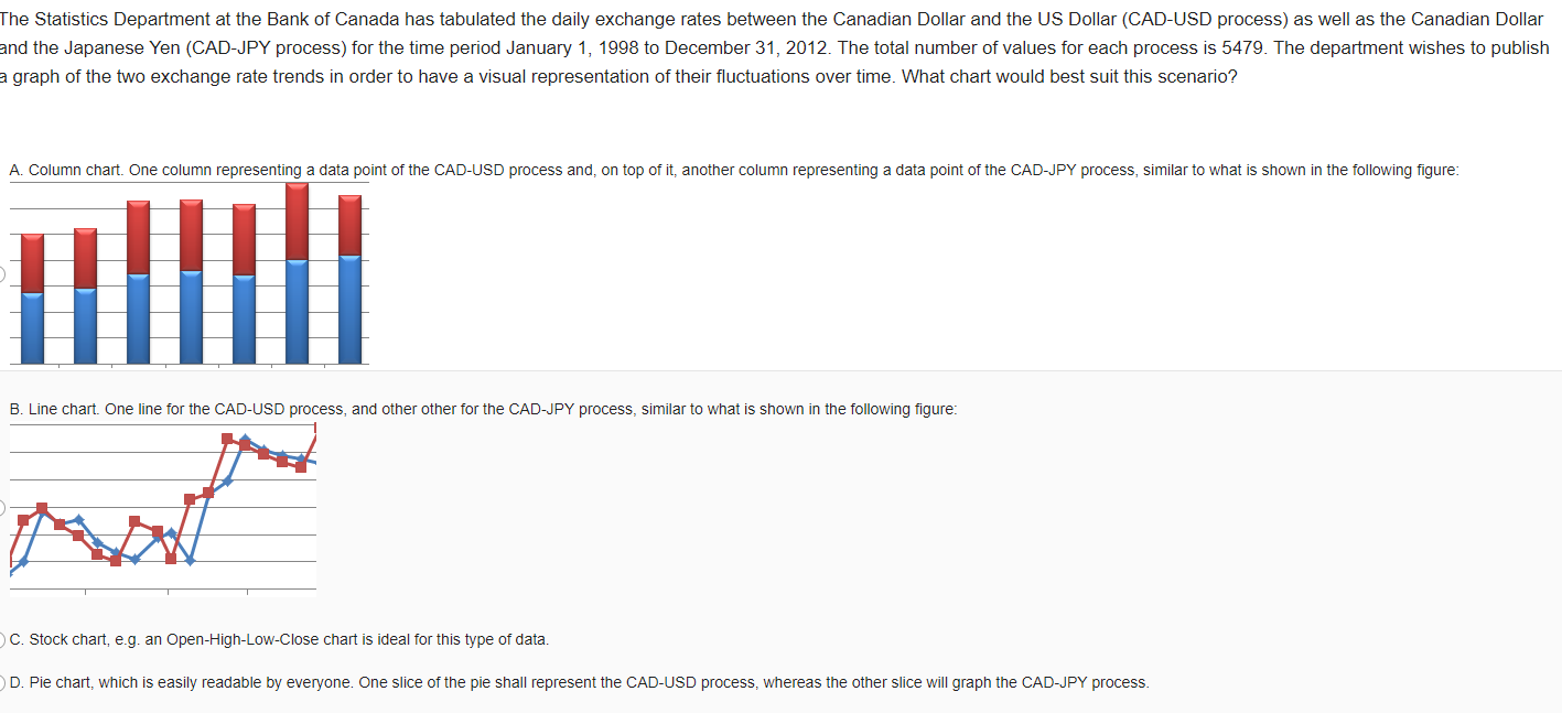
The Statistics Department at the Bank of Canada has tabulated the daily exchange rates between the Canadian Dollar and the US Dollar (CAD-USD process) as well as the Canadian Dollar and the Japanese Yen (CAD-JPY process) for the time period January 1, 1998 to December 31, 2012. The total number of values for each process is 5479. The department wishes to publish a graph of the two exchange rate trends in order to have a visual representation of their fluctuations over time. What chart would best suit this scenario? A. Column chart. One column representing a data point of the CAD-USD process and, on top of it, another column representing a data point of the CAD-JPY process, similar to what is shown in the following figure: ill B. Line chart. One line for the CAD-USD process, and other other for the CAD-JPY process, similar to what is shown in the following figure: C. Stock chart, e.g. an Open-High-Low-Close chart is ideal for this type of data. D. Pie chart, which is easily readable by everyone. One slice of the pie shall represent the CAD-USD process, whereas the other slice will graph the CAD-JPY processStep by Step Solution
There are 3 Steps involved in it
Step: 1
Get Instant Access to Expert-Tailored Solutions
See step-by-step solutions with expert insights and AI powered tools for academic success
Step: 2
Step: 3
Ace Your Homework with AI
Get the answers you need in no time with our AI-driven, step-by-step assistance
Get Started