

Question
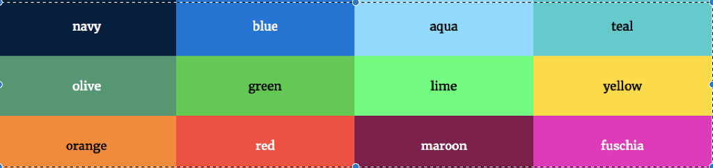
Use HTML and CSS to create a simple responsive website using Flexbox. Use an external CSS file and link it to the HTML file. Also
Use HTML and CSS to create a simple responsive website using Flexbox. Use an external CSS file and link it to the HTML file. Also use CSS media queries to accommodate for three different layouts depending on the screen of the device. The three designs will be single column, three column, and six column layout. Put any three pictures in each column. Also make sure that the HTML has a header tag with the class attribute value head, a div with the class attribute named row, and six divs with the class attribute named column each with three images. Also include, a section tag with the attribute value main, a footer tag with the value attribute of foot, and the rest of the classes you name and come up with. Also make sure the CSS is well commented. The final program should look something like what I've attached except with 6 columns instead of 4 and a header and a footer. Make the header and the footer say flexbox and make them red
.
Step by Step Solution
There are 3 Steps involved in it
Step: 1

Get Instant Access to Expert-Tailored Solutions
See step-by-step solutions with expert insights and AI powered tools for academic success
Step: 2

Step: 3
Ace Your Homework with AI
Get the answers you need in no time with our AI-driven, step-by-step assistance
Get Started
Intranet And Web Databases For Dummies
Authors: Paul Litwin
1st Edition
0764502212, 9780764502217