

Answered step by step
Verified Expert Solution
Question
1 Approved Answer
Using Matplotlib: I know you do not have the CSV file to actually create the graph I am just needing help with the code to
Using Matplotlib: I know you do not have the CSV file to actually create the graph I am just needing help with the code to write it.
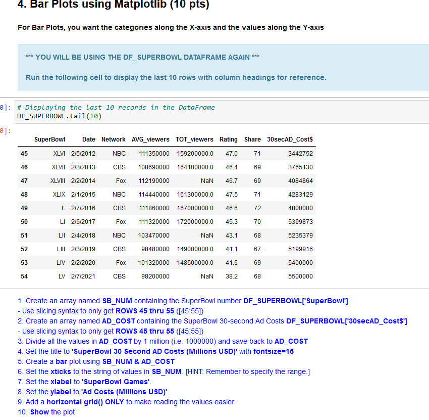
For Bar Plots, you want the categories along the X-axis and the values along the Y-axis YOU WILL BE USING THE DF_SUPERBOWL DATAFRAME AGAIN Run the following cell to display the last 10 rows with column headings for reference. \# Displaying the Last 10 records in the DataFrame DF_SUPERBOWL.tail(10) 1. Create an array named SB_NUM containing the SuperBowl number DF_SUPERBOWL['SuperBowI'] - Use slicing syntax to only get ROWS 45 thru 55 ([45:55]) 2. Create an array named AD_COST containing the SuperBowl 30-second Ad Costs DF_SUPERBOWL['30secAD_Cost\$'] - Use slicing syntax to only get ROWS 45 thru 55 ([45:55]) 3. Divide all the values in AD _COST by 1 million (i.e. 1000000) and save back to AD _COST 4. Set the title to 'SuperBowI 30 Second AD Costs (Millions USD)' with fontsize =15 5. Create a bar plot using SB_NUM \& AD_COST 6. Set the xticks to the string of values in SB_NUM. [HINT: Remember to specify the range.] 7. Set the xlabel to 'SuperBowl Games'. 8. Set the ylabel to 'Ad Costs (Millions USD)'. 9. Add a horizontal grid() ONLY to make reading the values easier. 10. Show the plot
Step by Step Solution
There are 3 Steps involved in it
Step: 1

Get Instant Access to Expert-Tailored Solutions
See step-by-step solutions with expert insights and AI powered tools for academic success
Step: 2

Step: 3
Ace Your Homework with AI
Get the answers you need in no time with our AI-driven, step-by-step assistance
Get Started
Advanced Oracle Solaris 11 System Administration
Authors: Bill Calkins
1st Edition
0133007170, 9780133007176