Answered step by step
Verified Expert Solution
Link Copied!

Question

1 Approved Answer

Using python to improve this bad bar chart and explain why is this bad: Problem 4: Bad bar chart 2 (20 points) Explain why this

Using python to improve this bad bar chart and explain why is this bad:image text in transcribed

Problem 4: Bad bar chart 2 (20 points) Explain why this visualization is a bad one: 500 400 300 200 100 0 Jan Feb Mar Apr May Jun Jul Aug Sep Oct Nov Dec Your Answer Here: Edit this cell with your answer In [9]: badBar2Names = ["Ian", "Feb", "Mar", "Apr", "May", "Jun", "Jul", "Aug", "Sep", "Oct", "Nov", "Dec"] badbar2Values = [240, 320, 360, 280, 290, 300, 500, 410, 390, 200, 220, 240] In [10]: # Plot a better chart using this data Tell a story or describe a pattern using your new visualization. Your Answer Here: Edit this cell with your

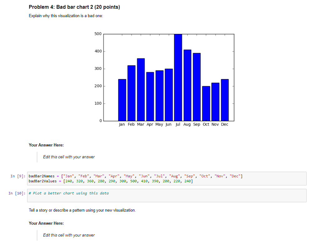
Step by Step Solution

There are 3 Steps involved in it

Step: 1

blur-text-image

Get Instant Access to Expert-Tailored Solutions

See step-by-step solutions with expert insights and AI powered tools for academic success

Step: 2

blur-text-image

Step: 3

blur-text-image

Ace Your Homework with AI

Get the answers you need in no time with our AI-driven, step-by-step assistance

Get Started

Recommended Textbook for

Systems Analysis And Synthesis Bridging Computer Science And Information Technology

Authors: Barry Dwyer

1st Edition

0128054492, 9780128054499

More Books

Students also viewed these Databases questions

Question

What do Dimensions represent in OLAP Cubes?

Answered: 1 week ago