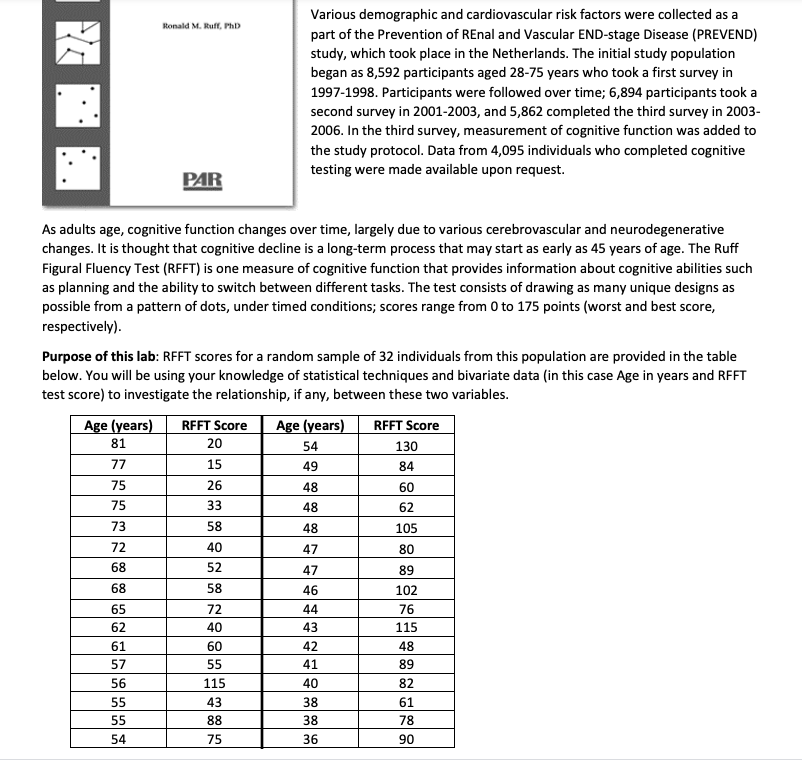
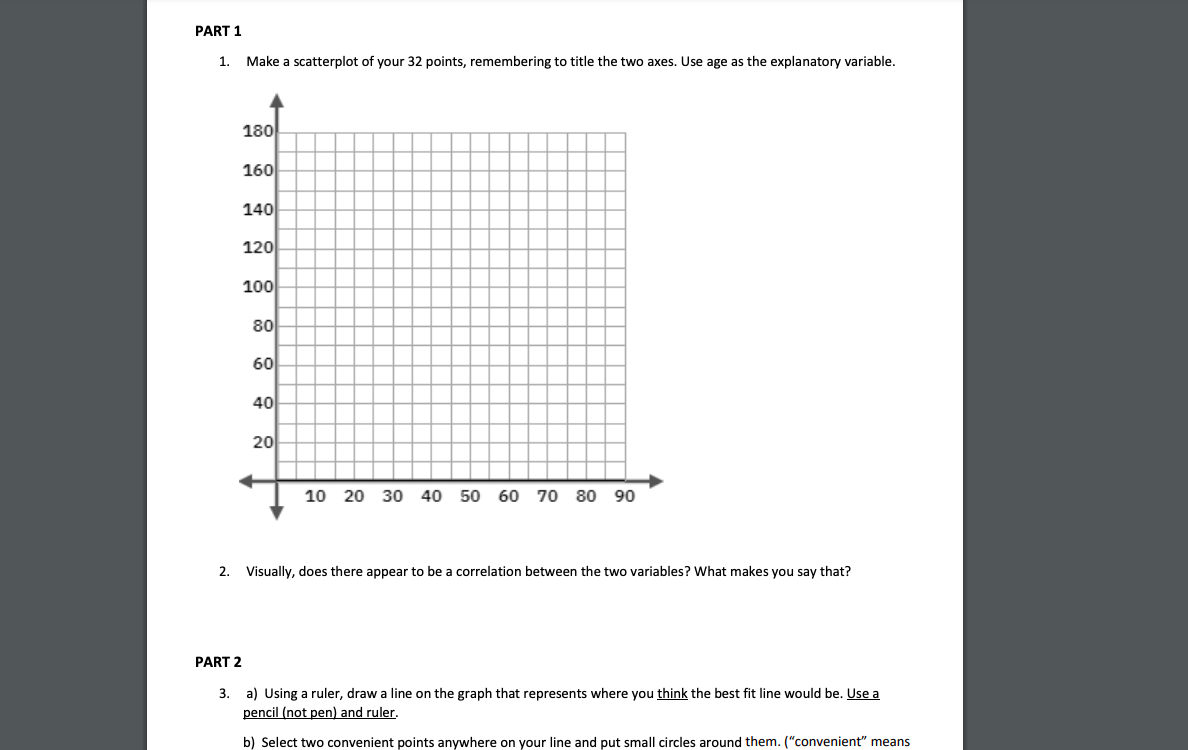
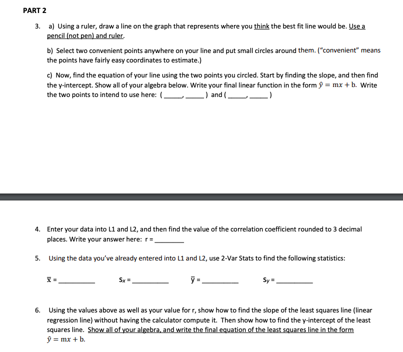
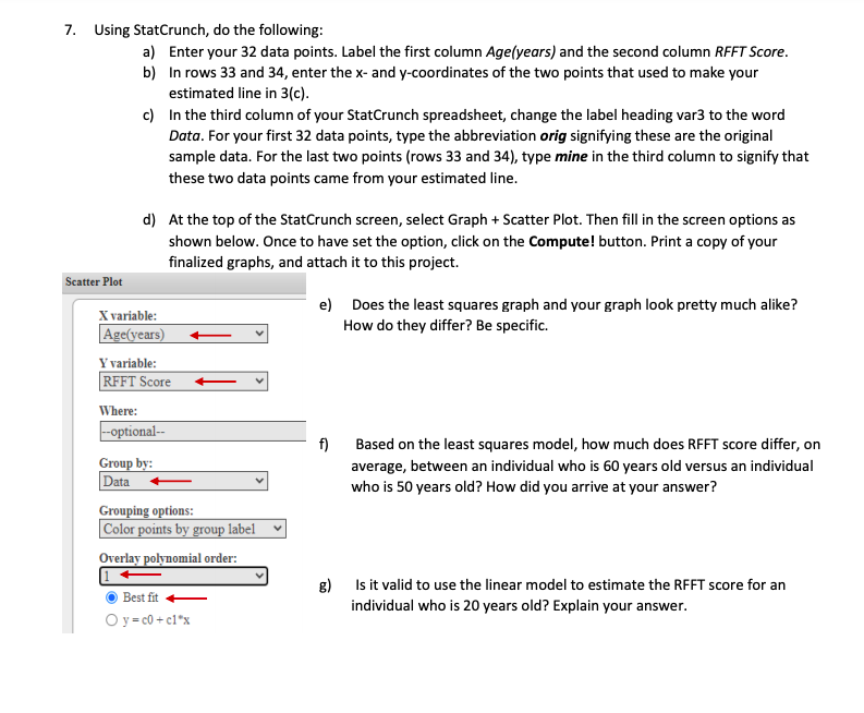
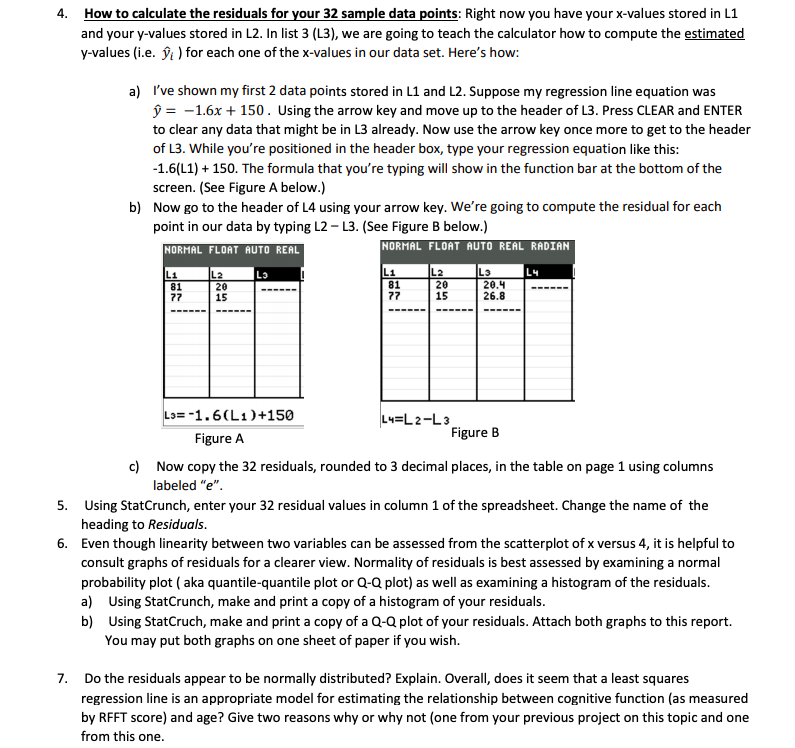
'v'a rious demographic and cardiovascular risk factors were collected as a part of the Prevention of REnal and Vascular END-stage Disease [PREVENDII study, which took plaoe in the Netherlands. The initial study population began as 3,592 participants aged 28-?5 years who took a first survey in HST-1998. Participants were followed over time; 6,894 participants took a second survey in 2001-2003, and 5,862 completed the third survey in 2003- 2005. In the third survey, measurement of cognitive function was added to the study protocol. Data from 4,095 individuals who completed cognitive testing were made available upon request. As adults age, cognitive function changes over time, largely due to various oerebrovascular and neu rodegenerative changes. It is thought that oognitive decline is a long-term process that may start as early as 45 years of age. The Ruff Figural Fluency Test [RFFTI is one measure of oognitive function that provides information about cognitive abilities such as planning and the ability to switch between different tasks. The test oonsists of drawing as many unique designs as possible from a pattern of dots, under timed conditions: soores range from 0 to 1?5 points [worst and best score, respectively]. Purpose of this lab: FIFFI' scores for a random sample of 32 individuals from this population are provided in the table below. You will be using your knowledge of statistical techniques and bivariate data [in this case Age in years and FtFl-'l' test see re) to investigate the relations hip, if any, between thie two variables. PART 1 1. Make a scatterplot of your 32 points, remembering to title the two axes. Use age as the explanatory variable. 180 160 140 120 100 80 60 40 20 10 20 30 40 50 60 70 80 90 2. Visually, does there appear to be a correlation between the two variables? What makes you say that? PART 2 3. a) Using a ruler, draw a line on the graph that represents where you think the best fit line would be. Use a pencil (not pen) and ruler. b) Select two convenient points anywhere on your line and put small circles around them. ("convenient" meansPART 2 3. a) Using a ruler, draw a line on the graph that represents where you think the best fit line would be. Use a pencil (not pen) and ruler. b) Select two convenient points anywhere on your line and put small circles around them. ("convenient" means the points have fairly easy coordinates to estimate.) c) Now, find the equation of your line using the two points you circled. Start by finding the slope, and then find the y-intercept. Show all of your algebra below. Write your final linear function in the form y = mx + b. Write the two points to intend to use here: (. _) and (. 4. Enter your data into L1 and L2, and then find the value of the correlation coefficient rounded to 3 decimal places. Write your answer here: r = 5. Using the data you've already entered into L1 and L2, use 2-Var Stats to find the following statistics: X = Sx = y : Sy = 6. Using the values above as well as your value for r, show how to find the slope of the least squares line (linear regression line) without having the calculator compute it. Then show how to find the y-intercept of the least squares line. Show all of your algebra, and write the final equation of the least squares line in the form y = mx + b.7. Using StatCrunch, do the following: a) Enter your 32 data points. Label the first column Age(years) and the second column RFFT Score. b) In rows 33 and 34, enter the x- and y-coordinates of the two points that used to make your estimated line in 3(c). c) In the third column of your StatCrunch spreadsheet, change the label heading var3 to the word Data. For your first 32 data points, type the abbreviation orig signifying these are the original sample data. For the last two points (rows 33 and 34), type mine in the third column to signify that these two data points came from your estimated line. d) At the top of the StatCrunch screen, select Graph + Scatter Plot. Then fill in the screen options as shown below. Once to have set the option, click on the Compute! button. Print a copy of your finalized graphs, and attach it to this project. Scatter Plot X variable: e) Does the least squares graph and your graph look pretty much alike? Age(years) How do they differ? Be specific. Y variable: RFFT Score + Where: optional- f) Based on the least squares model, how much does RFFT score differ, on Group by: Data average, between an individual who is 60 years old versus an individual who is 50 years old? How did you arrive at your answer? Grouping options: Color points by group label Overlay polynomial order: 1 + Best fit g) Is it valid to use the linear model to estimate the RFFT score for an O y=c0 + cl"x individual who is 20 years old? Explain your answer.4. How to calculate the residuals for your 32 sample data points: Right now you have your x-values stored in L1 and your y-values stored in L2. In list 3 (L3), we are going to teach the calculator how to compute the estimated y-values (i.e. >; ) for each one of the x-values in our data set. Here's how: a) I've shown my first 2 data points stored in L1 and L2. Suppose my regression line equation was D= -1.6x + 150. Using the arrow key and move up to the header of L3. Press CLEAR and ENTER to clear any data that might be in L3 already. Now use the arrow key once more to get to the header of L3. While you're positioned in the header box, type your regression equation like this: -1.6(L1) + 150. The formula that you're typing will show in the function bar at the bottom of the screen. (See Figure A below.) b) Now go to the header of L4 using your arrow key. We're going to compute the residual for each point in our data by typing L2 - L3. (See Figure B below.) NORMAL FLOAT AUTO REAL NORMAL FLOAT AUTO REAL RADIAN Li L2 Li Ly 20 81 L2 L3 77 20 20.4 26. Lo= -1. 6 (L1)+150 L4= L 2-L3 Figure A Figure B c) Now copy the 32 residuals, rounded to 3 decimal places, in the table on page 1 using columns labeled "e". 5. Using StatCrunch, enter your 32 residual values in column 1 of the spreadsheet. Change the name of the heading to Residuals. 6. Even though linearity between two variables can be assessed from the scatterplot of x versus 4, it is helpful to consult graphs of residuals for a clearer view. Normality of residuals is best assessed by examining a normal probability plot ( aka quantile-quantile plot or Q-Q plot) as well as examining a histogram of the residuals. a) Using StatCrunch, make and print a copy of a histogram of your residuals. b) Using StatCruch, make and print a copy of a Q-Q plot of your residuals. Attach both graphs to this report. You may put both graphs on one sheet of paper if you wish. 7. Do the residuals appear to be normally distributed? Explain. Overall, does it seem that a least squares regression line is an appropriate model for estimating the relationship between cognitive function (as measured by RFFT score) and age? Give two reasons why or why not (one from your previous project on this topic and one from this one
