

Answered step by step
Verified Expert Solution
Question
1 Approved Answer
Web Developement and Design Foundations with HTML5: Page 361-362. I would like to see the code for this mobile device css. Instructions are in the
Web Developement and Design Foundations with HTML5: Page 361-362. I would like to see the code for this mobile device css. Instructions are in the photgraphs below. 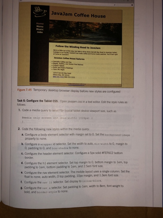
JavaJam Coffee House Jobs Follow the Winding Road to JavaJam Javadam Coffee House features . Specially of and the and was Figure 7.45 Temporary desktop browser display before new styles are configured Task 6: Configure the Tablet CSS. Open javajam.css in a text editor. Edit the style rules as follows: 1. Code a media query to select for typical tablet device viewport size, such as emedia only screen and (max-width: 1024px) { 2. Code the following new styles within the media query: a. Configure a body element selector with margin set to O. Set the background-image property to none. b. Configure a wrapper id selector. Set the width to auto, nin width to 0. margin to O, padding to 0, and box-shadow to none. C. Configure the header element selector. Configure a 5px solid #FEF6C2 bottom border. d. Configure the hl element selector. Set top margin to o, bottom margin to lem, top padding to lem, bottom padding to lem, and 2.5em font size e. Configure the nav element selector. The mobile layout uses a single column. Set the float to none, auto width, 0 top padding, 10px margin, and 1.3em font size. 1. Configure the nav 11 selector. Set display to inline-block. 8. Configure the nav a selector. Set padding to lem, width to Bem, font weight to bold, and border-style to none. Chapter 7 More on Links, Layout, and Mobile h. Configure the nav ur selector with O padding and margin 1. Configure the theroroad, Wheromugs, and theroguitar selectors. Configure o margin and 0 padding. 1. Configure the main element selector. Set margin to 0, and font size to 90%. Save the javajam.css file. Use the CSS validator to help you find syntax errors. Task 7: Configure the Smartphone CSS. Open javajam.css in a text editor. Note that any device with a screen max-width of 1024 pixels or less will apply the styles you coded in Task 6. In this task you will code additional styles needed for smaller devices. Edit the style rules as follows: 1. Code a media query to select for typical smartphone device viewport size, such as @media only screen and (max-width: 768px) 2. Code the following new styles within the media query: a. Configure the header element selector to display an image designed for small mobile devices. Set the background image to javajammini.jpg. Set the height to 128px. b. Configure the hl element selector Set 2em font size, centered text, and O left padding c. Configure the nav element selector. Set the margin to 0. d. Configure the anchor tags in the navigation area Code a style rule for the nav a selector. Set the display to block, padding to 0.2em, and width to auto. Also con- figure a 1 pixel bottom border (use WFEF6C2 for the border color). e. Configure the nav 11 selector. Set the display to block. f. Configure the main element selector. Set top padding to lpx. g. Configure the h2 element selector. Set 0.5em top padding, Oright padding, O bot- tom padding, and 0.5em left padding. Set the right margin to 0.5em. h. Configure the details class selector. Set left and right padding to 0. I. Configure the theroroad, theromugs, and theroguitar selectors. Set the background image to none. Set the height to auto. j. Configure the floatieft class selector. Set left and right padding to 0.5em. k. Remember the telephone number hyperlink you created in Task 2? Configure the CSS for the phone number display as shown below: mobile #desktop display: inline; } display: none; Save the javajam.css file. Use the CSS validator to help you find syntax errors. Display your pages in a desktop browser. The pages should look the same as they did before you started this case study (see Figure 6.49). Next, test the mobile display. Display your page and reduce the width of the browser. Your mobile display should be similar to Figure 7.43 or 7.44. Select the hyperlinks to view the Menu and Music pages. They should be similar to the home page. Javajam is mobile Step by Step Solution
There are 3 Steps involved in it
Step: 1

Get Instant Access to Expert-Tailored Solutions
See step-by-step solutions with expert insights and AI powered tools for academic success
Step: 2

Step: 3
Ace Your Homework with AI
Get the answers you need in no time with our AI-driven, step-by-step assistance
Get Started
Joe Celkos Data And Databases Concepts In Practice
Authors: Joe Celko
1st Edition
1558604324, 978-1558604322