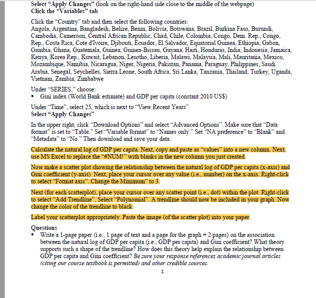
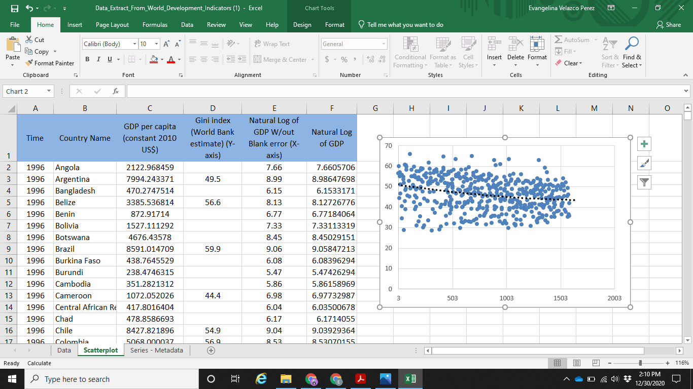
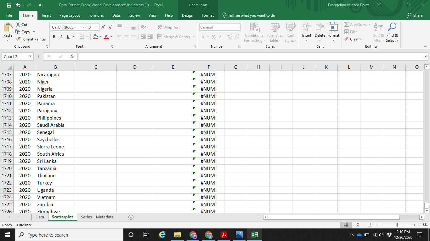
Question: What does it mean each scatterplot am i suppose to do it for every year (it goes till 2020)? Also, if you can double check


What does it mean "each scatterplot" am i suppose to do it for every year (it goes till 2020)? Also, if you can double check if i did the first scatterplot correctly?
Select Apply Changes (look on the right-hand side close to the middle of the webpage) Click the "Variables" tab Click the "Country tab and then select the following countries: Angola, Argentina, Bangladesh, Belize, Benin, Bolivia, Botswana, Brazil, Burkina Faso, Burundi, Cambodia, Cameroon, Central African Republic Chad Chile Colombia, Congo, Dem. Rep. Congo, Rep., Costa Rica, Cote d'Ivoire Djibouti, Ecuador, El Salvador, Equatorial Guinea, Ethiopia, Gabon, Gambia, Ghana, Guatemala, Guinea, Guinea-Bissau, Guyana, Haiti Honduras, India, Indonesia, Jamaica, Kenya, Korea Rep., Kuwait, Lebanon Lesotho Liberia, Malawi, Malaysia, Mali, Mauritania, Mexico, Mozambique, Namibia, Nicaragua, Niger, Nigeria, Pakistan, Panama, Paraguay, Philippines, Saudi Arabia, Senegal, Seychelles, Sierra Leone, South Africa, Sri Lanka, Tanzania, Thailand, Turkey, Uganda, Vietnam Zambia Zimbabwe Under "SERIES," choose: Gini index (World Bank estimate) and GDP per capita constant 2010 US$) Under Time, select 25, which is next to View Recent Years" Select "Apply Changes" In the upper right click Download Options and select "Advanced Options. Make sure that Data format" is set to "Table." Set "Variable format" to "Names only." Set *NA preference to Blank and "Metadata" to "No." Then download and save your data. Calculate the natural log of GDP per capita. Next, copy and paste as "values" into a new column Next, use MS Excel to replace the "#NUM!" with blanks in the new column you just created Now make a scatter plot showing the relationship between the natural log of GDP per capita (x-axis) and Gini coefficient (y-axis). Next, place your cursor over any value (i.e., number) on the x-axis. Right-click to select "Format axis. Change the Minimum" to 3. Next (for each scatterplot), place your cusor over any scatter point (1.e., dot) within the plot. Right click to select "Add Trendline". Select Polynomial. A trendline should now be included in your graph. Now change the color of the trendline to black Label your scatterplot appropriately. Paste the image (of the scatter plot) into your paper. Questions Write a 1-page paper (i.e., 1 page of text and a page for the graph = 2 pages) on the association between the natural log of GDP per capita (1.e., GDP per capita) and Gini coefficient? What theory supports such a shape of the trendline? How does this theory help explain the relationship between GDP per capita and Gini coefficient? Be sure your response references academic journal articles (citing our course textbook is permitted) and other credible sources. 1 Data_Extract_From_World_Development_Indicators (1) - Excel Chart Tools Evangelina Velazco Perez X File Home Insert Page Layout Formulas Data Review View Help Design Format Tell me what you want to do Share If I > AutoSum . Calibri (Body) - 10 ab Wrap Text General WH * Cut Be Copy Format Painter 47 HH Fill- Paste BIU.LT Merge & Center $ % Insert Delete Format Conditional Format as Cell Formatting Table Styles Styles Clear Sort & Find & Filter Select Editing Clipboard Font Alignment Number Cells A Chart 2 f A B D F H J K L M N O Time Country Name GDP per capita (constant 2010 US$) Gini index (World Bank estimate) (Y- axis) E Natural Log of GDP W/out Blank error (X- axis) 7.66 Natural Log of GDP 70 + 1 2 3 60 49.5 8.99 Y 50 4 5 56.6 40 6 O 30 7 8 9 59.9 20 1996 1996 1996 1996 1996 1996 1996 1996 1996 1996 1996 1996 1996 1996 1996 1996 Angola Argentina Bangladesh Belize Benin Bolivia Botswana Brazil Burkina Faso Burundi Cambodia Cameroon Central African Re Chad Chile Colombia Data Scatterplot 2122.968459 7994.243371 470.2747514 3385.536814 872.91714 1527.111292 4676.43578 8591.014709 438.7645529 238.4746315 351.2821312 1072.052026 417.8016404 478.8586693 8427.821896 5068 nnnn37 Series - Metadata 10 11 12 13 14 7.6605706 8.98647698 6.1533171 8.12726776 6.77184064 7.33113319 8.45029151 9.05847213 6.08396294 5.47426294 5.86158969 6.97732987 6.03500678 6.1714055 9.03929364 852070155 6.15 8.13 6.77 7.33 8.45 9.06 6.08 5.47 5.86 6.98 6.04 6.17 9.04 852 10 0 44.4 503 1503 2003 1003 O 15 16 17 54.9 569 + Ready Calculate 116% . Type here to search j 2:10 PM 12/30/2020 Data_Extract_From_World_Development_Indicators (1) - Excel Chart Tools Evangelina Velazco Perez File Home Insert Page Layout Formulas Data Review View Help Design Format Tell me what you want to do & Share If I > AutoSum - . Calibri (Body) - 10 PA ab Wrap Text General * Cut Eg Copy Format Painter - 47 HH Fill- Paste BIU A- Merge & Center - $ % Insert Delete Format Conditional Format as Cell Formatting Table Styles Styles Clear Sort & Find & Filter Select Editing Clipboard Font Alignment Number Cells A Chart 2 f C D E F H 1 j K L M N 0 1707 1708 1709 #NUM! #NUM! #NUM! #NUM! #NUM! 1710 1711 1712 1713 1714 1715 1716 1717 A B 2020 Nicaragua 2020 Niger 2020 Nigeria 2020 Pakistan 2020 Panama 2020 Paraguay 2020 Philippines 2020 Saudi Arabia 2020 Senegal 2020 Seychelles 2020 Sierra Leone 2020 South Africa 2020 Sri Lanka 2020 Tanzania 2020 Thailand 2020 Turkey 2020 Uganda 2020 Vietnam 2020 Zambia 2020 Zimbabwe Data Scatterplot Calculate 1718 1719 1720 #NUM! #NUM! #NUM! #NUM! #NUM! #NUM! #NUM! #NUM! #NUM! #NUM! #NUM! #NUM! #NUM! #NUM! #NUMU 1721 1722 1723 1724 1725 1726 Series - Metadata Ready 116% Type here to search | 0 e 2:10 PM 12/30/2020 D Select Apply Changes (look on the right-hand side close to the middle of the webpage) Click the "Variables" tab Click the "Country tab and then select the following countries: Angola, Argentina, Bangladesh, Belize, Benin, Bolivia, Botswana, Brazil, Burkina Faso, Burundi, Cambodia, Cameroon, Central African Republic Chad Chile Colombia, Congo, Dem. Rep. Congo, Rep., Costa Rica, Cote d'Ivoire Djibouti, Ecuador, El Salvador, Equatorial Guinea, Ethiopia, Gabon, Gambia, Ghana, Guatemala, Guinea, Guinea-Bissau, Guyana, Haiti Honduras, India, Indonesia, Jamaica, Kenya, Korea Rep., Kuwait, Lebanon Lesotho Liberia, Malawi, Malaysia, Mali, Mauritania, Mexico, Mozambique, Namibia, Nicaragua, Niger, Nigeria, Pakistan, Panama, Paraguay, Philippines, Saudi Arabia, Senegal, Seychelles, Sierra Leone, South Africa, Sri Lanka, Tanzania, Thailand, Turkey, Uganda, Vietnam Zambia Zimbabwe Under "SERIES," choose: Gini index (World Bank estimate) and GDP per capita constant 2010 US$) Under Time, select 25, which is next to View Recent Years" Select "Apply Changes" In the upper right click Download Options and select "Advanced Options. Make sure that Data format" is set to "Table." Set "Variable format" to "Names only." Set *NA preference to Blank and "Metadata" to "No." Then download and save your data. Calculate the natural log of GDP per capita. Next, copy and paste as "values" into a new column Next, use MS Excel to replace the "#NUM!" with blanks in the new column you just created Now make a scatter plot showing the relationship between the natural log of GDP per capita (x-axis) and Gini coefficient (y-axis). Next, place your cursor over any value (i.e., number) on the x-axis. Right-click to select "Format axis. Change the Minimum" to 3. Next (for each scatterplot), place your cusor over any scatter point (1.e., dot) within the plot. Right click to select "Add Trendline". Select Polynomial. A trendline should now be included in your graph. Now change the color of the trendline to black Label your scatterplot appropriately. Paste the image (of the scatter plot) into your paper. Questions Write a 1-page paper (i.e., 1 page of text and a page for the graph = 2 pages) on the association between the natural log of GDP per capita (1.e., GDP per capita) and Gini coefficient? What theory supports such a shape of the trendline? How does this theory help explain the relationship between GDP per capita and Gini coefficient? Be sure your response references academic journal articles (citing our course textbook is permitted) and other credible sources. 1 Data_Extract_From_World_Development_Indicators (1) - Excel Chart Tools Evangelina Velazco Perez X File Home Insert Page Layout Formulas Data Review View Help Design Format Tell me what you want to do Share If I > AutoSum . Calibri (Body) - 10 ab Wrap Text General WH * Cut Be Copy Format Painter 47 HH Fill- Paste BIU.LT Merge & Center $ % Insert Delete Format Conditional Format as Cell Formatting Table Styles Styles Clear Sort & Find & Filter Select Editing Clipboard Font Alignment Number Cells A Chart 2 f A B D F H J K L M N O Time Country Name GDP per capita (constant 2010 US$) Gini index (World Bank estimate) (Y- axis) E Natural Log of GDP W/out Blank error (X- axis) 7.66 Natural Log of GDP 70 + 1 2 3 60 49.5 8.99 Y 50 4 5 56.6 40 6 O 30 7 8 9 59.9 20 1996 1996 1996 1996 1996 1996 1996 1996 1996 1996 1996 1996 1996 1996 1996 1996 Angola Argentina Bangladesh Belize Benin Bolivia Botswana Brazil Burkina Faso Burundi Cambodia Cameroon Central African Re Chad Chile Colombia Data Scatterplot 2122.968459 7994.243371 470.2747514 3385.536814 872.91714 1527.111292 4676.43578 8591.014709 438.7645529 238.4746315 351.2821312 1072.052026 417.8016404 478.8586693 8427.821896 5068 nnnn37 Series - Metadata 10 11 12 13 14 7.6605706 8.98647698 6.1533171 8.12726776 6.77184064 7.33113319 8.45029151 9.05847213 6.08396294 5.47426294 5.86158969 6.97732987 6.03500678 6.1714055 9.03929364 852070155 6.15 8.13 6.77 7.33 8.45 9.06 6.08 5.47 5.86 6.98 6.04 6.17 9.04 852 10 0 44.4 503 1503 2003 1003 O 15 16 17 54.9 569 + Ready Calculate 116% . Type here to search j 2:10 PM 12/30/2020 Data_Extract_From_World_Development_Indicators (1) - Excel Chart Tools Evangelina Velazco Perez File Home Insert Page Layout Formulas Data Review View Help Design Format Tell me what you want to do & Share If I > AutoSum - . Calibri (Body) - 10 PA ab Wrap Text General * Cut Eg Copy Format Painter - 47 HH Fill- Paste BIU A- Merge & Center - $ % Insert Delete Format Conditional Format as Cell Formatting Table Styles Styles Clear Sort & Find & Filter Select Editing Clipboard Font Alignment Number Cells A Chart 2 f C D E F H 1 j K L M N 0 1707 1708 1709 #NUM! #NUM! #NUM! #NUM! #NUM! 1710 1711 1712 1713 1714 1715 1716 1717 A B 2020 Nicaragua 2020 Niger 2020 Nigeria 2020 Pakistan 2020 Panama 2020 Paraguay 2020 Philippines 2020 Saudi Arabia 2020 Senegal 2020 Seychelles 2020 Sierra Leone 2020 South Africa 2020 Sri Lanka 2020 Tanzania 2020 Thailand 2020 Turkey 2020 Uganda 2020 Vietnam 2020 Zambia 2020 Zimbabwe Data Scatterplot Calculate 1718 1719 1720 #NUM! #NUM! #NUM! #NUM! #NUM! #NUM! #NUM! #NUM! #NUM! #NUM! #NUM! #NUM! #NUM! #NUM! #NUMU 1721 1722 1723 1724 1725 1726 Series - Metadata Ready 116% Type here to search | 0 e 2:10 PM 12/30/2020 D
Step by Step Solution
There are 3 Steps involved in it

Get step-by-step solutions from verified subject matter experts


