Question
What is the mean of the TPCP population data? See Step 3 in the Python script. In the Python script, you selected a random sample
- What is the mean of the TPCP population data? See Step 3 in the Python script.
- In the Python script, you selected a random sample with replacement, of size 50 (note that this is a sufficiently large sample), from the TPCP population. What is the mean of your random sample? Does this sample mean closely approximate the TPCP population mean? See Step 4 in the Python script.
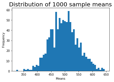
- You also selected 1,000 random samples of size 50 and calculated the mean of each sample. Then you stored those means into a dataframe. Check to make sure the output of this step is in your attachment. See Step 5 in the Python script.
- Review the plotted data distribution for these 1,000 means. Does this approximate a Normal distribution? Does this confirm the first part of the central limit theorem? Why or why not? See Step 6 in the Python script.
- What is the "grand" mean and standard deviation of these 1,000 means? Does the grand mean closely approximate (on a relative basis) the mean of the original distribution? Does this confirm the second part of the central limit theorem? Why or why not? See Step 7 in the Python script.
Step 1: Generating population data
This block of Python code will generate unique TPCP population data of size 500 observations. You will use this data set in this week's discussion. The numpy module in Python can be used to generate datasets with a skewed distribution by randomly generating data from a gamma distribution. You do not need to know what a gamma distribution is or how a dataset is drawn from it. The dataset will be saved in a Python dataframe that you will use in later calculations.
Click the block of code below and hit theRunbutton above.
In[1]:
import pandas as pd
import matplotlib.pyplot as plt
import numpy as np
import scipy.stats as st
?
# use gamma distribution to randomly generate 500 observations.
shape, scale = 1.95, 2.5
tpcp = 100*np.random.gamma(shape, scale, 500)
?
# pandas library can be used to convert the array into a dataframe of rounded figures with the column name TPCP.
tpcp_df = pd.DataFrame(tpcp, columns=['TPCP'])
tpcp_df = tpcp_df.round(0)
?
# print the dataframe to see the first 5 and last 5 observations (note that the index of dataframe starts at 0).
print("TPCP data frame ")
print(tpcp_df)
TPCP data frame
TPCP
0325.0
1346.0
2949.0
3818.0
4533.0
.....
495614.0
496110.0
497305.0
498163.0
499299.0
[500 rows x 1 columns]
Step 2: Creating a histogram plot of population data
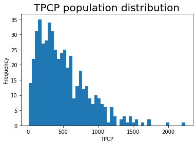
You will use the matplotlib module in Python to generate a histogram plot of the population data from Step 1. This plot allows you to visualize the population data distribution and confirm that it is skewed. You will use 50 bins in the histogram to display the distribution.
Click the block of code below and hit theRunbutton above.
NOTE: If the graph is not created, click the code section and hit theRunbutton again.
In[2]:
# generate a figure for the plot.
fig, ax = plt.subplots()
?
# generate a histogram plot with 50 bins of TPCP population data.
plt.hist(tpcp_df['TPCP'], bins=50)
?
# set a title for the plot, x-axis, and y-axis.
plt.title('TPCP population distribution', fontsize=20)
ax.set_xlabel('TPCP')
ax.set_ylabel('Frequency')
?
# show the plot.
plt.show()


Step by Step Solution
There are 3 Steps involved in it
Step: 1

Get Instant Access to Expert-Tailored Solutions
See step-by-step solutions with expert insights and AI powered tools for academic success
Step: 2

Step: 3

Ace Your Homework with AI
Get the answers you need in no time with our AI-driven, step-by-step assistance
Get Started


