Why is brand logo important for today's marketing
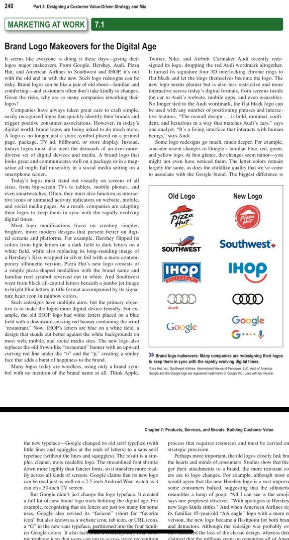
240 Part 3: Designing a Customer Value-Driven Strategy and Mix MARKETING AT WORK 7.1 Brand Logo Makeovers for the Digital Age It seems like everyone is doing it these days-giving their Twitter, Nike, and Airbnb, Carmaker Audi recently rede- logos major makeovers. From Google, Hershey, Audi, Pizza signed its logo, dropping the red Audi wordmark altogether. Hut, and American Airlines to Southwest and IHOP, it's out It turned its signature four 3D interlocking chrome rings to with the old and in with the new. Such logo redesigns can be flat black and let the rings themselves become the logo. The risky. Brand logos can be like a pair of old shoes-familiar and new logo seems plainer but is also less restrictive and more comforting-and customers often don't take kindly to changes. interactive across today's digital formats, from screens inside Given the risks, why are so many companies reworking their the car to Audi's website. mobile apps, and even wearables. logos? No longer tied to the Audi wordmark, the flat black logo can Companies have always taken great care to craft simple, be used with any number of positioning phrases and interac- casily recognized logos that quickly identify their brands and tive features. "The overall design ... is bold, minimal. confi- trigger positive consumer associations. However, in today's dent, and luxurious in a way that matches Audi's cars," says digital world, brand logos are being asked to do much more. one analyst. "It's a living interface that interacts with human A logo is no longer just a static symbol placed on a printed beings," says Audi. page, package, TV ad, billboard, or store display. Instead. Some logo redesigns go much, much deeper. For example, today's logos must also meet the demands of an ever-more- consider recent changes to Google's familiar blue, red, green. diverse set of digital devices and media. A brand logo that and yellow logo. At first glance, the changes seem minor-you looks great and communicates well on a package or in a mag- might not even have noticed them. The letter colors remain azine ad might fail miserably in a social media setting on a largely the same. as does the childlike quality that we've come smartphone screen. to associate with the Google brand. The biggest difference is Today's logos must stand out visually on screens of all sizes, from big-screen TVs to tablets, mobile phones, and even smartwatches. Often, they must also function as interac- tive icons or animated activity indicators on website, mobile, Old Logo New Logo and social media pages, As a result, companies are adapting their logos to keep them in sync with the rapidly evolving digital times. Pizza Pizza Hut Most logo modifications focus on creating simpler, brighter, more modern designs that present better on digi- tal screens and platforms. For example, Hershey flipped its colors from light letters on a dark field to dark letters on a Southwest. white field. while also replacing its long-standing image of SOUTHWEST a Hershey's Kiss wrapped in silver foil with a more contem- porary silhouette version. Pizza Hut's new logo consists of a simple pizza-shaped medallion with the brand name and IHOP familiar roof symbol reversed out in white. And Southwest IHOP went from black all-capital letters beneath a jumbo jet image to bright blue letters in title format accompanied by its signa- ture heart icon in rainbow colors. Such redesigns have multiple aims, but the primary object tive is to make the logos more digital device-friendly. For ex- Audi ample, the old IHOP logo had white letters placed on a blue field with a downward-curving red banner containing the word Google Google "restaurant." Now. IHOP's letters are blue on a white field. a design that stands out better against the white backgrounds on G.... most web, mobile, and social media sites. The new logo also replaces the old frown-like "restaurant" banner with an upward curving red line under the "o" and the "p." creating a smiley >> Brand logo makeovers: Many companies are redesigning their logos face that adds a burst of happiness to the brand. to keep them in sync with the rapidly evolving digital times. Many logos today are wordless, using only a brand sym- Pizza Hut Inc. Southwest Airlines; International House of Pancakes, LLC: Audi of America, bol with no mention of the brand name at all. Think Apple. Google and the Google logo are repistered trademarks of Google Inc, used with permission. Chapter 7: Products, Services, and Brands: Building Customer Value the new typeface-Google changed its old serif typeface (with process that requires resources and must be carried ou little lines and squiggles at the ends of letters) to a sans serif strategic precision. typeface (without the lines and squiggles). The result is a sim- Perhaps more important, the old logos closely link br pler. cleaner, more readable logo. The streamlined font shrinks the hearts and minds of consumers. Studies show that the down more legibly than fancier fonts, so it transfers more read- ger their attachments to a brand, the more resistant co ily across all kinds of screens. Google claims that its new logo ers are to logo changes. For example, although most can be read just as well on a 2.5-inch Android Wear watch as it would agree that the new Hershey logo is a vast improv can on a 50-inch TV screen. some consumers balked, suggesting that the silhouette But Google didn't just change the logo typeface. It created resembles a lump of poop. "All I can see is the emoji a full kit of new brand logo tools befitting the digital age. For says one perplexed observer. "With apologies to Hershey example, recognizing that six letters are just too many for some new logo kinda stinks." And when American Airlines re uses, Google also revised its "favicon" (short for "favorite its familiar 45-year-old "AA eagle" logo with a more icon" but also known as a website icon, tab icon, or URL icon). version, the new logo became a flashpoint for both bran a "G" in the new sans typeface, partitioned into the four famil and detractors. Although the redesign was probably or iar Google colors. It also fast ed the loss of the classic design, whereas det