

Market share, part 2. Heres a bar chart of the data in Exercise 15: a) Compared to
Question:
Market share, part 2.
Here’s a bar chart of the data in Exercise 15:
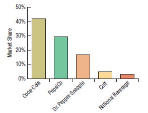
a) Compared to the pie chart in Exercise 15, which is better for displaying the relative portions of market share? Explain.
b) What is missing from this display that might make it misleading? (Source: Based on Pepsi Thirsty for a Comeback by The Wall Street Journal. March 18, 2011.) LO ➊
Fantastic news! We've Found the answer you've been seeking!
Step by Step Answer:

Answered By
Ashok Kumar Malhotra
Chartered Accountant - Accounting and Management Accounting for 15 years.
QuickBooks Online - Certified ProAdvisor (Advance - QuickBooks Online for 3 years.
3+ Reviews
10+ Question Solved
Related Book For 

Business Statistics
ISBN: 9780136726548
4th Canadian Edition
Authors: Norean Sharpe, Richard De Veaux, Paul Velleman, David Wright
Question Posted:
