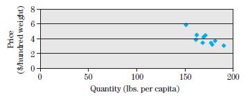
2. The following figure plots the average farm prices of potatoes in the United States for the...
Question:
2. The following figure plots the average farm prices of potatoes in the United States for the years 1989 to 1998 versus the annual per capita consumption.
Each point represents the price and quantity data for a given year. Explain whether simply drawing the line that approximates the data points would give the demand curve for potatoes.

Fantastic news! We've Found the answer you've been seeking!
Step by Step Answer:
Related Book For 

Question Posted:


