

A USA Snapshot (March 10, 2005) presented a bar graph depicting business travelers impression of wait times
Question:
A USA Snapshot (March 10, 2005) presented a bar graph depicting business travelers’ impression of wait times in airport security lines over the past 12 months. Statistics were derived from a Travel Industry Association of America Business Traveler Survey of 2034 respondents. Is this a probability distribution? Explain.
Impression Percentage Impression Percentage Impression Percentage Worse 49 Same 40 Better 11 5.25
a. Use a computer (or random-number table) to generate a random sample of 25 observations drawn from the discrete probability distribution.
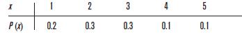
Compare the resulting data with your expectations.
b. Form a relative frequency distribution of the random data.
c. Construct a probability histogram of the given distribution and a relative frequency histogram of the observed data using class midpoints of 1, 2, 3, 4, and 5.
d. Compare the observed data with the theoretical distribution. Describe your conclusions.
e. Repeat parts a–d several times with n 25.
Describe the variability you observe between samples.
f. Repeat parts a–d several times with n 250.
Describe the variability you see between samples of this much larger size.
MINITAB (Release 14)
a. Input the x values of the random variable into C1 and their corresponding probabilities, P(x), into C2; then continue with the generating random data MINITAB commands on page 275.
b. To obtain the frequency distribution, continue with:
Choose: Stat Tables Cross Tabulation Enter: Categorical variables: For rows: C3 Select: Display: Total percents OK
c. To construct the histogram of the generated data in C3, continue with the histogram MINITAB commands on page 61, selecting scale Y-Scale Type Percent. (Use Binning followed by midpoint and midpoint positions 1:5/1 if necessary.)
To construct a bar graph of the given distribution, continue with the bar graph MINITAB commands on page 266 using C2 as the Graph variable and C1 as the Categorical variable.
Excel
a. Input the x values of the random variable in column A and their corresponding probabilities, P(x), in column B; then continue with the generating random data Excel commands on page 275 for n 25.
b. &
c. The frequency distribution is given with the histogram of the generated data. Use the histogram Excel commands on pages 61–62 using the data in column C and the bin range in column A.
To construct a histogram of the given distribution, continue with:
Choose: Chart Wizard Column 1st picture(usually)
Next Enter: Data range: (A1:B6 or select cells)
Choose: Series Remove (Series 1: x column) Next
Titles Enter: Chart and axes titles Finish (Edit as needed)
Step by Step Answer:

This question has not been answered yet.
You can Ask your question!


Just The Essentials Of Elementary Statistics
ISBN: 9780495314875
10th Edition
Authors: Robert Johnson, Patricia Kuby
