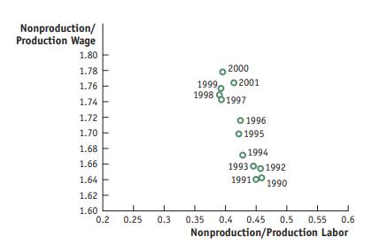
6. The following diagram shows what happened to the relative wage and relative demand for skilled labor
Question:
6. The following diagram shows what happened to the relative wage and relative demand for skilled labor in the U.S. manufacturing sector during the 1990s. These points are plotted using the data from Figures 7-5 and 7-6. To interpret this diagram, let us think about the offshoring of service activities done by nonproduction workers.
a. Suppose that the nonproduction workers providing service activities being offshored, such as call centers, earn a lower wage in the United States than other nonproduction workers. As the amount of offshoring increases, what will happen to the average wage of the nonproduction workers remaining in the United States? What happens to the relative wage of nonproduction/production workers? Is this outcome consistent with the diagram?
b. As the service activities are offshored, what happens to the U.S. employment of nonproduction workers? What happens to the relative employment of nonproduction/ production workers? Is this outcome also consistent with the diagram?

Step by Step Answer:


