

Question: 4. The following data visualizations are based on the channel prediction dataset given in Question 3. Each visualization illustrates the relationship between a descriptive feature
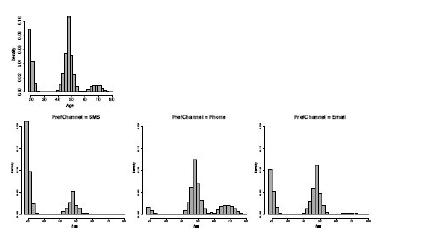
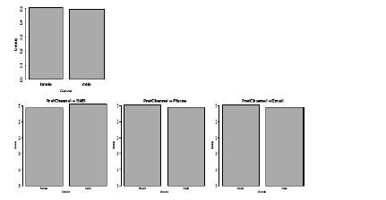
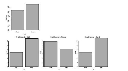
4. The following data visualizations are based on the channel prediction dataset given in Question 3. Each visualization illustrates the relationship between a descriptive feature and the target feature, PREFCHANNEL. Each visualization is composed of four plots: one plot of the distribution of the descriptive feature values in the entire dataset, and three plots illustrating the distribution of the descriptive feature values for each level of the target. Discuss the strength of the relationships shown in each visualizations.
a. The visualization below illustrates the relationship between the continuous feature AGE and the target feature, PREFCHANNEL.
b. The visualization below illustrates the relationship between the categorical feature GENDER and the target feature PREFCHANNEL.
c. The visualization below illustrates the relationship between the categorical feature LOC and the target feature, PREFCHANNEL.
313 00 00 00 L G
Step by Step Solution
There are 3 Steps involved in it

Get step-by-step solutions from verified subject matter experts