7. Table 14.9 shows the share of income going to each quintile of the income distribution for...
Question:
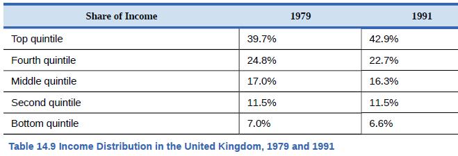
7. Table 14.9 shows the share of income going to each quintile of the income distribution for the United Kingdom in 1979 and 1991. Use this data to calculate what the points on a Lorenz curve would be, and sketch the Lorenz curve.
How did inequality in the United Kingdom shift over this time period? How can you see the patterns in the quintiles in the Lorenz curves?

Fantastic news! We've Found the answer you've been seeking!
Step by Step Answer:
Related Book For 

Question Posted:


