

Question
1) As for the pie chart, how do we include the number of students according to the ethnicity in the pie chart? 2) As for
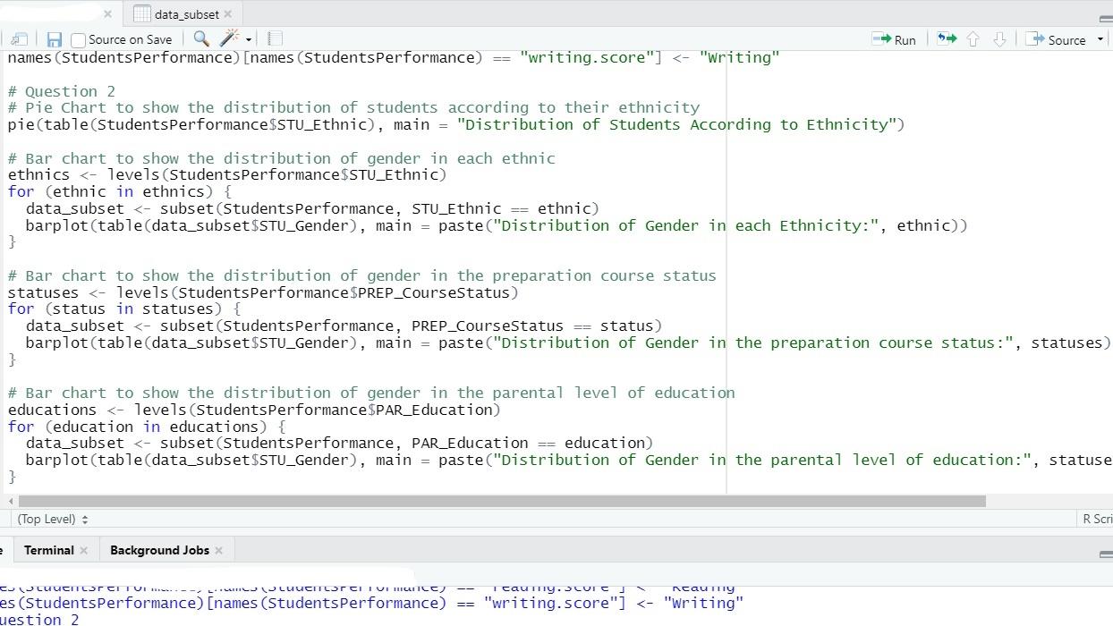
1) As for the pie chart, how do we include the number of students according to the ethnicity in the pie chart?
2) As for the bar chart to show distribution of gender in each ethnic, how do we get the distribution of for EACH ethnicity? From the code above, I only get the distribution of gender in ethnicity for group E.
3) As for the bar chart to show distribution of gender for the preparation course status, how do we get the distribution of female that has a complete preparation status and how many females has a 'none' for the complete preparation status? The same goes to men.
4) As for the bar chart to show distribution of gender for the parental level of education, how do we get the distribution of men and females for each level of education which are bachelor's degree, high school, master's degree, some college and some high school.
USING R PROGRAMMING! THE LINK OF THE DATASET IS AS FOLLOWS: https://drive.google.com/file/d/18JBe3v-mNv32Ga-H5Ngaiymo-RdBHHXN/view?usp=share_link
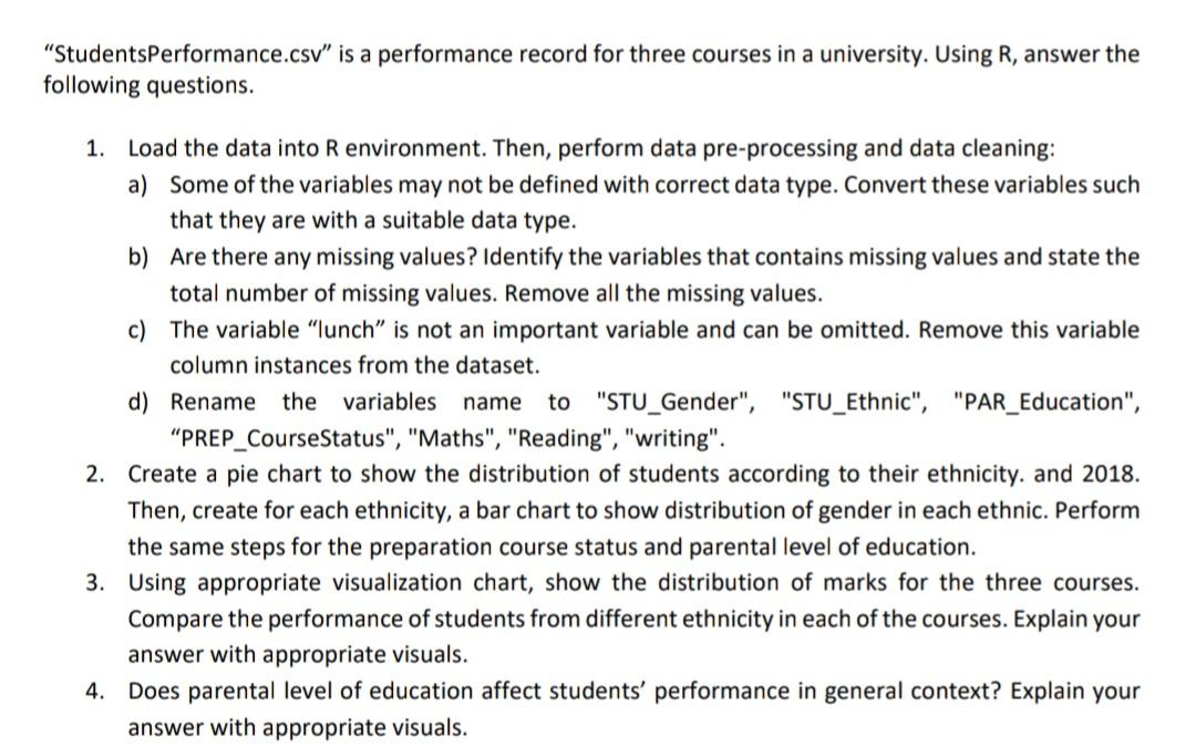
"StudentsPerformance.csv" is a performance record for three courses in a university. Using R, answer the ollowing questions. 1. Load the data into R environment. Then, perform data pre-processing and data cleaning: a) Some of the variables may not be defined with correct data type. Convert these variables such that they are with a suitable data type. b) Are there any missing values? Identify the variables that contains missing values and state the total number of missing values. Remove all the missing values. c) The variable "lunch" is not an important variable and can be omitted. Remove this variable column instances from the dataset. d) Rename the variables name to "STU_Gender", "STU_Ethnic", "PAR_Education", "PREP_CourseStatus", "Maths", "Reading", "writing". 2. Create a pie chart to show the distribution of students according to their ethnicity. and 2018. Then, create for each ethnicity, a bar chart to show distribution of gender in each ethnic. Perform the same steps for the preparation course status and parental level of education. 3. Using appropriate visualization chart, show the distribution of marks for the three courses. Compare the performance of students from different ethnicity in each of the courses. Explain your answer with appropriate visuals. 4. Does parental level of education affect students' performance in general context? Explain your answer with appropriate visualsStep by Step Solution
There are 3 Steps involved in it
Step: 1

Get Instant Access to Expert-Tailored Solutions
See step-by-step solutions with expert insights and AI powered tools for academic success
Step: 2

Step: 3
Ace Your Homework with AI
Get the answers you need in no time with our AI-driven, step-by-step assistance
Get Started
Databases Theory And Applications 27th Australasian Database Conference Adc 20 Sydney Nsw September 28 29 20 Proceedings Lncs 9877
Authors: Muhammad Aamir Cheema ,Wenjie Zhang ,Lijun Chang
1st Edition