

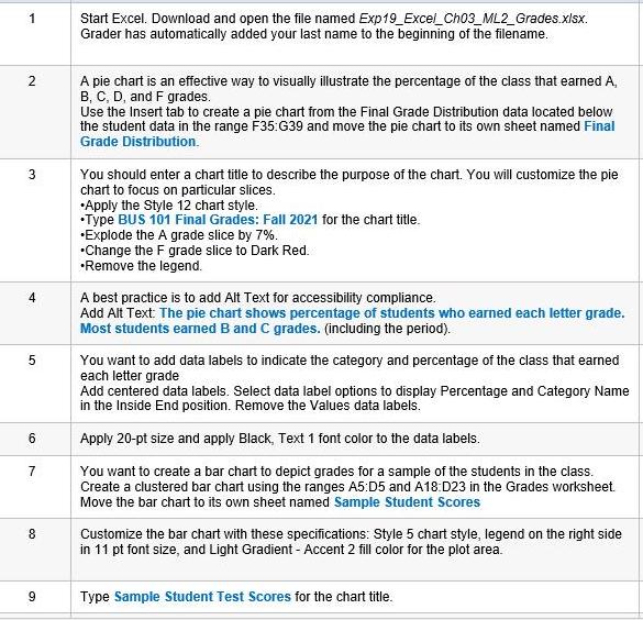
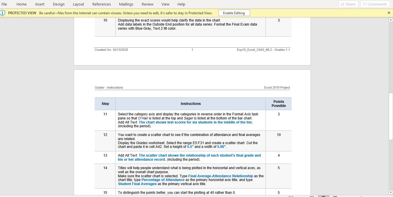
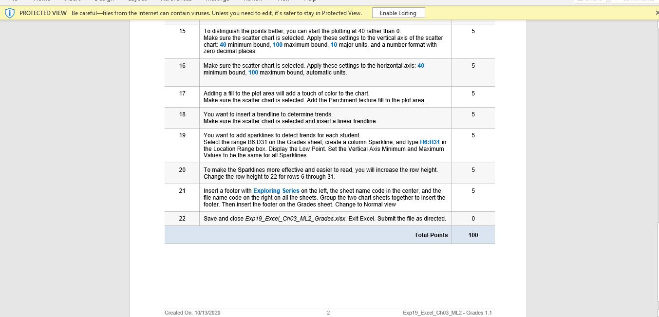
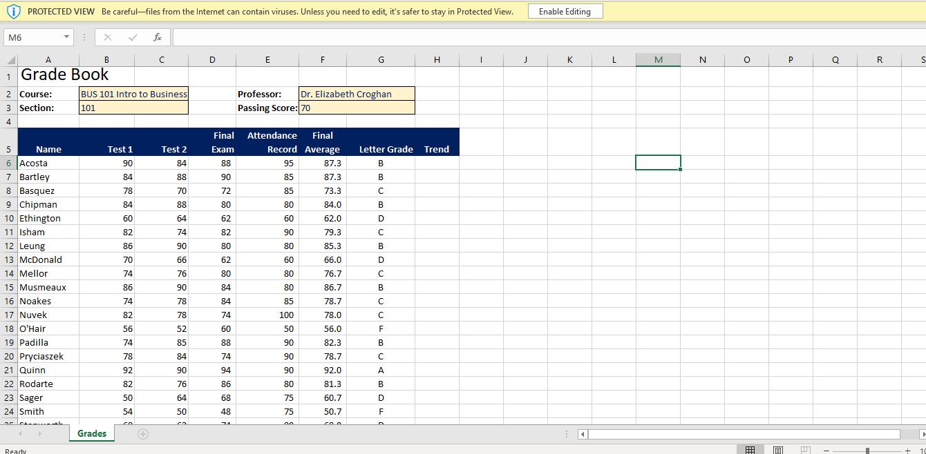
Start Excel. Download and open the file named Exp19_Excel_Ch03_ML2_Grades.xlsx. Grader has automatically added your last name...
Fantastic news! We've Found the answer you've been seeking!
Question:
Transcribed Image Text:
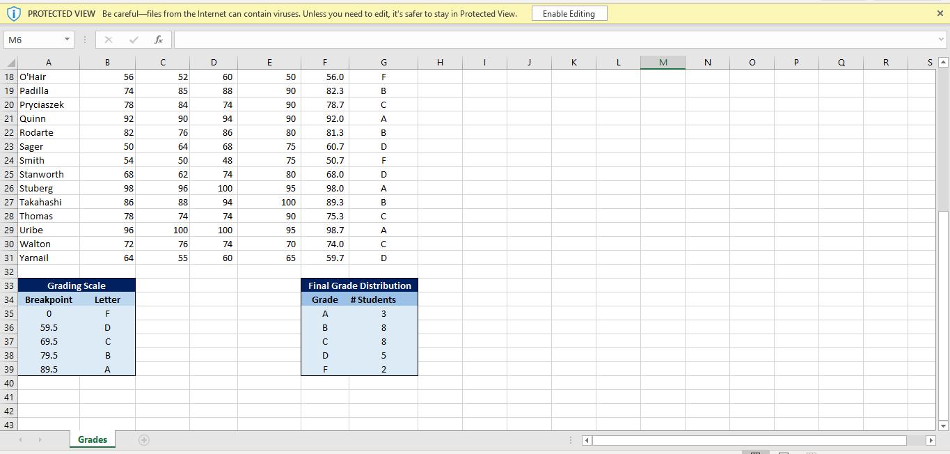
Start Excel. Download and open the file named Exp19_Excel_Ch03_ML2_Grades.xlsx. Grader has automatically added your last name to the beginning of the filename. 1 2 A pie chart is an effective way to visuall illustrate the percentage of the class that earned A, B, C, D, and F grades. Use the Insert tab to create a pie chart from the Final Grade Distribution data located below the student data in the range F35:G39 and move the pie chart to its own sheet named Final Grade Distribution. 3 You should enter a chart title to describe the purpose of the chart. You will customize the pie chart to focus on particular slices. •Apply the Style 12 chart style. •Type BUS 101 Final Grades: Fall 2021 for the chart title. •Explode the A grade slice by 7%. •Change the F grade slice to Dark Red. •Remove the legend. 4 A best practice is to add Alt Text for accessibility compliance. Add Alt Text: The pie chart shows percentage of students who earned each letter grade. Most students earned B and C grades. (including the period). You want to add data labels to indicate the category and percentage of the class that earned each letter grade Add centered data labels. Select data label options to display Percentage and Category Name in the Inside End position. Remove the Values data labels. Apply 20-pt size and apply Black, Text 1 font color to the data labels. You want to create a bar chart to depict grades for a sample of the students in the class. Create a clustered bar chart using the ranges A5:D5 and A18:D23 in the Grades worksheet. Move the bar chart to its own sheet named Sample Student Scores 7 8. Customize the bar chart with these specifications: Style 5 chart style, legend on the right side in 11 pt font size, and Light Gradient - Accent 2 fill color for the plot area. Type Sample Student Test Scores for the chart title. File Design Layout References Mailings Review View Help A Share P Comments Home Insert D PROTECTED VIEW Be careful-files from the Internet can contain viruses. Unless you need to edit, it's safer to stay in Protected View. Enable Editing 10 Displaying the exact scores would help clarify the data in the chart. Add data labels in the Outside End position for all data series. Format the Final Exam data series with Blue-Gray, Text 2 fill color. 3 Created On: 10/13/2020 Exp19_Excel_Ch03_ML2 - Grades 1.1 Grader - Instructions Excel 2019 Project Points Step Instructions Possible 11 Select the category axis and display the categories in reverse order in the Format Axis task pane so that O'Hair is listed at the top and Sager is listed at the bottom of the bar chart. Add Alt Text: The chart shows test scores for six students in the middle of the list. (including the period). 3 You want to create a scatter chart to see if the combination of attendance and final averages are related. Display the Grades worksheet. Select the range E5:F31 and create a scatter chart. Cut the chart and paste it in cell A42. Set a height of 5.5" and a width of 5.96". 12 10 13 Add Alt Text: The scatter chart shows the relationship of each student's final grade and his or her attendance record. (including the period). 4. 14 Titles will help people understand what is being plotted in the horizontal and vertical axes, as well as the overall chart purpose. Make sure the scatter chart is selected. Type Final Average-Attendance Relationship as the chart title, type Percentage of Attendance as the primary horizontal axis title, and type Student Final Averages as the primary vertical axis title. 15 To distinguish the points better, you can start the plotting at 40 rather than 0. 5 1) PROTECTED VIEW Be careful-files from the Internet can contain viruses. Unless you need to edit, it's safer to stay in Protected View. Enable Editing 15 To distinguish the points better, you can start the plotting at 40 rather than 0. Make sure the scatter chart is selected. Apply these settings to the vertical axis of the scatter chart: 40 minimum bound, 100 maximum bound, 10 major units, and a number format with zero decimal places. 16 Make sure the scatter chart is selected. Apply these settings to the horizontal axis: 40 minimum bound, 100 maximum bound, automatic units. 17 Adding a fill to the plot area will add a touch of color to the chart. Make sure the scatter chart is selected. Add the Parchment texture fill to the plot area. 18 You want to insert a trendline to determine trends Make sure the scatter chart is selected and insert a linear trendline. You want to add sparklines to detect trends for each student. Select the range B6:D31 on the Grades sheet, create a column Sparkline, and type H6:H31 in the Location Range box. Display the Low Point. Set the Vertical Axis Minimum and Maximum Values to be the same for all Sparklines. 19 5 20 To make the Sparklines more effective and easier to read, you will increase the row height. Change the row height to 22 for rows 6 through 31. 5 21 Insert a footer with Exploring Series on the left, the sheet name code in the center, and the file name code on the right on all the sheets. Group the two chart sheets together to insert the footer. Then insert the footer on the Grades sheet. Change to Normal view 5 22 Save and close Exp19_Excel_Ch03_ML2_Grades.xlsx. Exit Excel. Submit the file as directed. Total Points 100 Created On: 10/13/2020 Exp19_Excel_Ch03_ML2 - Grades 1.1 PROTECTED VIEW Be careful-files from the Internet can contain viruses. Unless you need to edit, it's safer to stay in Protected View. Enable Editing M6 fe A B D F G H K L. M N P Q R 1 Grade Book BUS 101 Intro to Business 101 2 Course: Professor: Dr. Elizabeth Croghan 3 Section: Passing Score: 70 4 Final Attendance Final 5 Name Test 1 Test 2 Exam Record Average Letter Grade Trend 6 Acosta 90 84 88 95 87.3 B 7 Bartley 8 Basquez 9 Chipman 10 Ethington 11 Isham 84 88 90 85 87.3 B 78 70 72 85 73.3 84 88 80 80 84.0 B 60 64 62 60 62.0 82 74 82 90 79.3 C 12 Leung 13 McDonald 14 Mellor 15 Musmeaux 86 90 80 80 85.3 B 70 66 62 60 66.0 D 74 76 80 80 76.7 86 90 84 80 86.7 B 16 Noakes 17 Nuvek 18 O'Hair 19 Padilla 20 Pryciaszek 74 78 84 85 78.7 82 78 74 100 78.0 56 52 60 50 56.0 F 74 85 88 90 82.3 B 78 84 74 90 78.7 21 Quinn 92 90 94 90 92.0 A 22 Rodarte 82 76 86 80 81.3 B 23 Sager 50 64 68 75 60.7 D 24 Smith 54 50 48 75 50.7 ar le coo Grades Ready 囲 10 i) PROTECTED VIEW Be careful-files from the Internet can contain viruses. Unless you need to edit, it's safer to stay in Protected View. Enable Editing M6 fe A. B D E F G K N P. R 18 O'Hair 56 52 60 50 56.0 F 19 Padilla 74 85 88 90 82.3 B 20 Pryciaszek 21 Quinn 22 Rodarte 78 84 74 90 78.7 92 90 94 90 92.0 A 82 76 86 80 81.3 B 23 Sager 24 Smith 25 Stanworth 26 Stuberg 27 Takahashi 50 64 68 75 60.7 54 50 48 75 50.7 68 62 74 80 68.0 D 98 96 100 95 98.0 A 86 88 94 100 89.3 28 Thomas 78 74 74 90 75.3 29 Uribe 96 100 100 95 98.7 A 30 Walton 31 Yarnail 72 76 74 70 74.0 64 55 60 65 59.7 D 32 33 Grading Scale Final Grade Distribution 34 Breakpoint Letter Grade # Students 35 F A 3 36 59.5 D B 8. 37 69.5 8 38 79.5 B D 39 89.5 A 2. 40 41 42 43 Grades Start Excel. Download and open the file named Exp19_Excel_Ch03_ML2_Grades.xlsx. Grader has automatically added your last name to the beginning of the filename. 1 2 A pie chart is an effective way to visuall illustrate the percentage of the class that earned A, B, C, D, and F grades. Use the Insert tab to create a pie chart from the Final Grade Distribution data located below the student data in the range F35:G39 and move the pie chart to its own sheet named Final Grade Distribution. 3 You should enter a chart title to describe the purpose of the chart. You will customize the pie chart to focus on particular slices. •Apply the Style 12 chart style. •Type BUS 101 Final Grades: Fall 2021 for the chart title. •Explode the A grade slice by 7%. •Change the F grade slice to Dark Red. •Remove the legend. 4 A best practice is to add Alt Text for accessibility compliance. Add Alt Text: The pie chart shows percentage of students who earned each letter grade. Most students earned B and C grades. (including the period). You want to add data labels to indicate the category and percentage of the class that earned each letter grade Add centered data labels. Select data label options to display Percentage and Category Name in the Inside End position. Remove the Values data labels. Apply 20-pt size and apply Black, Text 1 font color to the data labels. You want to create a bar chart to depict grades for a sample of the students in the class. Create a clustered bar chart using the ranges A5:D5 and A18:D23 in the Grades worksheet. Move the bar chart to its own sheet named Sample Student Scores 7 8. Customize the bar chart with these specifications: Style 5 chart style, legend on the right side in 11 pt font size, and Light Gradient - Accent 2 fill color for the plot area. Type Sample Student Test Scores for the chart title. File Design Layout References Mailings Review View Help A Share P Comments Home Insert D PROTECTED VIEW Be careful-files from the Internet can contain viruses. Unless you need to edit, it's safer to stay in Protected View. Enable Editing 10 Displaying the exact scores would help clarify the data in the chart. Add data labels in the Outside End position for all data series. Format the Final Exam data series with Blue-Gray, Text 2 fill color. 3 Created On: 10/13/2020 Exp19_Excel_Ch03_ML2 - Grades 1.1 Grader - Instructions Excel 2019 Project Points Step Instructions Possible 11 Select the category axis and display the categories in reverse order in the Format Axis task pane so that O'Hair is listed at the top and Sager is listed at the bottom of the bar chart. Add Alt Text: The chart shows test scores for six students in the middle of the list. (including the period). 3 You want to create a scatter chart to see if the combination of attendance and final averages are related. Display the Grades worksheet. Select the range E5:F31 and create a scatter chart. Cut the chart and paste it in cell A42. Set a height of 5.5" and a width of 5.96". 12 10 13 Add Alt Text: The scatter chart shows the relationship of each student's final grade and his or her attendance record. (including the period). 4. 14 Titles will help people understand what is being plotted in the horizontal and vertical axes, as well as the overall chart purpose. Make sure the scatter chart is selected. Type Final Average-Attendance Relationship as the chart title, type Percentage of Attendance as the primary horizontal axis title, and type Student Final Averages as the primary vertical axis title. 15 To distinguish the points better, you can start the plotting at 40 rather than 0. 5 1) PROTECTED VIEW Be careful-files from the Internet can contain viruses. Unless you need to edit, it's safer to stay in Protected View. Enable Editing 15 To distinguish the points better, you can start the plotting at 40 rather than 0. Make sure the scatter chart is selected. Apply these settings to the vertical axis of the scatter chart: 40 minimum bound, 100 maximum bound, 10 major units, and a number format with zero decimal places. 16 Make sure the scatter chart is selected. Apply these settings to the horizontal axis: 40 minimum bound, 100 maximum bound, automatic units. 17 Adding a fill to the plot area will add a touch of color to the chart. Make sure the scatter chart is selected. Add the Parchment texture fill to the plot area. 18 You want to insert a trendline to determine trends Make sure the scatter chart is selected and insert a linear trendline. You want to add sparklines to detect trends for each student. Select the range B6:D31 on the Grades sheet, create a column Sparkline, and type H6:H31 in the Location Range box. Display the Low Point. Set the Vertical Axis Minimum and Maximum Values to be the same for all Sparklines. 19 5 20 To make the Sparklines more effective and easier to read, you will increase the row height. Change the row height to 22 for rows 6 through 31. 5 21 Insert a footer with Exploring Series on the left, the sheet name code in the center, and the file name code on the right on all the sheets. Group the two chart sheets together to insert the footer. Then insert the footer on the Grades sheet. Change to Normal view 5 22 Save and close Exp19_Excel_Ch03_ML2_Grades.xlsx. Exit Excel. Submit the file as directed. Total Points 100 Created On: 10/13/2020 Exp19_Excel_Ch03_ML2 - Grades 1.1 PROTECTED VIEW Be careful-files from the Internet can contain viruses. Unless you need to edit, it's safer to stay in Protected View. Enable Editing M6 fe A B D F G H K L. M N P Q R 1 Grade Book BUS 101 Intro to Business 101 2 Course: Professor: Dr. Elizabeth Croghan 3 Section: Passing Score: 70 4 Final Attendance Final 5 Name Test 1 Test 2 Exam Record Average Letter Grade Trend 6 Acosta 90 84 88 95 87.3 B 7 Bartley 8 Basquez 9 Chipman 10 Ethington 11 Isham 84 88 90 85 87.3 B 78 70 72 85 73.3 84 88 80 80 84.0 B 60 64 62 60 62.0 82 74 82 90 79.3 C 12 Leung 13 McDonald 14 Mellor 15 Musmeaux 86 90 80 80 85.3 B 70 66 62 60 66.0 D 74 76 80 80 76.7 86 90 84 80 86.7 B 16 Noakes 17 Nuvek 18 O'Hair 19 Padilla 20 Pryciaszek 74 78 84 85 78.7 82 78 74 100 78.0 56 52 60 50 56.0 F 74 85 88 90 82.3 B 78 84 74 90 78.7 21 Quinn 92 90 94 90 92.0 A 22 Rodarte 82 76 86 80 81.3 B 23 Sager 50 64 68 75 60.7 D 24 Smith 54 50 48 75 50.7 ar le coo Grades Ready 囲 10 i) PROTECTED VIEW Be careful-files from the Internet can contain viruses. Unless you need to edit, it's safer to stay in Protected View. Enable Editing M6 fe A. B D E F G K N P. R 18 O'Hair 56 52 60 50 56.0 F 19 Padilla 74 85 88 90 82.3 B 20 Pryciaszek 21 Quinn 22 Rodarte 78 84 74 90 78.7 92 90 94 90 92.0 A 82 76 86 80 81.3 B 23 Sager 24 Smith 25 Stanworth 26 Stuberg 27 Takahashi 50 64 68 75 60.7 54 50 48 75 50.7 68 62 74 80 68.0 D 98 96 100 95 98.0 A 86 88 94 100 89.3 28 Thomas 78 74 74 90 75.3 29 Uribe 96 100 100 95 98.7 A 30 Walton 31 Yarnail 72 76 74 70 74.0 64 55 60 65 59.7 D 32 33 Grading Scale Final Grade Distribution 34 Breakpoint Letter Grade # Students 35 F A 3 36 59.5 D B 8. 37 69.5 8 38 79.5 B D 39 89.5 A 2. 40 41 42 43 Grades
Expert Answer:
Answer rating: 100% (QA)
Task 1 Go to the File menu Click on save as Enter the file name and location Task 2 Select the cell F35G39 Go to Insert Tab From the chart section sel... View the full answer

Related Book For 

Posted Date:
Students also viewed these biology questions
-
You cannot edit a protected Wikipedia entry unless you are an administrator. Express your answer in terms of e: "You can edit a protected Wikipedia entry" and a: "You are an administrator."
-
A certain dosage of radiation, measured in kilorads, must be given to the tumor near the brain. The dose delivered must be sufficient to kill the malignant cells but the aggregate dose must not...
-
A pure sample of solid benzoic acid (CzH6O2) weighing 1.221 g was placed in a constant-volume bomb calorimeter and burned in an oxygen atmosphere. The temperature rose from 25.240 C to 31.668 C. The...
-
Ilana Mathers, CPA, was hired by Interactive Computer Installations to prepare its financial statements for March 2017. Using all the ledger balances in the owner's records, Ilana put together the...
-
Redraw Figure 9-4 (a) for a perfect competitor. Why is dd horizontal? Explain why the horizontal dd curve coincides with MR Then proceed to find the profit-maximizing MR and MC intersection. Why does...
-
The velocity of a car is recorded at half-second intervals (in feet per second). Use the average of the left- and right-endpoint approximations to estimate the total distance traveled during the...
-
The document that identifies and explains all differences between the companys record of cash and the banks record of that cash is the a. bank reconciliation. b. bank collection. C. bank statement....
-
Juan Companys output for the current period was assigned a $ 150,000 standard direct materials cost. The direct materials variances included a $ 12,000 favorable price variance and a $ 2,000...
-
Auditor: Tom Flanagan Firm: Deloitte Client: Best Buy / Walgreens Issue: Insider trading What was the situation for this Auditor? What was the auditor s ethical situation? What Audit Standards...
-
Kalogridis Corp. manufactures industrial dye. The company is preparing its 2011 master budget and has presented you with the following information: a. The projected December 31, 2010, balance sheet...
-
aces An employee asks her boss whether she can transfer offices so that she can work in a different part of the country. The boss responds positively and says that the employee can choose to work in...
-
Watch the video explaining the four characteristics of services posted in this module 1. As you move into your future careers, how can a supervisor/manager overcome the challenges associated with:...
-
Igloo Inc. acquires Jagged Enterprises for $15 million in an acquisition reported as a merger. Jagged's recorded identifiable assets have a book value of $10 million and a fair value of $2 million....
-
What aspects of an organization's culture or structure could keep managers from leading effectively? Explain.
-
Your group is the newly formed "Service Excellence Committee" at Hillcrest Memorial Hospital. Over the past year, employee turnover has dramatically increased throughout the organization with no...
-
Examine the performance management and team management processes at "The Empowerment Plan" (TEP): Which aspects are currently well-designed to empower the employee? Which aspects can be improved to...
-
Assume that you are the database security analyst for the TECHTEC LLC. The employees are mostly working in shift basis. When 50% of the employees are working from home due to the covid-19 pandemic by...
-
Federated Shipping, a competing overnight delivery service, informs the customer in Problem 65 that they would ship the 5-pound package for $29.95 and the 20-pound package for $59.20. (A) If...
-
What determines domicile for an individual?
-
Point for Discussion: Because Bob had not been served or made aware of the order, should he be held accountable for violating the order by withdrawing the funds?
-
What is joint custody?
-
a. Indicate the scope of data and procedural controls, b. Describe the activities of a data control group.
-
a. What are documentation controls in an EDP department? b. Why is documentation important to management and the auditor? c. What items should be included in documentation for an EDP department?
-
a. Indicate the purpose of each of the three types of application controls, b. Identify the categories of controls pertaining to the conversion of data.

Study smarter with the SolutionInn App