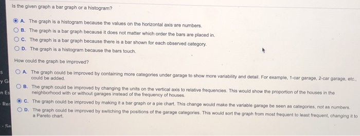
Accumulated depreciation represents the cash set aside to buy new assets Question Help The accompanying graph shows the distribution of data on whether houses in a large neighborhood have a garage. (A 1 indicates the house has a garage, and a 0 indicates it does not have a garage.) Is this a bar graph or a histogram? How could the graph be improved? Click to view the graph showing the data on garages 1-4L Is the given graph a bar graph or a histogram? A. The graph is a histogram because the values on the horizontal axis are numbers. O B. The graph is a bar graph because it does not matter which order the bars are placed in C. The graph is a bar graph because there is a bar shown for each observed category. O D. The graph is a histogram because the bars touch. How could the graph be improved? OA. The graph could be improved by containing more categories under garage to show more variability and detail. For example, 1-car garage, 2-car garage, etc., could be added S y G O B. The graph could be improved by changing the units on the vertical axis to relative frequencies. This would show the proportion of the houses in the neighborhood with or without garages instead of the frequency of houses. n Es C. The graph could be improved by making it a bar graph or a pie chart. This change would make the variable garage be seen as categories, not as numbers. O D. The graph could be improved by switching the positions of the garage categories. This would sort the graph from most frequent to least frequent, changing it to a Pareto chart Rer Sel Accumulated depreciation represents the cash set aside to buy new assets Question Help The accompanying graph shows the distribution of data on whether houses in a large neighborhood have a garage. (A 1 indicates the house has a garage, and a 0 indicates it does not have a garage.) Is this a bar graph or a histogram? How could the graph be improved? Click to view the graph showing the data on garages 1-4L Is the given graph a bar graph or a histogram? A. The graph is a histogram because the values on the horizontal axis are numbers. O B. The graph is a bar graph because it does not matter which order the bars are placed in C. The graph is a bar graph because there is a bar shown for each observed category. O D. The graph is a histogram because the bars touch. How could the graph be improved? OA. The graph could be improved by containing more categories under garage to show more variability and detail. For example, 1-car garage, 2-car garage, etc., could be added S y G O B. The graph could be improved by changing the units on the vertical axis to relative frequencies. This would show the proportion of the houses in the neighborhood with or without garages instead of the frequency of houses. n Es C. The graph could be improved by making it a bar graph or a pie chart. This change would make the variable garage be seen as categories, not as numbers. O D. The graph could be improved by switching the positions of the garage categories. This would sort the graph from most frequent to least frequent, changing it to a Pareto chart Rer Sel


