Question: Answer Questions in Handout 2-5 Resource needed for Handout Questions Included Below: Handout 2-5 Please respond to the following questions. 1. Please read page 95.
Answer Questions in Handout 2-5
Resource needed for Handout Questions Included Below:
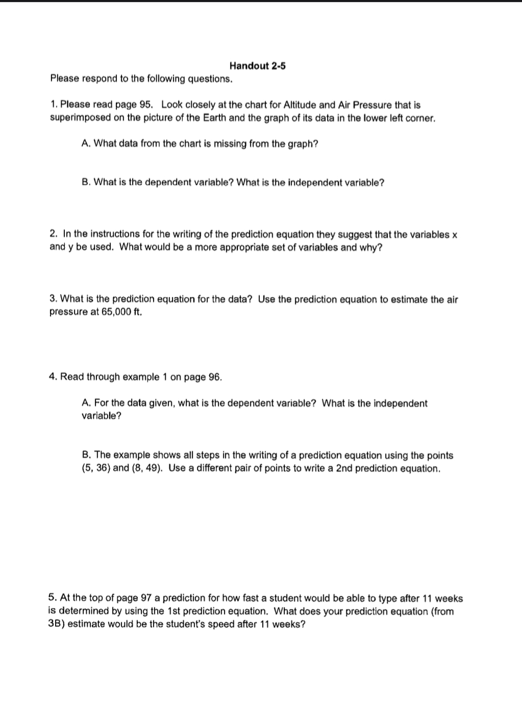
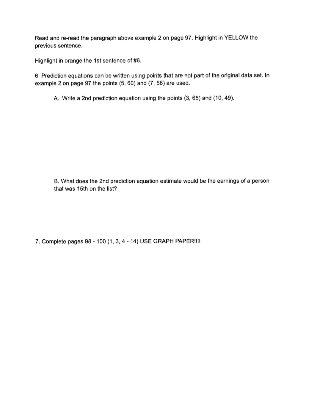
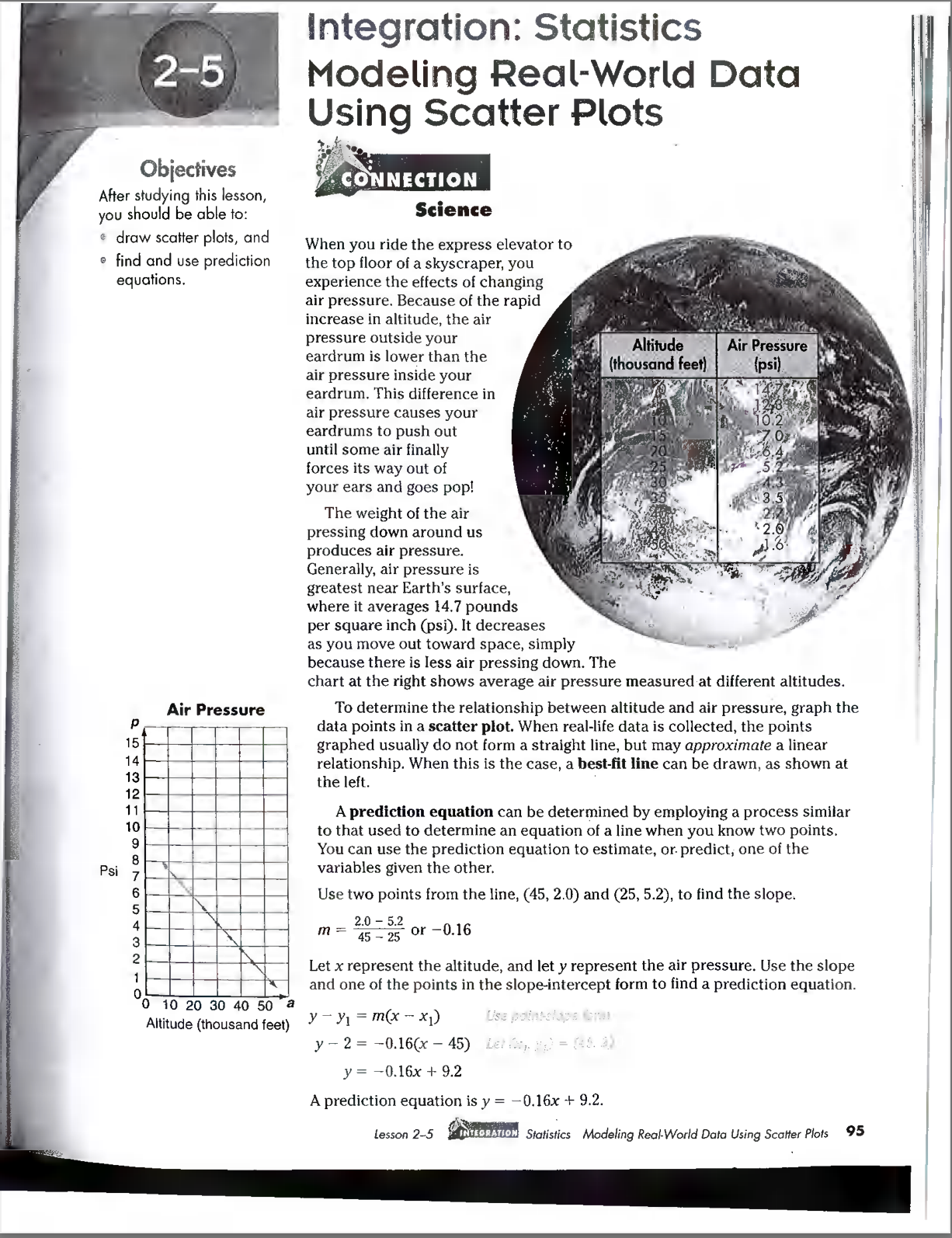
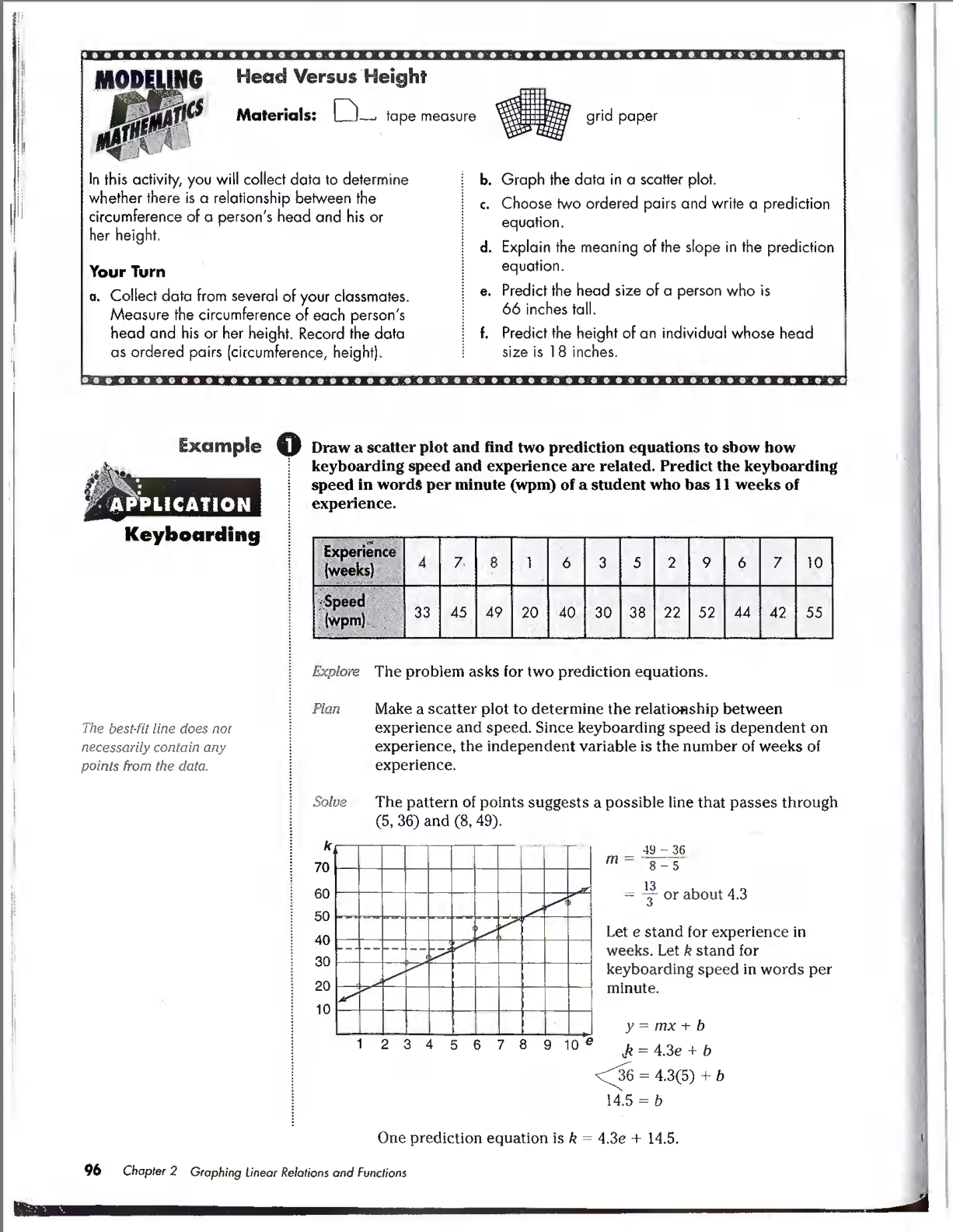
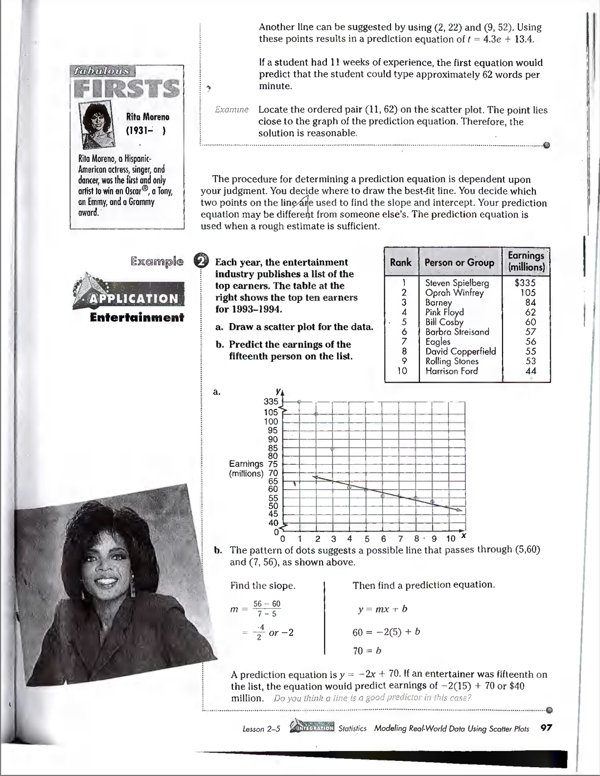
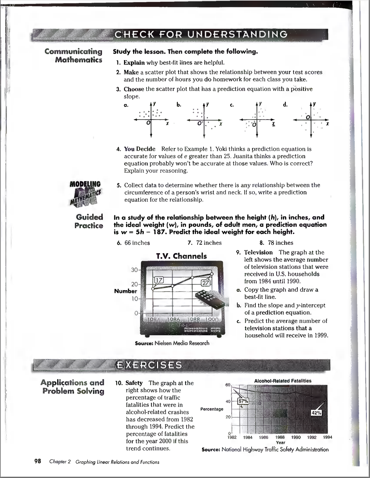
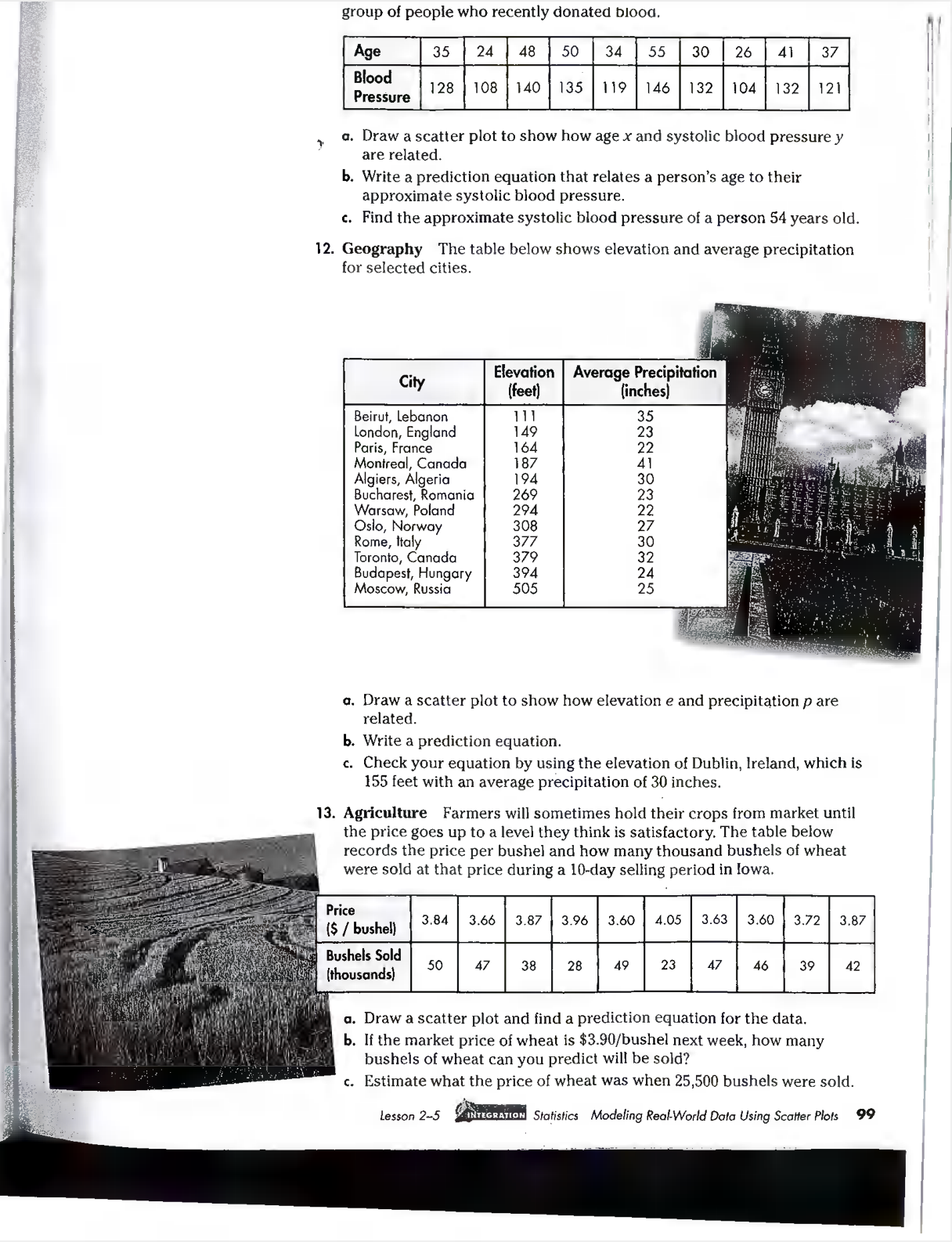
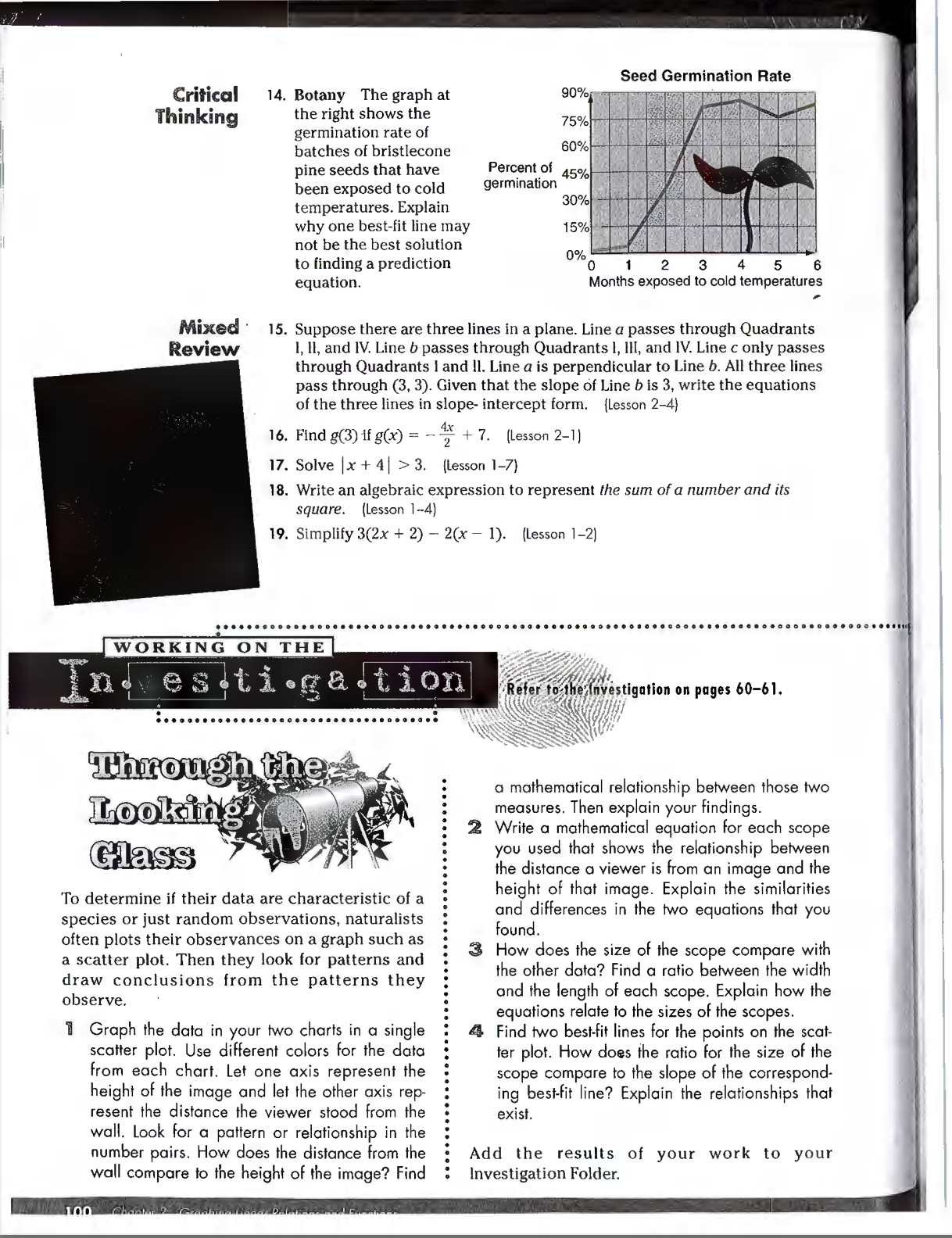
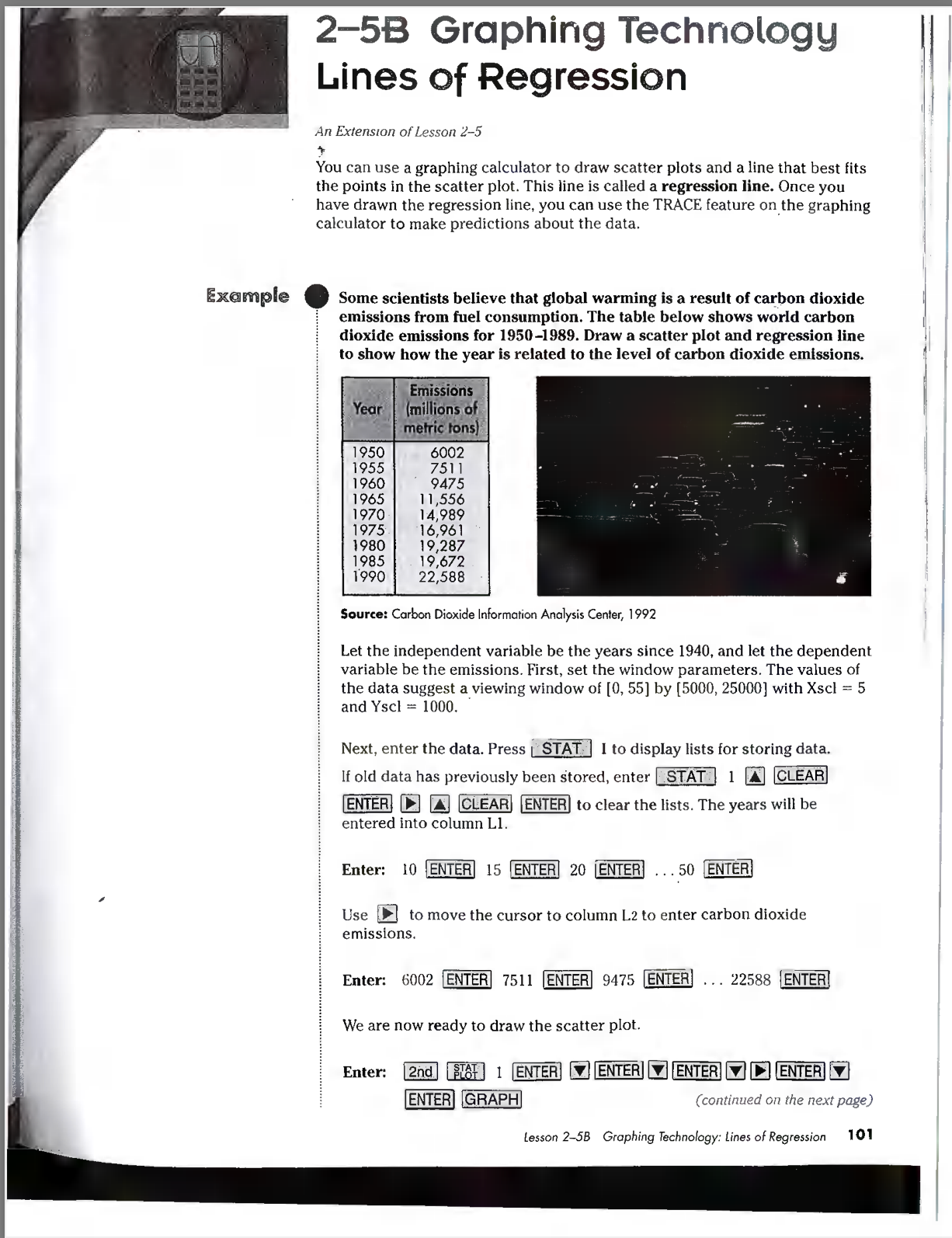
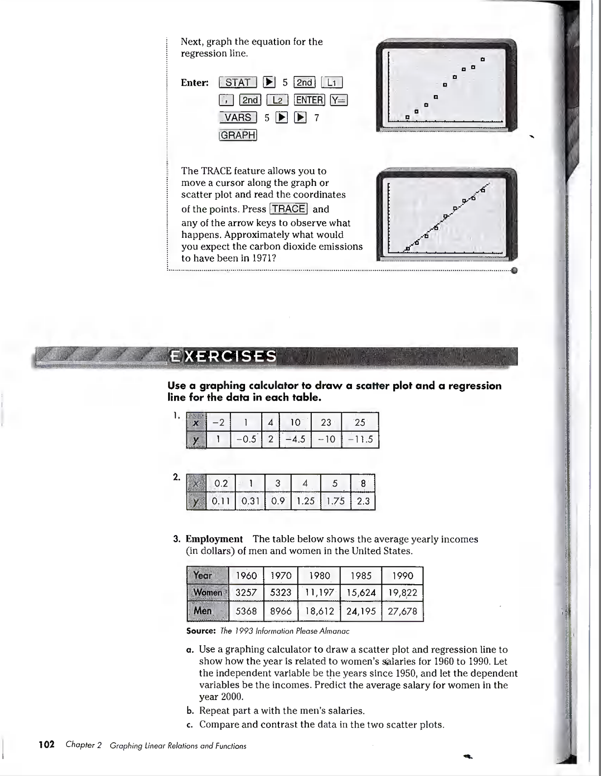
Handout 2-5 Please respond to the following questions. 1. Please read page 95. Look closely at the chart for Altitude and Air Pressure that is superimposed on the picture of the Earth and the graph of its data in the lower left corner. A. What data from the chart is missing from the graph? B. What is the dependent variable? What is the independent variable? 2. In the instructions for the writing of the prediction equation they suggest that the variables x and y be used. What would be a more appropriate set of variables and why? 3. What is the prediction equation for the data? Use the prediction equation to estimate the air pressure at 65,000 ft. 4. Read through example 1 on page 96. A. For the data given, what is the dependent variable? What is the independent variable? B. The example shows all steps in the writing of a prediction equation using the points (5, 36) and (8, 49). Use a different pair of points to write a 2nd prediction equation. 5. At the top of page 97 a prediction for how fast a student would be able to type after 11 weeks is determined by using the 1st prediction equation. What does your prediction equation (from 3B) estimate would be the student's speed after 11 weeks? Read and re-read the paragraph above example 2 on page 97. Highlight in YELLOW the previous sentence. Highlight in orange the 1st sentence of #6. 6. Prediction equations can be written using points that are not part of the original data set. In example 2 on page 97 the points (5, 60) and (7, 66) are used. A. Write a 2nd prediction equation using the points (3, 65) and (10, 49). B. What does the 2nd prediction equation estimate would be the earnings of a person that was 15th on the list? 7. Complete pages 98 - 100 (1, 3, 4 - 14} USE GRAPH PAPER!!!! Objectives After studying this lesson, you should be able to: draw scatter plois, and find and use prediction equations. O= NWHBOONO Air Pressure T 0 10 20 30 40 50 @ Altitude (thousand feet) Integration: Statistics Modeling Real-World Data When you ride the express elevator to the top floor of a skyscraper, you experience the effects of changing air pressure. Because of the rapid increase in altitude, the air pressure outside your eardrum is lower than the air pressure inside your eardrum. This difference in air pressure causes your eardrums to push out until some air finally forces its way out of your ears and goes pop! The weight of the air pressing down around us produces air pressure. Generally, air pressure is greatest near Earth's surface, where it averages 14.7 pounds per square inch (psi). It decreases as you move out toward space, simply because there is less air pressing down. The chart at the right shows average air pressure measured at different altitudes. To determine the relationship between altitude and air pressure, graph the data points in a scatter plot. When real-life data is collected, the points graphed usually do not form a straight line, but may approximate a linear relationship. When this is the case, a best-fit line can be drawn, as shown at the left. ' A prediction equation can be determined by employing a process similar to that used to determine an equation of a line when you know two points. You can use the prediction equation to estimate, or. predict, one of the variables given the other. Use two points from the line, (45, 2.0) and (25, 5.2), to find the slope. 20-52 45 a5 Of 0.16 m= Let x represent the altitude, and let y represent the air pressure. Use the slope and one of the points in the slope-intercept form to find a prediction equation. Y=y =mx - x) y 2= -0.16(x 45) y= 0.16x + 9.2 A prediction equation is y = 0.16x + 9.2, losson 2-5 SBUTIRIN Statistics Modeling Real-World Data Using Scalfer Plots 93 MODELING Head Versus Height MATHEMATICS Materials: )_ tape measure grid paper In this activity, you will collect data to determine b. Graph the data in a scatter plot. whether there is a relationship between the t. Choose two ordered pairs and write a prediction circumference of a person's head and his or equation. her height. d. Explain the meaning of the slope in the prediction Your Turn equation. a. Collect data from several of your classmates. . Predict the head size of a person who is Measure the circumference of each person's 66 inches tall. head and his or her height. Record the data f. Predict the height of an individual whose head as ordered pairs (circumference, height). size is 18 inches. Example 1 Draw a scatter plot and find two prediction equations to show how keyboarding speed and experience are related. Predict the keyboarding speed in words per minute (wpm) of a student who bas 11 weeks of APPLICATION experience. Keyboarding Experience 8 7 10 (weeks) Speed 33 45 49 20 40 30 38 22 (wpm) 52 44 1 42 1 55 Explore The problem asks for two prediction equations. Plan Make a scatter plot to determine the relationship between The best-fit line does not experience and speed. Since keyboarding speed is dependent on necessarily contain any experience, the independent variable is the number of weeks of points from the data. experience. Solve The pattern of points suggests a possible line that passes through (5, 36) and (8, 49). K 49 - 36 70 m =. 8 -5 60 13 3 or about 4.3 50 Let e stand for experience in weeks. Let k stand for keyboarding speed in words per minute. y = mx + b 1 2 3 4 5 6 7 8 9 10 e k = 4.3e + b 36 = 4.3(5) + b 14.5 = b One prediction equation is k = 4.3e + 14.5. 96 Chapter 2 Graphing Linear Relations and FunctionsAnother line can be suggested by using (2, 22) and (9, 52). Using these points results in a prediction equation of f = 4.3e + 13.4. If a student had 11 weeks of experience, the first equation would fabulous predict that the student could type approximately 62 words per FIRSTS minute. Examine Locate the ordered pair (11, 62) on the scatter plot. The point lies Rita Moreno close to the graph of the prediction equation. Therefore, the (1931- ) solution is reasonable. Rita Moreno, a Hispanic American actress, singer, and dancer, was the first and only The procedure for determining a prediction equation is dependent upon artist to win an Oscar, a Tony, your judgment. You decide where to draw the best-fit line. You decide which an Emmy, and a Grammy two points on the line are used to find the slope and intercept. Your prediction award. equation may be different from someone else's. The prediction equation is used when a rough estimate is sufficient. Example 2 Earnings Each year, the entertainment Rank Person or Group (millions) industry publishes a list of the top earners. The table at the Steven Spielberg $335 right shows the top ten earners Oprah Winfrey 105 APPLICATION Barney 84 for 1993-1994. Entertainment Pink Floyd 62 Bill Cosby 60 a. Draw a scatter plot for the data. DO0 VaLAWN- Barbra Streisand 57 b. Predict the earnings of the Eagles 56 55 fifteenth person on the list. David Copperfield Rolling Stones 53 Harrison Ford 44 a. 335 105 100 95 90 85 80 Earnings 75 (millions) 70 65 60 55 45 40 0 1 2 3 4 5 6 7 8 . 9 10 X b. The pattern of dots suggests a possible line that passes through (5,60) and (7, 56), as shown above. Find the siope. Then find a prediction equation. m = = 56 - 60 7 - 5 y = mx + b = 2 60 = -2(5) + b 70 = b A prediction equation is y = -2x + 70. If an entertainer was fifteenth on the list, the equation would predict earnings of -2(15) + 70 or $40 million. Do you think a line is a good predictor in this case? Lesson 2-5 ZackGRATION Statistics Modeling Real-World Data Using Scatter Plots 97(k0] e L ARSI e Communicating Study the lesson. Then complete the following. Mathematics 1. Explain why best-fit lines are helpful. 2. Make a scatter plot that shows the relationship between your test scores and the number of hours you do homework for each class you take. 3. Choose the scatter plot that has a prediction equation with a positive slope. 4. You Decide Refer to Example 1. Yoki thinks a prediction equation is accurate for values of e greater than 25. Juanita thinks a prediction equation probably won't be accurate at those values. Who is correct? Explain your reasoning. 5. Collect data to determine whether there is any reiationship between the circumference of a person's wrist and neck. If so, write a prediction equation for the relationship. Guided In a study of the relationship between the height (h), in inches, and Practice the ideal weight (w), in pounds, of adult men, a prediction equation is w = 5h 187. Predict the ideal weight for each height. 6. 66 inches 7. 72inches 8. 78 inches 9. Television The graph at the T.V. Channels left shows the average number : . of television stations that were received in U.S. households from 1984 until 1990. a. Copy the graph and draw a best-fit line. b. Find the slope and y-intercept of a prediction equation. s g . Predict the average number of KR television stations that a RT household will receive in 1999, Applications and 10. Safety The graph at the . Aloohol-Related Fatailties Problem SQIVing right shows how the g : percentage of traffic fatalities that were in alcohol-related crashes has decreased from 1982 through 1994. Predict the percentage of fatalities for the year 2000 if this trend continues. Percentage o LU i 1982 1984 1986 1888 1990 1992 1994 Year Source: Notional Highway Traffic Safety Administration 98 Chapler 2 Graphing Linear Relations and Functions group of people who recently donated blood. Age 35 24 48 50 34 55 30 26 41 37 Blood 128 108 140 135 119 146 132 104 132 121 Pressure a. Draw a scatter plot to show how age x and systolic blood pressure y are related. b. Write a prediction equation that relates a person's age to their approximate systolic blood pressure. c. Find the approximate systolic blood pressure of a person 54 years old. 12. Geography The table below shows elevation and average precipitation for selected cities. City Elevation Average Precipitation (feet) (inches) Beirut, Lebanon 111 35 London, England 149 23 Paris, France 164 22 Montreal, Canada 187 41 Algiers, Algeria 194 30 Bucharest, Romania 269 23 Warsaw, Poland 294 22 Oslo, Norway 308 27 Rome, Italy 377 30 Toronto, Canada 379 32 Budapest, Hungary 394 24 Moscow, Russia 505 25 a. Draw a scatter plot to show how elevation e and precipitation p are related. b. Write a prediction equation. c. Check your equation by using the elevation of Dublin, Ireland, which is 155 feet with an average precipitation of 30 inches. 13. Agriculture Farmers will sometimes hold their crops from market until the price goes up to a level they think is satisfactory. The table below records the price per bushel and how many thousand bushels of wheat were sold at that price during a 10-day selling period in lowa. Price 3.84 3.66 3.87 3.96 3.60 4.05 3.63 3.60 3.72 3.87 ($ / bushel) Bushels Sold 50 47 38 28 23 47 46 39 42 (thousands) a. Draw a scatter plot and find a prediction equation for the data. b. If the market price of wheat is $3.90/bushel next week, how many bushels of wheat can you predict will be sold? c. Estimate what the price of wheat was when 25,500 bushels were sold. Lesson 2-5 INTEGRATION Statistics Modeling Real-World Data Using Scatter Plots 99Seed Germination Rate Critical 14. Botany The graph at 90% Thinking the right shows the 75% germination rate of batches of bristlecone 60% pine seeds that have Percent of 45% been exposed to cold germination 30% temperatures. Explain why one best-fit line may 15% not be the best solution 0% to finding a prediction 1 2 3 4 5 6 equation. Months exposed to cold temperatures Mixed . 15. Suppose there are three lines in a plane. Line a passes through Quadrants Review 1, ll, and IV. Line b passes through Quadrants I, III, and IV. Line c only passes through Quadrants I and II. Line a is perpendicular to Line b. All three lines pass through (3, 3). Given that the slope of Line b is 3, write the equations of the three lines in slope- intercept form. (Lesson 2-4) 16. Find g(3) if g(x) = - *+ 2 + 7. (Lesson 2-1) 17. Solve (x + 4| > 3. (Lesson 1-7) 18. Write an algebraic expression to represent the sum of a number and its square. (Lesson 1-4) 19. Simplify 3(2x + 2) - 2(x - 1). (Lesson 1-2) WORKING ON THE Investigation Refer to the Investigation on pages 60-61. . . ........ Through thes a mathematical relationship between those two Looking measures. Then explain your findings. . . . ....... 2 Write a mathematical equation for each scope Glass you used that shows the relationship between the distance a viewer is from an image and the To determine if their data are characteristic of a height of that image. Explain the similarities species or just random observations, naturalists and differences in the two equations that you often plots their observances on a graph such as found. a scatter plot. Then they look for patterns and 3 How does the size of the scope compare with draw conclusions from the patterns they the other data? Find a ratio between the width observe. and the length of each scope. Explain how the equations relate to the sizes of the scopes. 1 Graph the data in your two charts in a single Find two best-fit lines for the points on the scat- scatter plot. Use different colors for the data ter plot. How does the ratio for the size of the from each chart. Let one axis represent the scope compare to the slope of the correspond- height of the image and let the other axis rep- ing best-fit line? Explain the relationships that resent the distance the viewer stood from the exist. wall. Look for a pattern or relationship in the number pairs. How does the distance from the Add the results of your work to your wall compare to the height of the image? Find Investigation Folder. 1002-58 Graphing Technology Lines of Regression An Extension of Lesson 2-5 * You can use a graphing calculator to draw scatter plots and a line that best fits the points in the scatter plot. This line is called a regression line. Once you have drawn the regression line, you can use the TRACE feature on the graphing calculator to make predictions about the data. Exa mple . Some scientists believe that global warming is a result of carbon dioxide . i emissions from fuel consumption. The table below shows world carbon | dioxide emissions for 1950-1989. Draw a scatter plot and regression line | to show how the year is related to the level of carbon dioxide emissions. 19 287 19,672 22,588 Seurce: Carbon Dioxide Information Analysis Center, 1992 Let the independent variable be the years since 1940, and let the dependent variable be the emissions. First, set the window parameters. The values of the data suggest a viewing window of [0, 55] by [5000, 25000] with Xscl =5 and Yscl = 1000, Next, enter the data. Press | STAT. | I to display lists for storing data. If old data has previously been stored, enter | STAT | 1 @ m ENTER] (] [A] ENTER| to clear the lists. The years will be entered into column L1. Enter: 10 {ENTER] 15 (ENTER] 20 [ENTER] . (ENTER] Use E to move the cursor to column L2 to enter carbon dioxide emissions. Enter: 6002 [ENTER] 7511 [ENTER] 9475 [ENIER] ... 22588 |ENTER] We are now ready to draw the scatter plot. Enter: (B8F) 1 (! [ENTER| (7] [ENTER] (@] [P) v} ENTER (continued on the next page) lesson 2-5B Graphing Technolagy: lines of Regression 101 Next, graph the equation for the regression line. Enter: STAT _ 5 2nd [ Li 2nd L2 ENTER Y= VARS 5 1 0 7 GRAPH The TRACE feature allows you to move a cursor along the graph or scatter plot and read the coordinates of the points. Press TRACE and any of the arrow keys to observe what happens. Approximately what would you expect the carbon dioxide emissions to have been in 1971? EXERCISES Use a graphing calculator to draw a scatter plot and a regression line for the data in each table. X -2 1 4 10 23 25 -0.5 2 -4.5 - 10 11.5 2. 0.2 3 4 5 8 0.11 0.31 0.9 1.25 1.75 2.3 3. Employment The table below shows the average yearly incomes (in dollars) of men and women in the United States Year 1960 1970 1980 1985 1990 Women 3257 5323 1 1,197 5,624 19,822 Men 5368 8966 18,612 24, 195 27,678 Source: The 1993 Information Please Almanac a. Use a graphing calculator to draw a scatter plot and regression line to show how the year is related to women's salaries for 1960 to 1990. Let the independent variable be the years since 1950, and let the dependent variables be the incomes. Predict the average salary for women in the year 2000. b. Repeat part a with the men's salaries. c. Compare and contrast the data in the two scatter plots. 102 Chapter 2 Graphing Linear Relations and Functions
Step by Step Solution
There are 3 Steps involved in it

Get step-by-step solutions from verified subject matter experts


