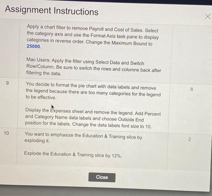
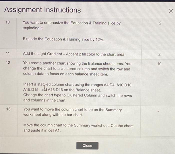
Assignment Instructions Apply a chart filter to remove Payroll and Cost of Sales. Select the category axis and use the Format Axis task pane to display categories in reverse order. Change the Maximum Bound to 25000. Mac Users: Apply the filter using Select Data and Switch Row/Column. Be sure to switch the rows and columns back after filtering the data. 9 You decide to format the pie chart with data labels and remove the legend because there are too many categories for the legend to be effective. 8 Display the Expenses sheet and remove the legend. Add Percent and Category Name data labels and choose Outside End position for the labels. Change the data labels font size to 10. You want to emphasize the Education & Training slice by exploding it. 10 2 Explode the Education & Training slice by 12%. Close Assignment Instructions X 10 2 You want to emphasize the Education & Training slice by exploding it. Explode the Education & Training slice by 12%. 11 2 12 Add the Light Gradient - Accent 2 fill color to the chart area. You create another chart showing the Balance sheet items. You change the chart to a clustered column and switch the row and column data to focus on each balance sheet item. 10 Insert a stacked column chart using the ranges A4:D4, A10:010, A15:015, arta A16:D 16 on the Balance sheet. Change the chart type to Clustered Column and switch the rows and columns in the chart. 13 You want to move the column chart to be on the Summary worksheet along with the bar chart. 5 Move the column chart to the Summary worksheet. Cut the chart and paste it in cell A1. Close Assignment Instructions Apply a chart filter to remove Payroll and Cost of Sales. Select the category axis and use the Format Axis task pane to display categories in reverse order. Change the Maximum Bound to 25000. Mac Users: Apply the filter using Select Data and Switch Row/Column. Be sure to switch the rows and columns back after filtering the data. 9 You decide to format the pie chart with data labels and remove the legend because there are too many categories for the legend to be effective. 8 Display the Expenses sheet and remove the legend. Add Percent and Category Name data labels and choose Outside End position for the labels. Change the data labels font size to 10. You want to emphasize the Education & Training slice by exploding it. 10 2 Explode the Education & Training slice by 12%. Close Assignment Instructions X 10 2 You want to emphasize the Education & Training slice by exploding it. Explode the Education & Training slice by 12%. 11 2 12 Add the Light Gradient - Accent 2 fill color to the chart area. You create another chart showing the Balance sheet items. You change the chart to a clustered column and switch the row and column data to focus on each balance sheet item. 10 Insert a stacked column chart using the ranges A4:D4, A10:010, A15:015, arta A16:D 16 on the Balance sheet. Change the chart type to Clustered Column and switch the rows and columns in the chart. 13 You want to move the column chart to be on the Summary worksheet along with the bar chart. 5 Move the column chart to the Summary worksheet. Cut the chart and paste it in cell A1. Close