| B-V | Absolute Magnitude |
| 1.35 | 9.9619 |
| 1.35 | 9.3502 |
| 1.391 | 9.1013 |
| 1.243 | 7.8032 |
| 1.333 | 8.1185 |
| 1.541 | 8.551 |
| 1.163 | 8.6824 |
| 1.097 | 8.753 |
| 1.219 | 8.794 |
| 1.414 | 8.8705 |
| 1.278 | 8.934 |
| 1.282 | 8.947 |
| 1.295 | 8.9506 |
| 1.429 | 9.0226 |
| 1.511 | 7.0973 |
| 1.212 | 8.0541 |
| 1.645 | 8.2833 |
| 1.418 | 8.456 |
| 1.598 | 8.7682 |
| 1.518 | 8.8064 |
| 1.284 | 9.0662 |
| 1.485 | 7.2662 |
| 1.298 | 7.8039 |
| 1.17 | 9.2368 |
| 1.351 | 7.1315 |
| 1.363 | 8.1779 |
| 1.527 | 8.3709 |
| 1.626 | 8.385 |
| 1.261 | 8.9 |
| 1.263 | 9.0069 |
| 1.113 | 8.321 |
| 1.425 | 7.1397 |
| 1.188 | 8.1782 |
| 1.453 | 6.891 |
| 1.313 | 7.3973 |
| 1.689 | 7.5972 |
| 1.437 | 8.0964 |
| 1.438 | 8.3536 |
| 1.484 | 8.6093 |
| 1.49 | 8.9608 |
| 1.411 | 7.9771 |
| 1.629 | 6.3544 |
| 1.563 | 7.8204 |
| 1.416 | 7.8779 |
| 1.551 | 7.977 |
| 1.327 | 6.9495 |
| 1.657 | 7.4021 |
| 1.436 | 7.4129 |
| 1.579 | 6.7884 |
| 1.574 | 7.5536 |
| 1.595 | 7.9554 |
| 1.411 | 8.0744 |
| 1.661 | 8.1341 |
| 1.847 | 7.7998 |
| 1.514 | 8.0545 |
| 1.435 | 7.3835 |
| 1.601 | 6.788 |
| 1.894 | 7.6075 |
| 1.699 | 7.7361 |
| 1.469 | 7.6241 |
| 1.521 | 8.7047 |
| 1.397 | 6.753 |
| 1.538 | 6.9006 |
| 1.463 | 6.4295 |
| 1.41 | 7.7796 |
| 1.472 | 6.6418 |
| 1.349 | 8.2261 |
| 1.326 | 6.6688 |
| 1.13 | 8.8403 |
| 1.309 | 6.1467 |
| 1.359 | 7.6288 |
| 1.376 | 7.9088 |
| 1.271 | 7.3263 |
| 1.216 | 6.971 |
| 1.128 | 7.0986 |
| 1.212 | 6.0249 |
| 1.172 | 6.3431 |
| 0.859 | 6.7499 |
| 1.152 | 6.3449 |
| 1.001 | 5.9978 |
| 0.988 | 5.0912 |
| 0.703 | 6.4279 |
| 0.998 | 6.0886 |
| 0.694 | 5.2585 |
| 0.657 | 5.0444 |
| 0.693 | 4.9825 |
| 0.577 | 5.1117 |
| 0.564 | 6.0187 |
| 0.588 | 4.3682 |
| 0.395 | 4.579 |
| 0.319 | 3.7373 |
| 0.288 | 1.7297 |
| 0.13 | 1.4945 |
| 0.12 | 0.9933 |
| 0.196 | 9.823 |
| 0.03 | 11.18 |
| 0.03 | 11.27 |
| 1.61 | 2.0699 |
| 1.44 | 0.75 |
| 1.23 | 0.1 |
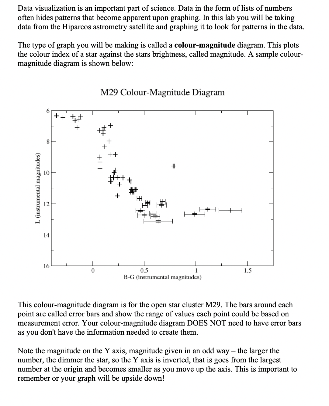
Data visualization is an important part of science. Data in the form of lists of numbers often hides patterns that become apparent upon graphing. In this lab you will be taking data from the Hiparcos astrometry satellite and graphing it to look for patterns in the data. The type of graph you will be making is called a colour-magnitude diagram. This plots the colour index of a star against the stars brightness, called magnitude. A sample colourmagnitude diagram is shown below: M29 Colour-Magnitude Diagram This colour-magnitude diagram is for the open star cluster M29. The bars around each point are called error bars and show the range of values each point could be based on measurement error. Your colour-magnitude diagram DOES NOT need to have error bars as you don't have the information needed to create them. Note the magnitude on the Y axis, magnitude given in an odd way - the larger the number, the dimmer the star, so the Y axis is inverted, that is goes from the largest number at the origin and becomes smaller as you move up the axis. This is important to remember or your graph will be upside down! A CSV (comma separated values) file is attached to the lab/assignment in D2L. This contains the data. The first column is the colour index information, labeled B-V (this stands for the two filters that were used to make the index). The second column is the magnitude information. Activity: The first thing to do is to create your graph. You can do this one of two ways. First you can use software such as a spreadsheet (e.g. Excel, LibreOffice Calc, etc) or other electronic graphing software to generate your graph. This is the recommended method, as it will take less time. Most spreadsheets and graphing software should be able to import the CSV file. The second method is to draw your graph manually on graph paper (a PDF of a sheet of graph paper is available on D2L as part of the Lab/Assignment folder). This will take a little longer to make the graph (about an hour). Make sure to read the marking rubric at the end of this lab/assignment to see what your graph will be marked on. For your axes you can simply use the labels "Colour Index" and "Magnitude" as appropriate. Analysis: For this lab your analysis is to tell, in a short paragraph or two, what patterns you see in your graph; specifically look for any points that seem to form lines or curves. Are there any points that don't fit into lines? What do you suppose the number of points in different parts means? What do you think the patterns mean? Please make sure you answer all the questions in your paragraph. Marking rubric Data visualization is an important part of science. Data in the form of lists of numbers often hides patterns that become apparent upon graphing. In this lab you will be taking data from the Hiparcos astrometry satellite and graphing it to look for patterns in the data. The type of graph you will be making is called a colour-magnitude diagram. This plots the colour index of a star against the stars brightness, called magnitude. A sample colourmagnitude diagram is shown below: M29 Colour-Magnitude Diagram This colour-magnitude diagram is for the open star cluster M29. The bars around each point are called error bars and show the range of values each point could be based on measurement error. Your colour-magnitude diagram DOES NOT need to have error bars as you don't have the information needed to create them. Note the magnitude on the Y axis, magnitude given in an odd way - the larger the number, the dimmer the star, so the Y axis is inverted, that is goes from the largest number at the origin and becomes smaller as you move up the axis. This is important to remember or your graph will be upside down! A CSV (comma separated values) file is attached to the lab/assignment in D2L. This contains the data. The first column is the colour index information, labeled B-V (this stands for the two filters that were used to make the index). The second column is the magnitude information. Activity: The first thing to do is to create your graph. You can do this one of two ways. First you can use software such as a spreadsheet (e.g. Excel, LibreOffice Calc, etc) or other electronic graphing software to generate your graph. This is the recommended method, as it will take less time. Most spreadsheets and graphing software should be able to import the CSV file. The second method is to draw your graph manually on graph paper (a PDF of a sheet of graph paper is available on D2L as part of the Lab/Assignment folder). This will take a little longer to make the graph (about an hour). Make sure to read the marking rubric at the end of this lab/assignment to see what your graph will be marked on. For your axes you can simply use the labels "Colour Index" and "Magnitude" as appropriate. Analysis: For this lab your analysis is to tell, in a short paragraph or two, what patterns you see in your graph; specifically look for any points that seem to form lines or curves. Are there any points that don't fit into lines? What do you suppose the number of points in different parts means? What do you think the patterns mean? Please make sure you answer all the questions in your paragraph. Marking rubric