Can someone please explain to me how I would do this problem on Excel (b), using the data entry tool on Excel? B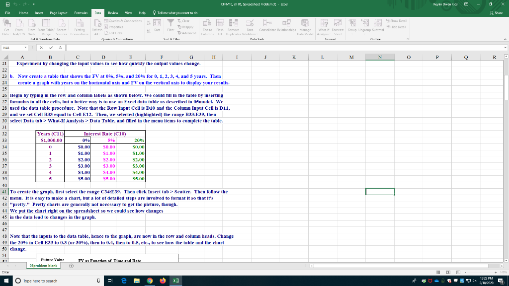 ecause I don't understand how is supposed to be done, your help will be greatly appreciated.
CHEMIC, ch 0 Spreadsheet Problem! - Excel Keyin Owen Rios - X Share File Home Int Page Layout Female Dots Besir Viru Help Time what you want in de Properties S Commtur To Advanced Dule TLCSW W Th Culum R S stranden Data isch Fil Duca e Manage Dale M Aldt Line Connen D Concelhe a Validation Data cah What Forest Group Ungroup Shorts Arish Shol Outline Sort N41 X A B C D E F G H I J K L M N O P Q R 21 Experiment by changing the input values to see how quickly the output values change. 23 b. Now create a table that shows the FV at 0%, 5%, and 20% for 0, 1, 2, 3, 4, and 5 years. Then 24 create a graph with years on the horizontal axis and FV on the vertical axis to display your results. 25 26 Begin by typing in the row and column labels as shown below. We could fill in the table by inserting 27 formulas in all the cells, but a better way is to use an Excel data table as described in 0smodel. We 28 used the data table procedure. Note that the Row Input Cell is D10 and the Column Input Cell is D11, 29 and we set Cell B33 equal to Cell E12. Then, we selected (highlighted) the range B33:E 39, then 30 select Data tab > What It Analysis Data Table, and filled in the menu items to complete the table. Years (C11) $1,000.00 Interest Rale (C10) 00 50 $0.00 $1.00 $2.00 $3.000 $4.00 $5.00 0.00 $1.00 S2.001 53.00 S4.00 $5.00 20% $0.00 $1.00 $2.00 53.00 $4.00 S5.00 38 39 40 41 To create the graph, first select the range C34:E.39. Then click Tusert tab > Scatter. Then follow the 42 menu. It is easy to make chart, but a lot of detailed steps are involved to format it so that it's 13 "pretty." Pretty charts are generally not necessary to get the picture, though. 44 We put the chart right on the spreadsheet so we could see how changes 45 in the data lead to changes in the graph. 46 18 Note that the inputs to the data table, hence to the graph, are now in the row and column heads. Change 49 the 20% in Cell E33 to 0.3 (or 30%), then to 0.4, then to 0.5, etc., to see how the table and the chart 50 change. Future Value Sproblem blank FY as Function of Time and Rate 12-23 PM - Type here to search CHEMIC, ch 0 Spreadsheet Problem! - Excel Keyin Owen Rios - X Share File Home Int Page Layout Female Dots Besir Viru Help Time what you want in de Properties S Commtur To Advanced Dule TLCSW W Th Culum R S stranden Data isch Fil Duca e Manage Dale M Aldt Line Connen D Concelhe a Validation Data cah What Forest Group Ungroup Shorts Arish Shol Outline Sort N41 X A B C D E F G H I J K L M N O P Q R 21 Experiment by changing the input values to see how quickly the output values change. 23 b. Now create a table that shows the FV at 0%, 5%, and 20% for 0, 1, 2, 3, 4, and 5 years. Then 24 create a graph with years on the horizontal axis and FV on the vertical axis to display your results. 25 26 Begin by typing in the row and column labels as shown below. We could fill in the table by inserting 27 formulas in all the cells, but a better way is to use an Excel data table as described in 0smodel. We 28 used the data table procedure. Note that the Row Input Cell is D10 and the Column Input Cell is D11, 29 and we set Cell B33 equal to Cell E12. Then, we selected (highlighted) the range B33:E 39, then 30 select Data tab > What It Analysis Data Table, and filled in the menu items to complete the table. Years (C11) $1,000.00 Interest Rale (C10) 00 50 $0.00 $1.00 $2.00 $3.000 $4.00 $5.00 0.00 $1.00 S2.001 53.00 S4.00 $5.00 20% $0.00 $1.00 $2.00 53.00 $4.00 S5.00 38 39 40 41 To create the graph, first select the range C34:E.39. Then click Tusert tab > Scatter. Then follow the 42 menu. It is easy to make chart, but a lot of detailed steps are involved to format it so that it's 13 "pretty." Pretty charts are generally not necessary to get the picture, though. 44 We put the chart right on the spreadsheet so we could see how changes 45 in the data lead to changes in the graph. 46 18 Note that the inputs to the data table, hence to the graph, are now in the row and column heads. Change 49 the 20% in Cell E33 to 0.3 (or 30%), then to 0.4, then to 0.5, etc., to see how the table and the chart 50 change. Future Value Sproblem blank FY as Function of Time and Rate 12-23 PM - Type here to search