Complete chapters 8 Path of Light Case Study instructions
Additionally, create a privacy policy page and link to it on each page in the footer section.
CHAPTER 8 INSTRUCTIONS BELOW
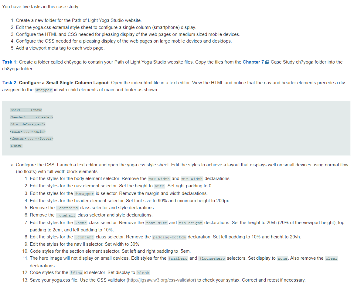
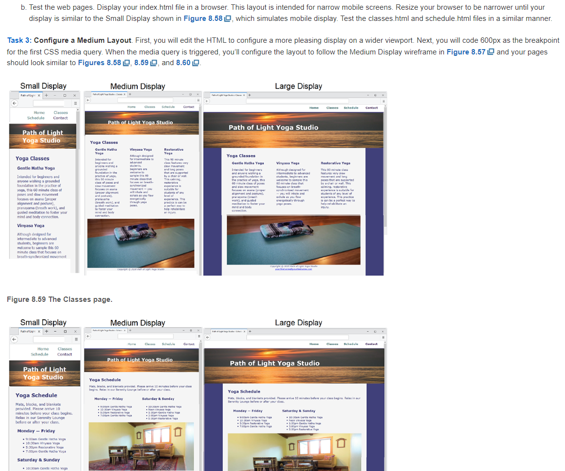
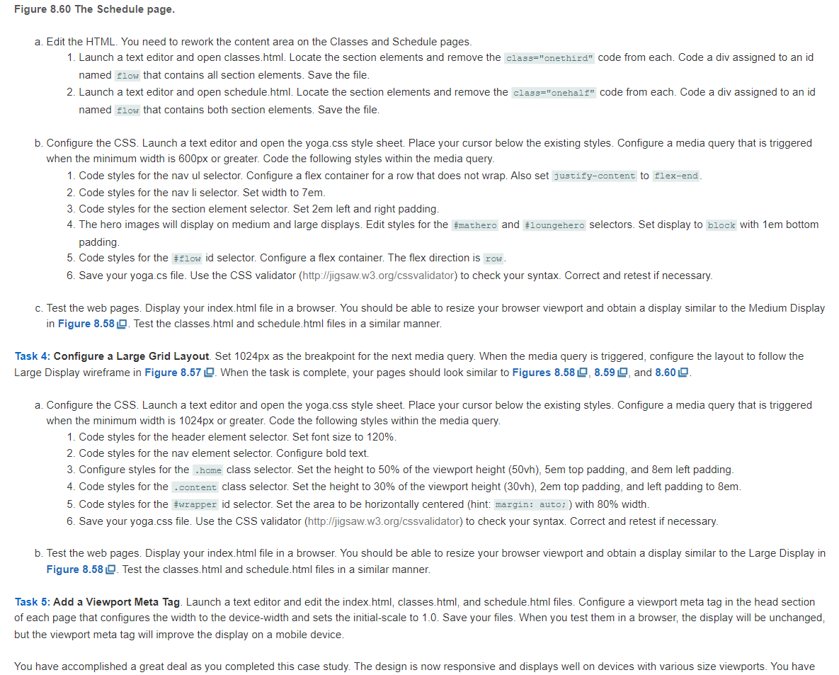
You have five tasks in this case study: 1. Create a new folder for the Path of Light Yoga Studio website. 2. Edit the yoga.css external style sheet to configure a single column (smartphone) display. 3. Configure the HTML and CSS needed for pleasing display of the web pages on medium sized mobile devices. 4. Configure the CSS needed for a pleasing display of the web pages on large mobile devices and desktops. 5. Add a viewport meta tag to each web page. Task 1: Create a folder called ch8yoga to contain your Path of Light Yoga Studio website files. Copy the files from the Chapter 7 Case Study ch7yoga folder into the ch8yoga folder. Task 2: Configure a Small Single-Column Layout. Open the index.html file in a text editor. View the HTML and notice that the nav and header elements precede a div assigned to the id with child elements of main and footer as shown. ... / header > main > ... footer> a. Configure the CSS. Launch a text editor and open the yoga.css style sheet. Edit the styles to achieve a layout that displays well on small devices using normal flow (no floats) with full-width block elements. 1. Edit the styles for the body element selector. Remove the and declarations. 2. Edit the styles for the nav element selector. Set the height to auto . Set right padding to 0 . 3. Edit the styles for the \#wrapper id selector. Remove the margin and width declarations. 4. Edit the styles for the header element selector. Set font size to 90% and minimum height to 200px. 5. Remove the class selector and style declarations. 6. Remove the .onehalf class selector and style declarations. 7. Edit the styles for the class selector. Remove the and min-height declarations. Set the height to 20vh (20\% of the viewport height), top padding to 2em, and left padding to 10%. 8. Edit the styles for the class selector. Remove the declaration. Set left padding to 10% and height to 20vh. 9. Edit the styles for the nav li selector. Set width to 30%. 10. Code styles for the section element selector. Set left and right padding to .5em. 11. The hero image will not display on small devices. Edit styles for the also remove the clear declarations. 12. Code styles for the \#flow id selector. Set display to block. 13. Save your yoga.css file. Use the CSS validator (http://jigsaw.w3.org/css-validator) to check your syntax. Correct and retest if necessary. b. Test the web pages. Display your index.html file in a browser. This layout is intended for narrow mobile screens. Resize your browser to be narrower until your display is similar to the Small Display shown in Figure 8.58 , which simulates mobile display. Test the classes.html and schedule.html files in a similar manner. Task 3: Configure a Medium Layout. First, you will edit the HTML to configure a more pleasing display on a wider viewport. Next, you will code 600 px as the breakpoint for the first CSS media query. When the media query is triggered, you'll configure the layout to follow the Medium Display wireframe in Figure 8.57 and your pages should look similar to Figures 8.58 , 8.59 and 8.60 . Figure 8.59 The Classes page. Figure 8.60 The Schede page a. Edit the HTML. You need to rework the content area on the Classes and Schedule pages. 1. Launch a text editor and open classes.html. Locate the section elements and remove the code from each. Code a div assigned to an id named that contains all section elements. Save the file. 2. Launch a text editor and open schedule.html. Locate the section elements and remove the code from each. Code a div assigned to an id named flow that contains both section elements. Save the file. b. Configure the CSS. Launch a text editor and open the yoga.css style sheet. Place your cursor below the existing styles. Configure a media query that is triggered when the minimum width is 600px or greater. Code the following styles within the media query. 1. Code styles for the nav ul selector. Configure a flex container for a row that does not wrap. Also set to 2. Code styles for the nav li selector. Set width to 7em. 3. Code styles for the section element selector. Set 2em left and right padding. 4. The hero images will display on medium and large displays. Edit styles for the and belectors. Set display to block with 1em bottom padding. 5. Code styles for the \#flow id selector. Configure a flex container. The flex direction is 6. Save your yoga.cs file. Use the CSS validator (http://jigsaw.w3.org/cssvalidator) to check your syntax. Correct and retest if necessary. c. Test the web pages. Display your index.html file in a browser. You should be able to resize your browser viewport and obtain a display similar to the Medium Display in Figure 8.58 . Test the classes.html and schedule.html files in a similar manner. Task 4: Configure a Large Grid Layout. Set 1024px as the breakpoint for the next media query. When the media query is triggered, configure the layout to follow the Large Display wireframe in Figure 8.57 When the task is complete, your pages should look similar to Figures 8.58 , 8.59 , and 8.60 a. Configure the CSS. Launch a text editor and open the yoga.css style sheet. Place your cursor below the existing styles. Configure a media query that is triggered when the minimum width is 1024px or greater. Code the following styles within the media query. 1. Code styles for the header element selector. Set font size to 120%. 2. Code styles for the nav element selector. Configure bold text. 3. Configure styles for the .home class selector. Set the height to 50% of the viewport height (50vh), 5em top padding, and 8em left padding. 4. Code styles for the .content class selector. Set the height to 30% of the viewport height (30vh), 2em top padding, and left padding to 8em. 5. Code styles for the \#wrapper id selector. Set the area to be horizontally centered (hint: with 80% width. 6. Save your yoga.css file. Use the CSS validator (http://jigsaw.w3.org/cssvalidator) to check your syntax. Correct and retest if necessary. b. Test the web pages. Display your index.html file in a browser. You should be able to resize your browser viewport and obtain a display similar to the Large Display in Test the classes.html and schedule.html files in a similar manner. Task 5: Add a Viewport Meta Tag. Launch a text editor and edit the index.html, classes.html, and schedule.html files. Configure a viewport meta tag in the head section of each page that configures the width to the device-width and sets the initial-scale to 1.0. Save your files. When you test them in a browser, the display will be unchanged, but the viewport meta tag will improve the display on a mobile device. You have accomplished a great deal as you completed this case study. The design is now responsive and displays well on devices with various size viewports. You have


