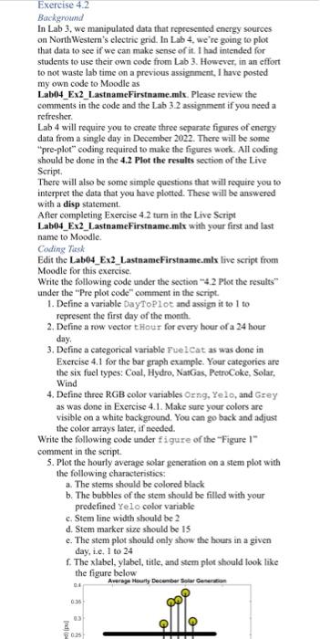
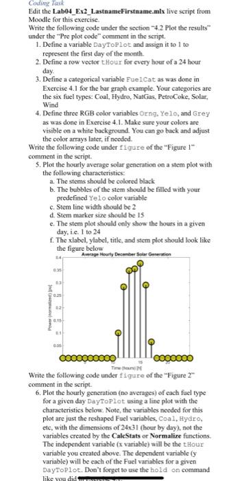
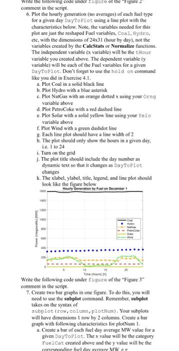
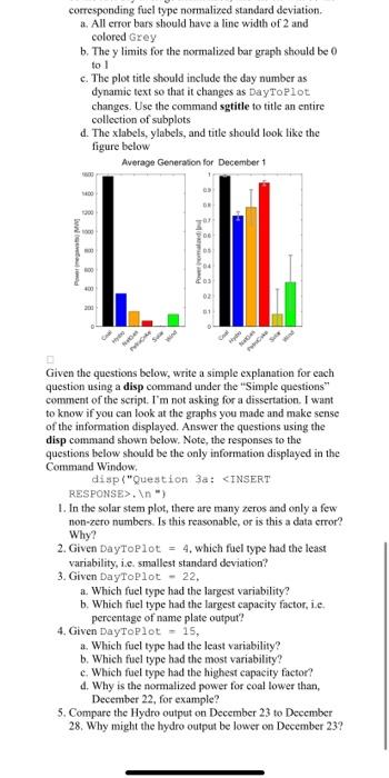
Exercise 4.2 Background In Lab 3, we manipulated data that represented enctgy sources on NorthWestern's electric grid. In Lab 4, we're going to plot that data to see if we can make sense of it. I had intended for students to use their own code from Lab 3. However, in an effort to not waste lab time on a previous assignment, I have posted my own code to Moodle as Lab04_Ex2_LastnameFirstname.mlx. Please review the comments in the code and the Lab 3.2 assignment if you need a refresher. Lab 4 will require you to create three separate figures of energy data from a single day in December 2022. There will be some "pre-plot" coding required to make the figures work. All coding should be done in the 4.2 Plot the results section of the Live Seript. There will also be some simple questions that will require you to interpret the data that you have plotted. These will be answered with a disp statement. After completing Exercise 4.2 tum in the Live Script Lab04_Ex2_LastnameFirstname.mlx with your first and last name to Moodle. Coding Tiask Edit the Lab04_Ex2_LastnameFirstname.mlx live script from Moodle for this exercise. Write the following code under the section "4.2 Plor the results" under the "Pre plot code" comment in the seript. 1. Define a variable DayToP1ot and assign it to 1 to represent the first day of the month. 2. Define a row veetor thour for every bour of a 24 hour day. 3. Define a categorical variable FuelCat as was done in Exercise 4.1 for the bar graph example. Your eategories are the six fuel types: Coal, Hydro, NatGas, PetroCoke, Solar, Wind 4. Define three RGB color variables Orng, Yelo, and Grey as was done in Exercise 4.1. Make sure your colors are visible on a white background. You can go back and adjust the color arrays later, if needed. Write the following code under f i gure of the "Figure 1" comment in the script. 5. Plot the hourly average solar generation on a stem plot with the following characteristics: a. The stems should be colored black b. The bubbles of the stem should be filled with your predefined Yelo color variable c. Stem line width should be 2 d. Stem marker size should be 15 e. The stem plot should only show the hours in a given day, i.e. 1 to 24 f. The xlabel, ylabel, title, and stem plot should look like the figure below the color arrays later, if needed. Write the following code under figure of the "Figure 1 " comment in the script. 5. Plot the hourly average solar generation on a stem plot with the following characteristics: a. The stems should be colored black b. The bubbles of the stem should be filled with your predefined Yelo color variable c. Stem line width should be 2 d. Stem marker size should be is e. The stem plot should caly show the hours in a given day, i.e. 1 to 24 f. The xlabel, ylabel, titic, and stem plot should look like the figure below Write the following code under figure of the "Figure 2" comment in the seript. 6. Plot the hourly generation (no averages) of each fuel type for a given day DayToPlot using a line plot with the characteristics below. Note, the variables needed for this plot are just the reshaped Fuel variables, Coal, Hydro, etc, with the dimensions of 2431 (hour by day), not the variables created by the CaleStats or Normalize functions. The independent variable ( x variable) will be the thour variable you created above. The dependent variable ( y variable) will be each of the Fuel variables for a given DayToplot. Don't forget to use the hold on command comment in the script. 6. Plot the hourly generation (no averages) of each fuel type for a given day DayToPLot using a line plot with the characteristics below. Note, the variables needed for this plot are just the reshaped Fuel variables, Coa.1, Hydro, etc, with the dimensions of 2431 (hour by day), not the variables created by the CaleStats or Normalize functions. The independent variable ( x variable) will be the tHour variable you created above. The dependent variable ( y variable) will be each of the Fuel variables for a given DayToplot. Don't forget to use the hold on command like you did in Exercise 4.1. a. Plot Coal in a solid black line b. Plot Hydro with a blue asterisk c. Plot NatGas with an orange dotted x using your Orng variable aboye d. Plot PetroCoke with a red dashed line e. Plot Solar with a solid yellow line using your Ye 10 variable above f. Plot Wind with a green dashdot line g. Each line plot should have a line width of 2 h. The plot should only show the hours in a given day, i.e. 1 to 24 i. Turn on the grid j. The plot title should include the day number as dynamic text so that it changes as DayTorlot changes k. The xlabel, ylabel, title, legend, and line plot should look like the figure below Write the following code under figure of the "Figure 3* comment in the seript. 7. Create two bar graphs in one figure. To do this, you will need to use the subplot command. Remember, subplot takes on the syntax of subplot (row, column, plotNum). Your subplots will have dimensions 1 row by 2 columns. Create a bar graph with following characteristics for plotNum 1. a. Create a bar of each fuel day average MW value for a given DayToPlot. The x value will be the category Fuelcat created above and the y value will be the Write the following code under figure of the "Figure 3" comment in the script. 7. Create two bar graphs in one figure. To do this, you will need to use the subplot command. Remember, subplot takes on the syntax of subplot (row, column, plotwum). Your subplots will have dimensions I row by 2 columns. Create a bar graph with following characteristics for plotNum 1. a. Create a bar of each fuel day average MW value for a given DayToplot. The x value will be the category Fue l Cat created above and the y value will be the corresponding fuel day average MW, e.g. C_NW_AvgD. b. Each fuel type should be colored the same as assigned above 8. Create a second bar graph for plotNum 2. This bar graph will the same as the first, except that the y value will be the fucl day average Normalized, c.g. C_Norm__. AvgD. Continue the same color seheme as we have been making above. 9. Use the errorbar command to add an error bar to each normalized fuel bar in the previous step. The x value will be the category Fuel Cat created above, the y value will be the fuel day average normalized, and the err will be the corresponding fuel type normaliced standard deviation. a. All error bars should have a line width of 2 and colored Grey b. The y limits for the nommalized bar graph should be to 1 c. The plot title should include the day number as dynamic text so that it changes as DayToPLot changes. Use the command sgtitle to title an entire collection of subplots d. The xlabels, ylabels, and title should look like the figure below Given the questions below, write a simple explanation for each question using a disp command under the "Simple questions" comment of the script. I'm not asking for a dissertation. I want to know if you can look at the graphs you made and make sense of the information displayed. Answer the questions using the disp command shown below. Note, the respenses to the corresponding fuel type normalized standard deviation. a. All error bars should bave a line width of 2 and colored Grey b. The y limits for the normalized bar graph should be 0 to 1 c. The plot title should include the day number as dynamic text so that it changes as DayToPlot changes. Use the command sgtitle to title an entire collection of subplots d. The xlabels, ylabels, and title should look like the figure below Given the questions below, write a simple explanation for each question using a disp command under the "Simple questions" comment of the script. I'm not asking for a dissertation. I want to know if you can look at the graphs you made and make sense of the information displayed. Answer the questions using the disp command shown below. Note, the responses to the questions below should be the only information displayed in the Command Window, disp("Question3atINSERT RESPONSE>. = ) 1. In the solar stem plot, there are many zeros and only a few non-zero numbers. Is this reasonable, or is this a data error? Why? 2. Given DayToPlot =4, which fuel type had the least variability, i.e. smallest standard deviation? 3. Given DayToplot =22, a. Which fuel type had the largest variability? b. Which fuel type had the largest capacity factor, ie. percentage of name plate output? 4. Given DayToplot = 15 , a. Which fuel type had the least variability? b. Which fuel type had the most variability? c. Which fuel type had the highest capacity factor? 4. Why is the normalized power for coal lower than, December 22 , for example? 5. Compare the Hydro output on December 23 to December 28. Why might the hydro output be lower on December 23