Question
Here is my current code, I need help visualizing my data using Python. ################################################### from matplotlib import pyplot as plt import pandas as pd import
Here is my current code, I need help visualizing my data using Python.
###################################################
from matplotlib import pyplot as plt
import pandas as pd
import numpy as np
#find the location of the data file uploaded
from google.colab import drive
drive.mount('/content/drive')
#create the location as a variable
datapath = '/content/helsinki-vantaa (1).txt'
#read the data in
data = pd.read_csv(datapath, delim_whitespace=True,
usecols=["DATE", "USAF", "TEMP_F", "TEMP_C", "REF_TEMP_C", "DIFF_C"],
parse_dates=['DATE'], index_col='DATE')
selection = data[data.index.to_series().between('1988-01-01', '2018-12-31')]
plt_1 = plt.figure(figsize=(6, 3))
###################################################
Here is my goal for the code.
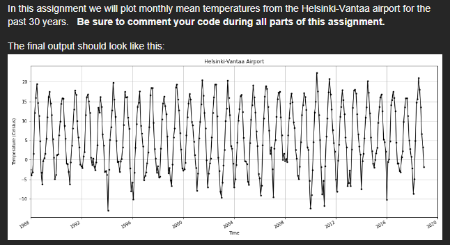
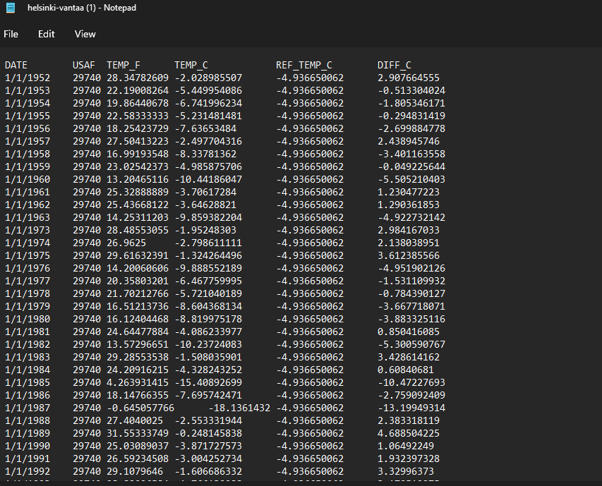
Here is what the source data looks like:
Step by Step Solution
There are 3 Steps involved in it
Step: 1

Get Instant Access to Expert-Tailored Solutions
See step-by-step solutions with expert insights and AI powered tools for academic success
Step: 2

Step: 3
Ace Your Homework with AI
Get the answers you need in no time with our AI-driven, step-by-step assistance
Get Started