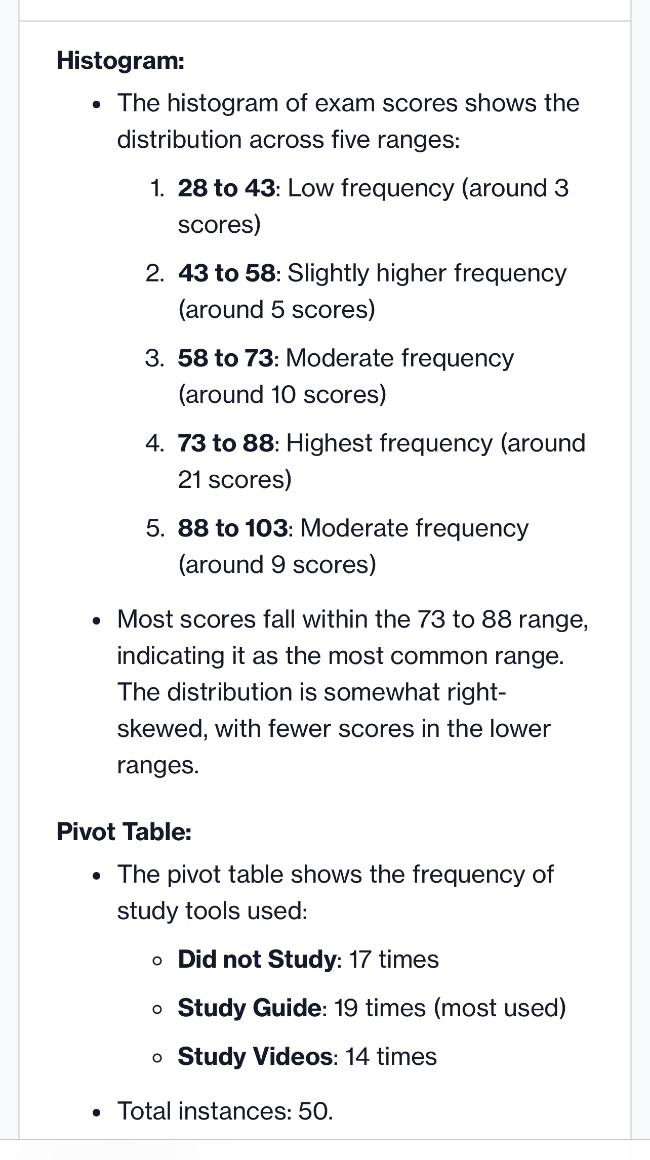
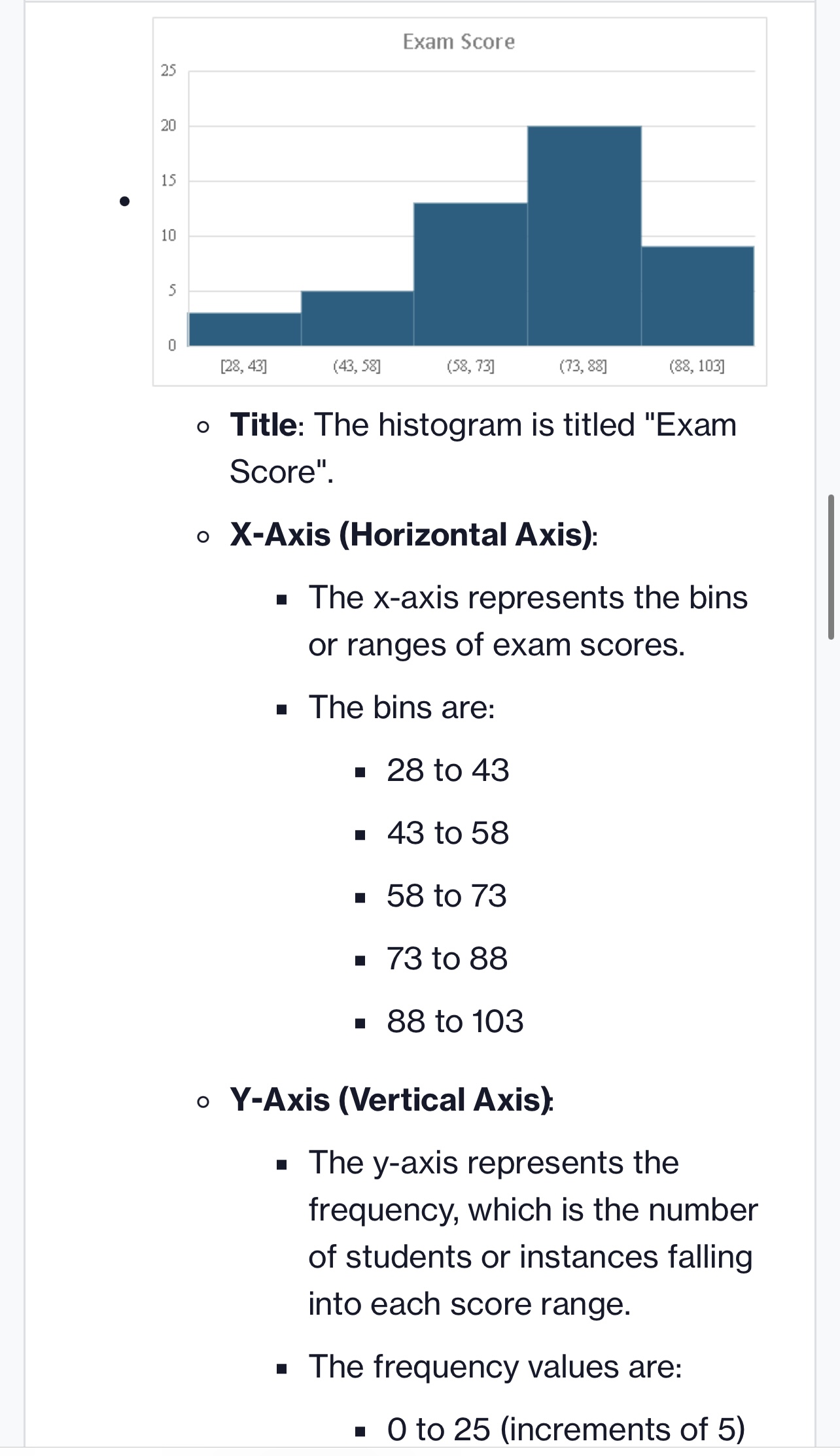
Histogram: e The histogram of exam scores shows the distribution across five ranges: 1. 28 to 43: Low frequency (around 3 scores) 2. 43 to
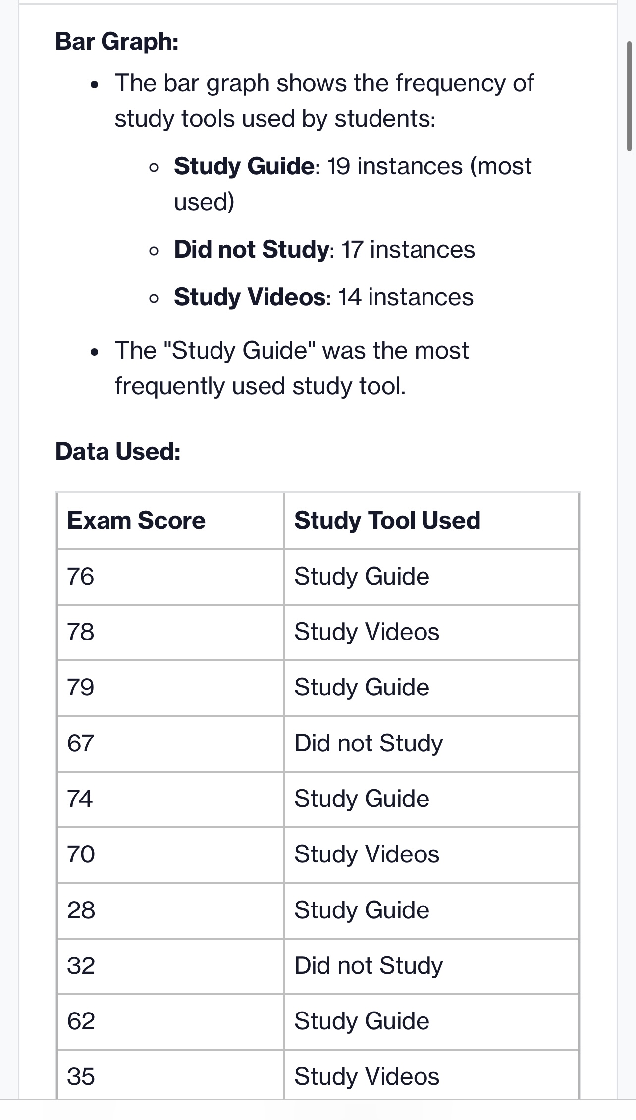
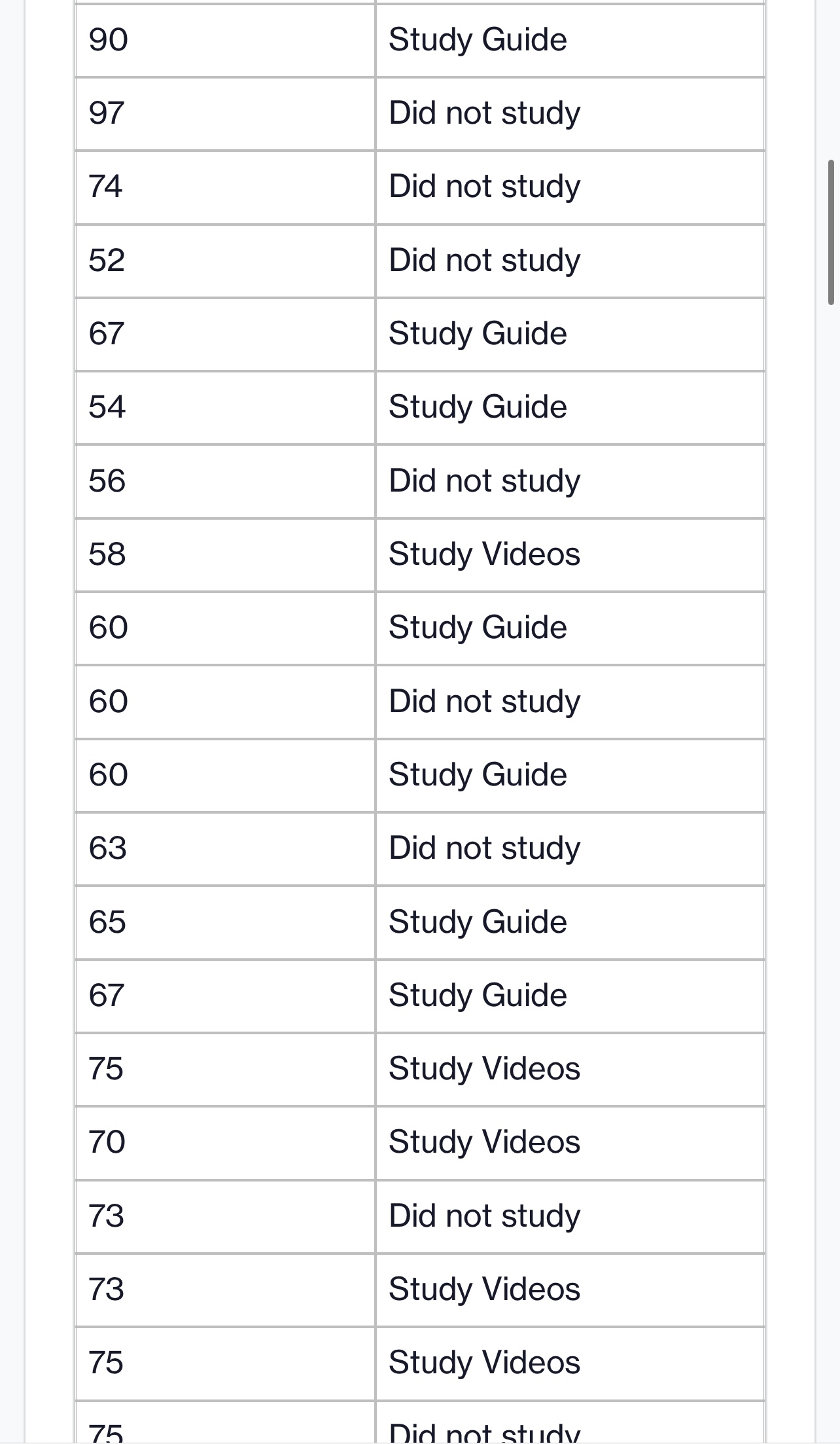
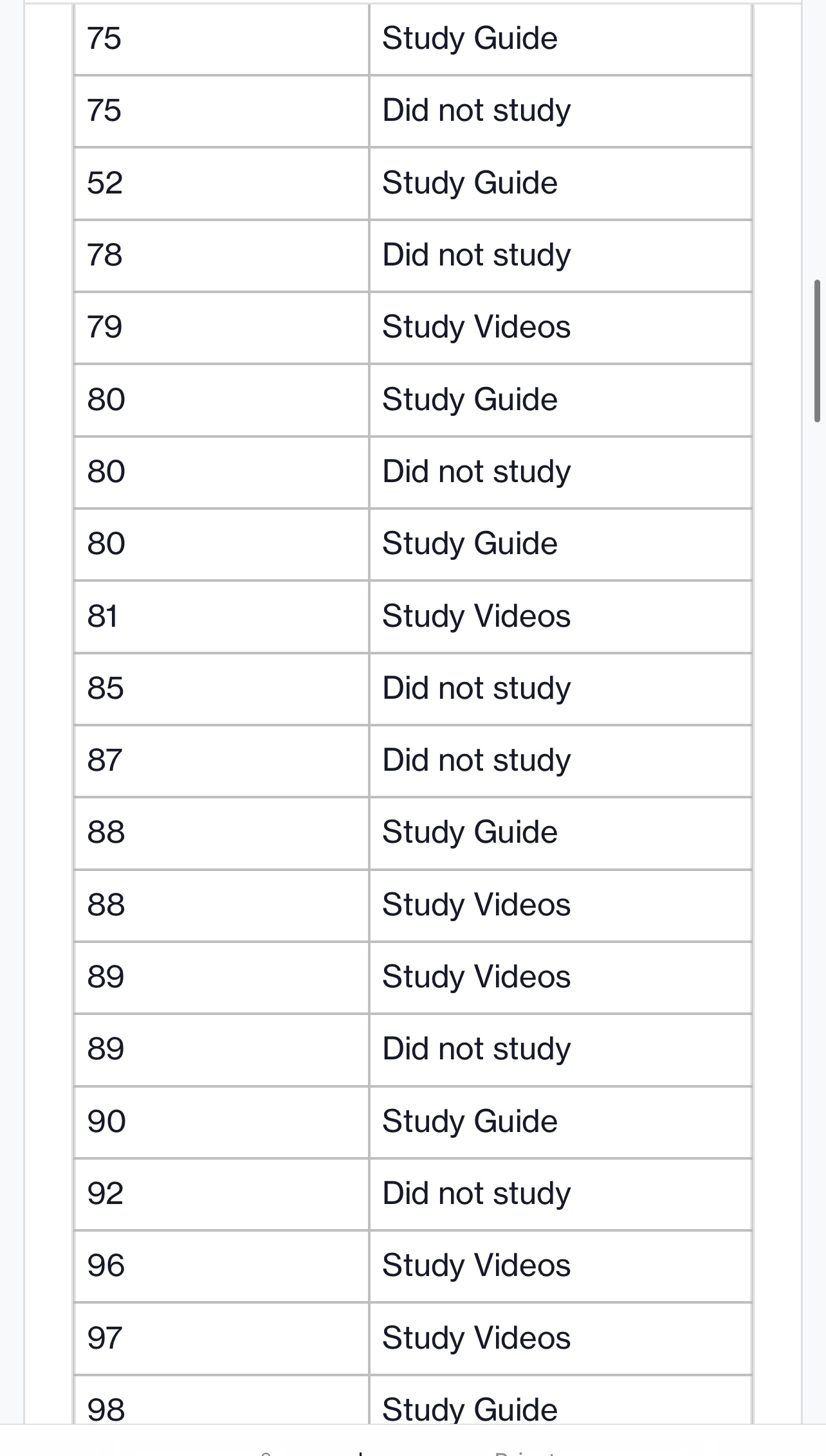
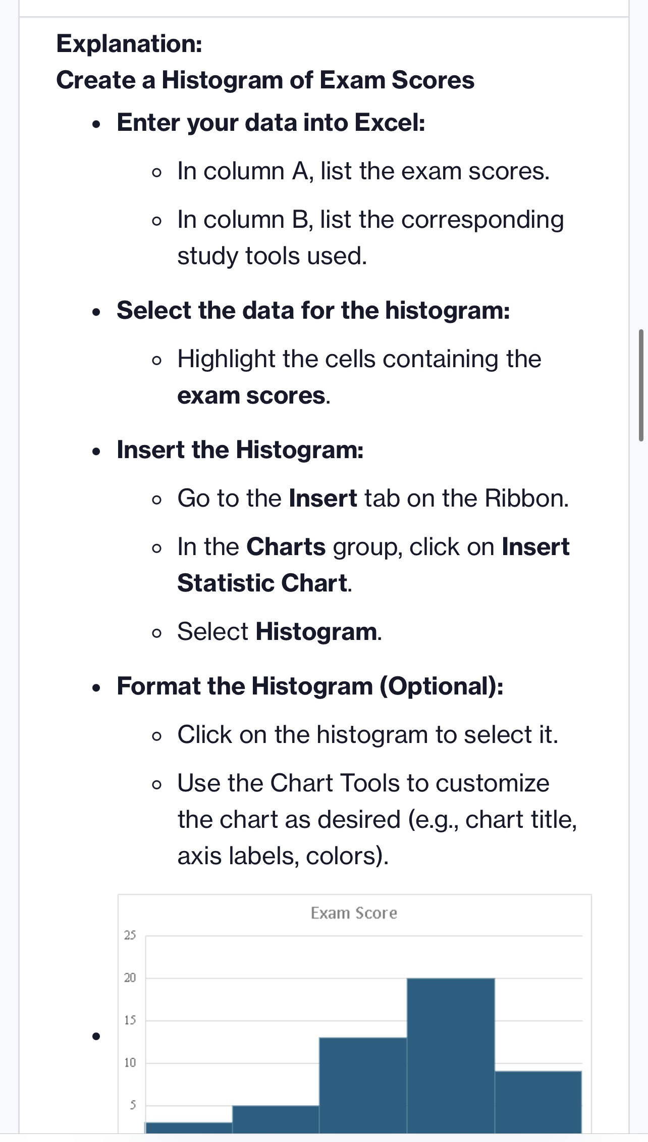
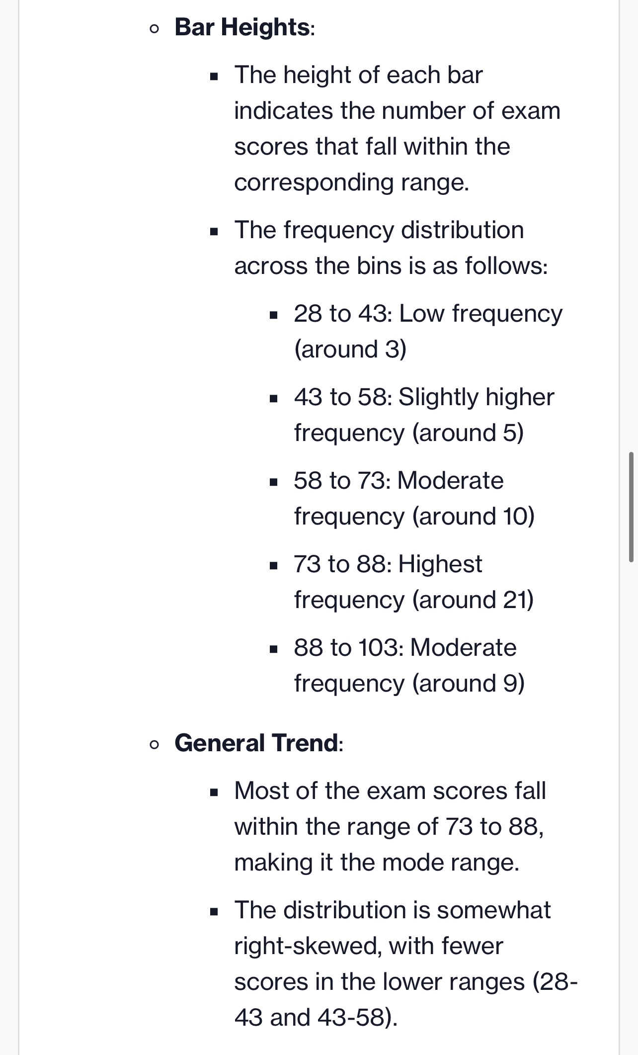
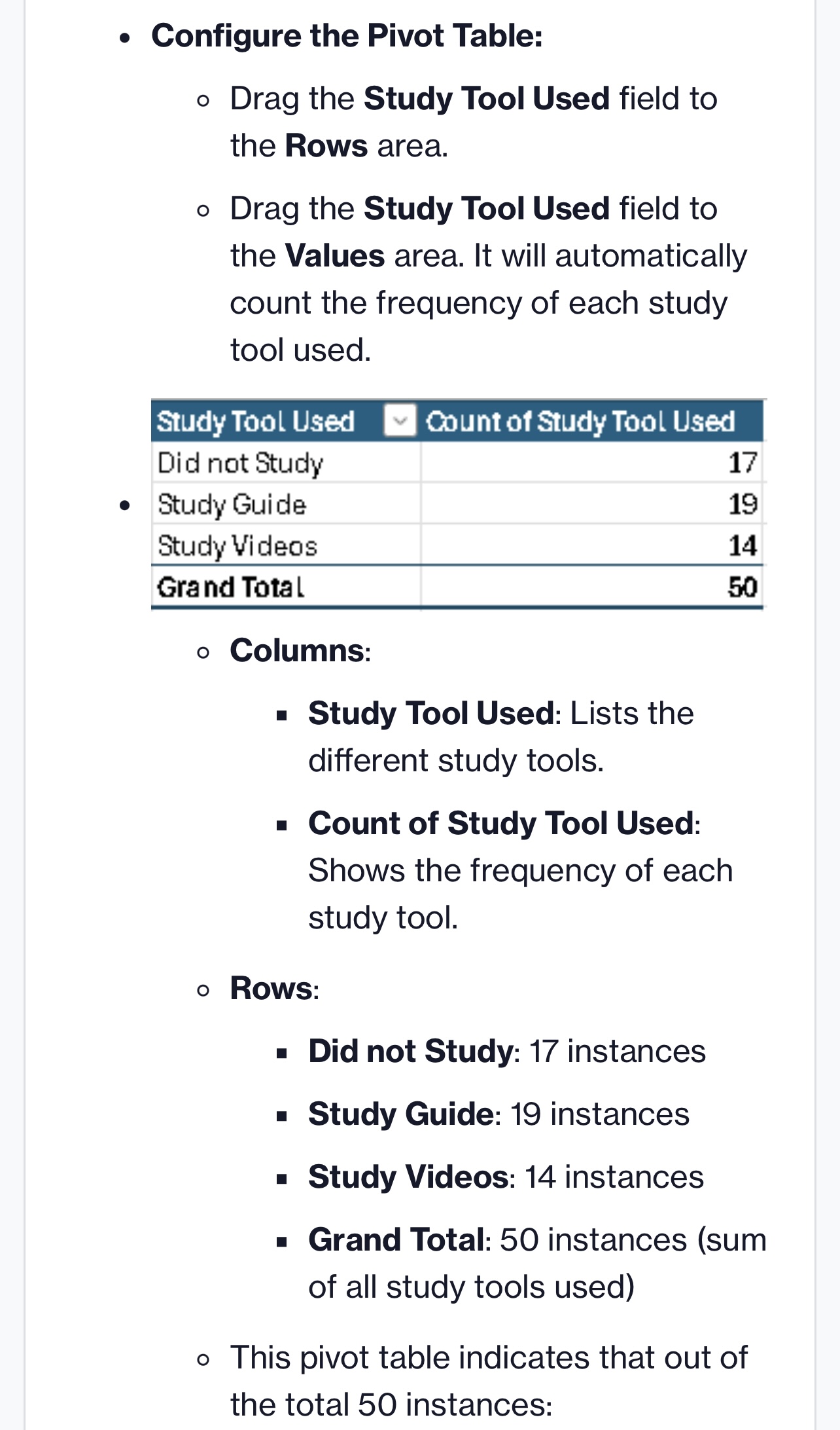
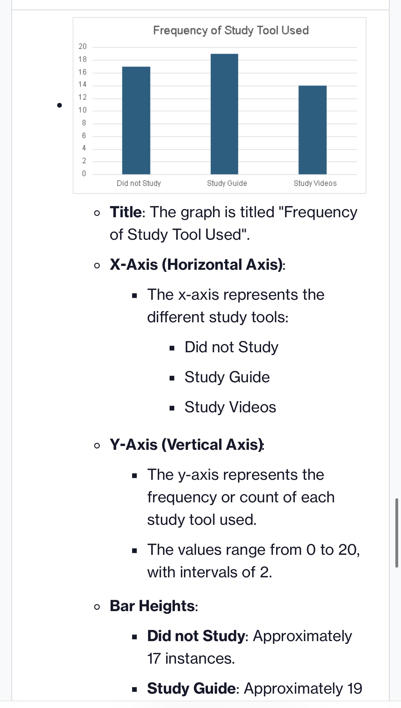
Histogram: e The histogram of exam scores shows the distribution across five ranges: 1. 28 to 43: Low frequency (around 3 scores) 2. 43 to 58: Slightly higher frequency (around 5 scores) 3. 58 to 73: Moderate frequency (around 10 scores) 4. 73 to 88: Highest frequency (around 21 scores) 5. 88 to 103: Moderate frequency (around 9 scores) e Most scores fall within the 73 to 88 range, indicating it as the most common range. The distribution is somewhat right- skewed, with fewer scores in the lower ranges. Pivot Table: e The pivot table shows the frequency of study tools used: o Did not Study: 17 times o Study Guide: 19 times (most used) o Study Videos: 14 times e Total instances: 50. Bar Graph: The bar graph shows the frequency of study tools used by students: o Study Guide: 19 instances (most used) o Did not Study: 17 instances o Study Videos: 14 instances e The "Study Guide" was the most frequently used study tool. Data Used: Exam Score Study Tool Used 76 Study Guide 78 Study Videos 79 Study Guide 67 Did not Study 74 Study Guide 70 Study Videos 28 Study Guide 32 Did not Study 62 Study Guide 35 Study Videos 90 Study Guide 97 Did not study 74 Did not study 52 Did not study 67 Study Guide 54 Study Guide 56 Did not study 58 Study Videos 60 Study Guide 60 Did not study 60 Study Guide 63 Did not study 65 Study Guide 67 Study Guide 75 Study Videos 70 Study Videos 73 Did not study 73 Study Videos 75 Study Videos 75 Did not studyI D 52 78 79 80 80 80 81 85 87 88 88 89 89 90 92 96 97 98 Study Guide Did not study Study Guide Did not study Study Videos Study Guide Did not study Study Guide Study Videos Did not study Did not study Study Guide Study Videos Study Videos Did not study Study Guide Did not study Study Videos Study Videos Study Guide Explanation: Create a Histogram of Exam Scores e Enter your data into Excel: o In column A, list the exam scores. o In column B, list the corresponding study tools used. Select the data for the histogram: o Highlight the cells containing the exam scores. e Insert the Histogram: o Go to the Insert tab on the Ribbon. o In the Charts group, click on Insert Statistic Chart. o Select Histogram. e Format the Histogram (Optional): o Click on the histogram to select it. o Use the Chart Tools to customize the chart as desired (e.g., chart title, axis labels, colors). Exam Score Exam Score [28, 47] (43, 58] (58, 73] (73, 28] (32, 107] o Title: The histogram is titled "Exam Score". o X-Axis (Horizontal Axis): The x-axis represents the bins or ranges of exam scores. = The bins are: 281043 43 t0 38 = 581073 = 731t0 88 = 8810103 o Y-Axis (Vertical Axis) The y-axis represents the frequency, which is the number of students or instances falling into each score range. = The frequency values are: = 0to 25 (increments of 5) o Bar Heights: = The height of each bar indicates the number of exam scores that fall within the corresponding range. The frequency distribution across the bins is as follows: 28 to 43: Low frequency (around 3) 43 to 58: Slightly higher frequency (around 5) 58 to 73: Moderate frequency (around 10) 73 to 88: Highest frequency (around 21) 88 to 103: Moderate frequency (around 9) o General Trend: Most of the exam scores fall within the range of 73 to 88, making it the mode range. The distribution is somewhat right-skewed, with fewer scores in the lower ranges (28- 43 and 43-58). o General Trend: Most of the exam scores fall within the range of 73 to 88, making it the mode range. The distribution is somewhat right-skewed, with fewer scores in the lower ranges (28- 43 and 43-58). Create a Pivot Table of Study Tools Used o Select your data: o Highlight both column B. o Insert the Pivot Table: o Go to the Insert tab on the Ribbon. o Click on PivotTable. o In the Create PivotTable dialog box, choose where you want the PivotTable report to be placed (e.g., a new worksheet or an existing worksheet). Table/Range: '"Assignment 1'"'$B$1:$B$51 = Existing Worksheet: = Location: 'Assignment 1''$D$19 o Configure the Pivot Table: o Configure the Pivot Table: o Drag the Study Tool Used field to the Rows area. o Drag the Study Tool Used field to the Values area. It will automatically count the frequency of each study tool used. Study Tool Used [ Count of Study Tool Used Did not Study 17 Study Guide 15 Study Videos 14 Grand Total 50 o Columns: = Study Tool Used: Lists the different study tools. = Count of Study Tool Used: Shows the frequency of each study tool. o Rows: = Did not Study: 17 instances Study Guide: 19 instances = Study Videos: 14 instances = Grand Total: 50 instances (sum of all study tools used) o This pivot table indicates that out of the total 50 instances: = "Did not Study" was noted 17 times. = "Study Guide" was used 19 times, making it the most used study tool. = "Study Videos" were used 14 times. Create a Bar Graph for the Frequency of Study Tools Used e Select the Pivot Table data: o Highlight the cells in the Pivot Table that show the frequency of each study tool. e Insert the Bar Graph: o Go to the Insert tab on the Ribbon. o In the Charts group, click on Insert Column or Bar Chart. o Select the desired bar chart type (e.g., Clustered Bar). Format the Bar Graph (Optional): o Click on the bar graph to select it. o Use the Chart Tools to customize the chart as desired (e.g., chart title, axis labels, colors). Frequency of Study Tool Used Did not Study Study Guide Study Videos o Title: The graph is titled "Frequency of Study Tool Used". o X-Axis (Horizontal Axis): = The x-axis represents the different study tools: = Did not Study Study Guide = Study Videos o Y-Axis (Vertical Axis) = The y-axis represents the frequency or count of each study tool used. = The values range from O to 20, with intervals of 2. o Bar Heights: = Did not Study: Approximately 17 instances. = Study Guide: Approximately 19
Step by Step Solution
There are 3 Steps involved in it
Step: 1
Get Instant Access to Expert-Tailored Solutions
See step-by-step solutions with expert insights and AI powered tools for academic success
Step: 2
Step: 3
Ace Your Homework with AI
Get the answers you need in no time with our AI-driven, step-by-step assistance