HTML HELP!!
I did my assignment and realized I had made no changes to the web sheet, will someone go over these directions to verify my styles sheet is correct.
@charset "utf-8";
/*
New Perspectives on HTML5 and CSS3, 7th Edition
Tutorial 5
Case Problem 2
Filename: wc_styles.css
This file contains the layout styles and media
queries used with sample pages from the Willet
Creek Golf Course website.
*/
/* Import Design Styles */
@import url('wc_designs.css') screen;
/* Flex Layout Styles */
body{
-webkit-flex-direction: row;
-webkit-flex-wrap: wrap;
}
#hole_list{
flex: 1 3 140px;
}
article{
flex: 3 1 341px;
-webkit-flex-direction: row;
-webkit-flex-wrap: wrap;
}
#stats{
flex: 4 1 361px;
}
aside{
-webkit-flex-direction: row;
-webkit-flex-wrap: wrap;
}
div{
flex: 1 1 180px;
}
/* =============================
Mobile Styles: 0 - 480 pixels
=============================
*/
@media only screen and (max-width: 180px){
#hole_list{
order: 99;
}
footer{
order: 100;
}
ul:hover{
display: block;
}
ul:link{
display: block;
}
aside{
display: block;
}
@media only screen and (max-width: 481px){
.navicon{
display: block;
}
nav ul{
-webkit-flex-direction: row;
-webkit-flex-direction: row;
flex: 1 1 auto;
}
}
/* =================================================
Tablet and Desktop Styles: 481 pixels and greater
=================================================
*/

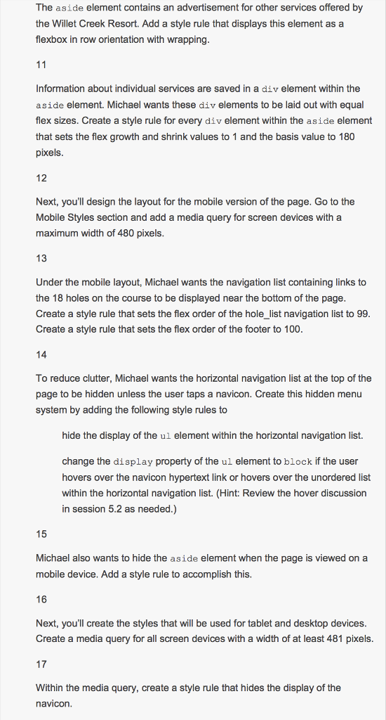
The aside element contains an advertisement for other services offered by the Willet Creek Resort. Add a style rule that displays this element as a flexbox in row orientation with wrapping Information about individual services are saved in a div element within the aside element. Michael wants these div elements to be laid out with equal flex sizes. Create a style rule for every div element within the aside element that sets the flex growth and shrink values to 1 and the basis value to 180 pixels 12 Next, you'll design the layout for the mobile version of the page. Go to the Mobile Styles section and add a media query for screen devices witha maximum width of 480 pixels 13 Under the mobile layout, Michael wants the navigation list containing links to the 18 holes on the course to be displayed near the bottom of the page Create a style rule that sets the flex order of the hole_list navigation list to 99 Create a style rule that sets the flex order of the footer to 100 To reduce clutter, Michael wants the horizontal navigation list at the top of the page to be hidden unless the user taps a navicon. Create this hidden menu system by adding the following style rules to hide the display of the ul element within the horizontal navigation list. change the display property of the ul element to block if the user hovers over the navicon hypertext link or hovers over the unordered list within the horizontal navigation list. (Hint: Review the hover discussion in session 5.2 as needed.) 15 Michael also wants to hide the aside element when the page is viewed on a mobile device. Add a style rule to accomplish this. 16 Next, you'll create the styles that will be used for tablet and desktop devices Create a media query for all screen devices with a width of at least 481 pixels 17 Within the media query, create a style rule that hides the display of the navicon The aside element contains an advertisement for other services offered by the Willet Creek Resort. Add a style rule that displays this element as a flexbox in row orientation with wrapping Information about individual services are saved in a div element within the aside element. Michael wants these div elements to be laid out with equal flex sizes. Create a style rule for every div element within the aside element that sets the flex growth and shrink values to 1 and the basis value to 180 pixels 12 Next, you'll design the layout for the mobile version of the page. Go to the Mobile Styles section and add a media query for screen devices witha maximum width of 480 pixels 13 Under the mobile layout, Michael wants the navigation list containing links to the 18 holes on the course to be displayed near the bottom of the page Create a style rule that sets the flex order of the hole_list navigation list to 99 Create a style rule that sets the flex order of the footer to 100 To reduce clutter, Michael wants the horizontal navigation list at the top of the page to be hidden unless the user taps a navicon. Create this hidden menu system by adding the following style rules to hide the display of the ul element within the horizontal navigation list. change the display property of the ul element to block if the user hovers over the navicon hypertext link or hovers over the unordered list within the horizontal navigation list. (Hint: Review the hover discussion in session 5.2 as needed.) 15 Michael also wants to hide the aside element when the page is viewed on a mobile device. Add a style rule to accomplish this. 16 Next, you'll create the styles that will be used for tablet and desktop devices Create a media query for all screen devices with a width of at least 481 pixels 17 Within the media query, create a style rule that hides the display of the navicon


