

Answered step by step
Verified Expert Solution
Question
1 Approved Answer
I couldn't import excel on here but i have the appropriote image. thank you! please specifically do it step by step 3 C D E
I couldn't import excel on here but i have the appropriote image. thank you!
please specifically do it step by step
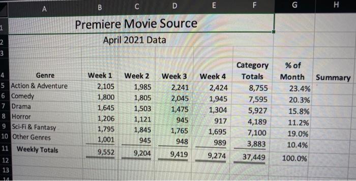
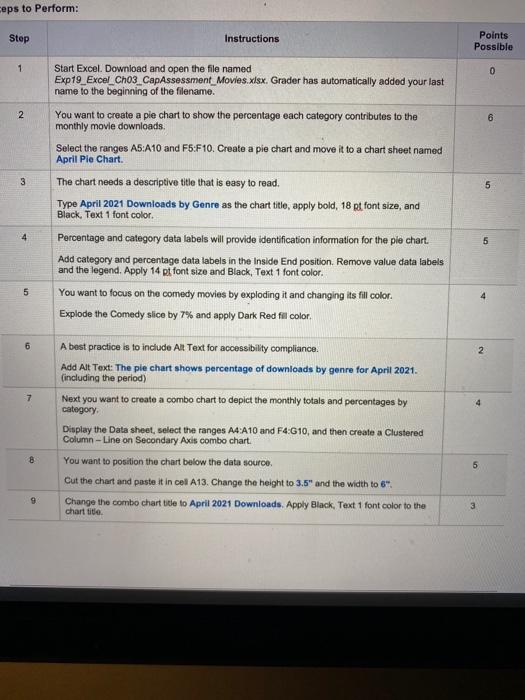
3 C D E F A G H Premiere Movie Source April 2021 Data 2 3 Summary 4 Genre 5 Action & Adventure 6 Comedy 7 Drama 8 Horror 9 Sci-Fi & Fantasy 10 Other Genres 11 Weekly Totals 12 13 14 Week 1 2,105 1,800 1,645 1,206 1,795 1,001 9,552 Week 2 1,985 1,805 1,503 1,121 1,845 945 9,204 Week 3 2,241 2,045 1,475 945 1,765 948 Week 4 2,424 1,945 1,304 917 1,695 989 9,274 Category Totals 8,755 7,595 5,927 4,189 7,100 3,883 37,449 % of Month 23.4% 20.3% 15.8% 11.2% 19.0% 10.4% 9,419 100.0% ceps to Perform: Step Instructions Points Possible 1 0 2 6 3 5 Start Excel. Download and open the file named Exp19_Excel_Cho3 CapAssessment_Movies.xlsx. Grader has automatically added your last name to the beginning of the filename. You want to create a pie chart to show the percentage each category contributes to the monthly movie downloads. Select the ranges AS:A10 and Fb:F 10. Create a pie chart and move it to a chart sheet named April Pie Chart The chart needs a descriptive title that is easy to read. Type April 2021 Downloads by Genre as the chart title, apply bold, 18 pt font size, and Black, Text 1 font color. Percentage and category data labels will provide identification information for the ple chart. Add category and percentage data labels in the Inside End position. Remove value data labels and the legend. Apply 14 pt font size and Black, Text 1 font color. You want to focus on the comedy movies by exploding it and changing its fill color. Explode the Comedy slice by 7% and apply Dark Red fil color, 5 5 6 2 7 4 A best practice is to include Alt Text for accessibility compliance. Add Alt Text: The pie chart shows percentage of downloads by genre for April 2021. (including the period) Next you want to create a combo chart to depict the monthly totals and percentages by category Display the Data sheet, select the ranges A4 A10 and F4:G10, and then create a Clustered Column-Line on Secondary Axis combo chart. You want to position the chart below the data source. Cut the chart and paste it in cel A13. Change the height to 3.5" and the width to 6". Change the combo chart title to April 2021 Downloads. Apply Black, Text 1 font color to the chart title 8 5 9 3 Step by Step Solution
There are 3 Steps involved in it
Step: 1

Get Instant Access to Expert-Tailored Solutions
See step-by-step solutions with expert insights and AI powered tools for academic success
Step: 2

Step: 3
Ace Your Homework with AI
Get the answers you need in no time with our AI-driven, step-by-step assistance
Get Started
The Temple Of Django Database Performance
Authors: Andrew Brookins
1st Edition
1734303700, 978-1734303704