Question
import matplotlib.pyplot as plt # set the color here COLOR = 'blue' def autolabel(rectangle_group): for rect in rectangle_group: height = rect.get_height() ax.annotate(str(height), xy = (rect.get_x()
import matplotlib.pyplot as plt
# set the color here COLOR = 'blue'
def autolabel(rectangle_group): for rect in rectangle_group: height = rect.get_height() ax.annotate(str(height), xy = (rect.get_x() + rect.get_width() / 2,height),
ha = 'center', xytext = (0,3),textcoords = 'offset points', color = 'grey')
countries = ['Brunie Darussalam', 'Indonesia', 'Cambodia', 'Timor-Leste', 'Malaysia', 'Philippines', 'Thailand', 'Vietnam', 'Singapore'] recycling_rate = [11.3, 7, 41, 12.5, 17.5, 28, 19.1, 23, 61 ] generated_waste_per_person = [0.499088743030168, 0.240923281868178, 0.0660538759431783, 0.0493960725965669, 0.406346654626102, 0.0400699034093881, 0.385682463666874, 0.0992130526364415, 0.32786310400448837 ]
width = 0.2 x_recycling_rate = [x - width for x in range(len(recycling_rate))] x_xbox = [x for x in range(len(recycling_rate))] x_nintendo = [x + width for x in range(len(recycling_rate))]
fig,ax = plt.subplots(figsize=(14,12))
rect1 = ax.bar(x_recycling_rate,width, label = 'Recycling Rate',color = COLOR)
# set the color of y-axis ax.yaxis.label.set_color(COLOR) ax.tick_params(axis='y', colors=COLOR) ax.tick_params(axis='x', rotation=20, labelsize=7) ax.set_title('Recycling Rate and Generated Waste per Person in Southeast Asian Countries - 2019') ax.set_ylabel('Recycling Rate') ax.set_ylim((0,80))
# set y-axis on the right side ax2 = ax.twinx() ax2.plot(generated_waste_per_person,label = 'PC Sales',color = 'red',marker = 'o') # set y-range ax2.set_ylim((0,0.6)) ax2.yaxis.label.set_color('red') ax2.tick_params(axis='y', colors='red') # set y label ax2.set_ylabel('Generated Waste per Person (Tons)') plt.xticks(rotation=45) ax.legend() plt.legend(['Generated Waste per Person (Tons)'], loc=(0.725, 0.92)) autolabel(rect1) plt.show()

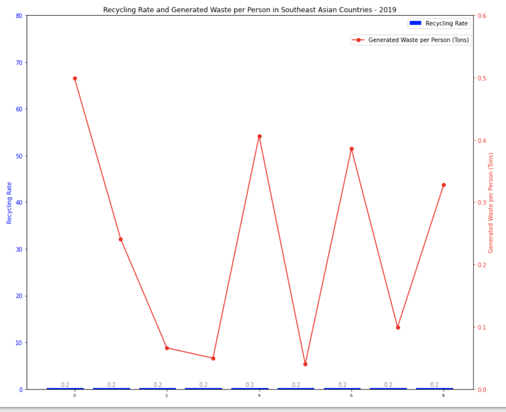
Why do Country names are disappearing in the x-axis? ('Brunie Darussalam', 'Indonesia', 'Cambodia', 'Timor-Leste', 'Malaysia', 'Philippines', 'Thailand', 'Vietnam', 'Singapore')
Why recycling rate (blue bar) has the same value, which is 0.2? (even if they all have different value) How to make it correct?
Recycling Rate and Generated Waste per Person in Southeast Asian Countries - 2019 80 0.6 Recycling Rate Generated Waste per Person (Tons) 70 0.5 60 -0.4 50 Recycling Rate 40 Generated Waste per Person (Tons) 30 0.2 20 -0.1 10 0.2 0.2 -0.0Step by Step Solution
There are 3 Steps involved in it
Step: 1

Get Instant Access to Expert-Tailored Solutions
See step-by-step solutions with expert insights and AI powered tools for academic success
Step: 2

Step: 3

Ace Your Homework with AI
Get the answers you need in no time with our AI-driven, step-by-step assistance
Get Started


