Instructions
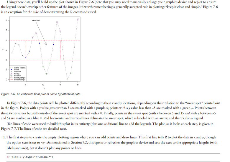
Reproduce steps 1-10 in "Section 7.3 - ADDING POINTS, LINES, AND TEXT TO AN EXISTING PLOT" of your textbook to generate the plot shown in Figure 7.6: An elaborate final plot of some hypothetical data.
Note: Steps 1-10 appear below Figure 7.6 in the textbook
Submission
Submit a single R script containing all 10 steps that can be executed to generate the plot. Annotate your script using R comments to provide descriptive information for the steps that are performed. Include an ID header.
Include the creation of the vectors x and y in your solution, here are those vectors (as created on pg 134 of the text):
x
Note: Your plot will probably not look exactly like Figure 7.6. One change I made to get it closer to the figure was to apply an overall cex scaling value of .75 to the legend.


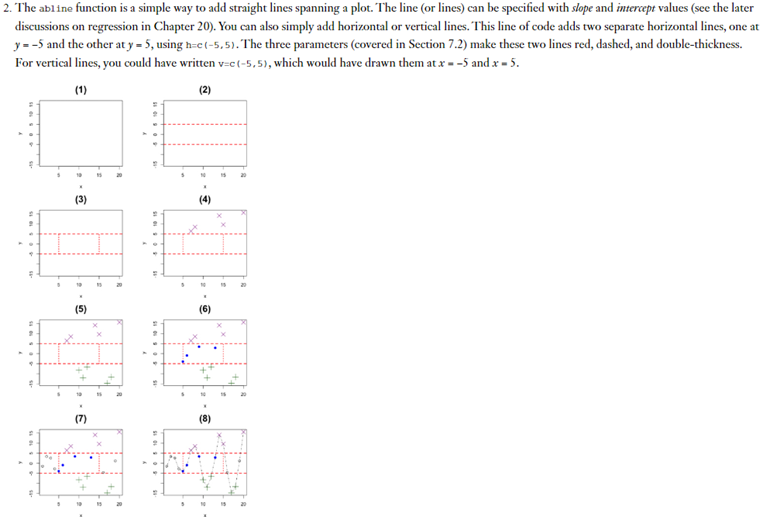
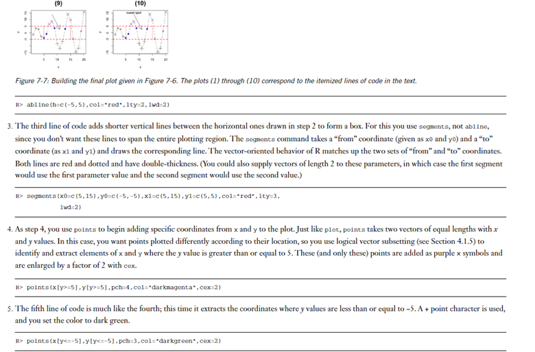
Using these data, you'll build up the plot shown in Figure 7-6 (note that you may need to manually enlarge your graphics device and replot to ensure the legend doesn't overlap other features of the image). It's worth remembering a generally accepted rule in plotting: "keep it clear and simple." Figure 7-6 is an exception for the sake of demonstrating the R commands used. Figure 7-6: An elaborate final plot of some hypothetical data In Figure 7-6, the data points will be plotted differently according to their x and y locations, depending on their relation to the "sweet spot" pointed out in the figure. Points with a y value greater than 5 are marked with a purple x; points with a y value less than 5 are marked with a green +. Points between these two y values but still outside of the sweet spot are marked with a 0 . Finally, points in the sweet spot (with x between 5 and 15 and with y between 5 and 5) are marked as a blue . Red horizontal and vertical lines delineate the sweet spot, which is labeled with an arrow, and there's also a legend. Ten lines of code were used to build this plot in its entirety (plus one additional line to add the legend). The plot, as it looks at each step, is given in Figure 7-7. The lines of code are detailed next. 1. The first step is to create the empty plotting region where you can add points and draw lines. This first line tells R to plot the data in x and y, though the option type is set to n. As mentioned in Section 7.2, this opens or refreshes the graphics device and sets the axes to the appropriate lengths (with labels and axes), but it doesn't plot any points or lines. 2. The abl ine function is a simple way to add straight lines spanning a plot. The line (or lines) can be specified with slope and intercept values (see the later discussions on regression in Chapter 20). You can also simply add horizontal or vertical lines. This line of code adds two separate horizontal lines, one at y=5 and the other at y=5, using h=c(5,5). The three parameters (covered in Section 7.2) make these two lines red, dashed, and double-thickness. For vertical lines, you could have written v=c(5,5), which would have drawn them at x=5 and x=5. (3) (4) (5) (6) (8) Figure 7-7: Building the final plot given in Figure 7-6. The plots (1) through (10) correspond to the itemized lines of code in the text. R>abline(h=c(5,5),col=red,1ty=2,1wd=2) 3. The third line of code adds shorter vertical lines between the horizontal ones drawn in step 2 to form a box. For this you use segments, not ab1ine, since you don't want these lines to span the entire plotting region. The segnents command takes a "from" coordinate (given as x0 and yo) and a "to" coordinate (as x1 and y1 ) and draws the corresponding line. The vector-oriented behavior of R matches up the two sets of "from" and "to" coordinates. Both lines are red and dotted and have double-thickness. (You could also supply vectors of length 2 to these parameters, in which case the first segment would use the first parameter value and the second segment would use the second value.) R> segnents (x0=e(5,15),y0=c(5,5),x1=e(5,15),y1=e(5,5), col="red* , 1ty=3, lwd=2) 4. As step 4, you use points to begin adding specific coordinates from x and y to the plot. Just like plot, points takes two vectors of equal lengths with x and y values. In this case, you want points plotted differently according to their location, so you use logical vector subsetting (see Section 4.1.5 ) to identify and extract elements of x and y where the y value is greater than or equal to 5 . These (and only these) points are added as purple x symbols and are enlarged by a factor of 2 with cex. R> points (x[y>=5],y[y>=5], pch =4, col = "darkmagenta , cex=2) 5. The fifth line of code is much like the fourth; this time it extracts the coordinates where y values are less than or equal to -5. A + point character is used, and you set the color to dark green. R> points (x[y=5x5ypoints(x[(x>=5x5y=5kx5y points (x[(x15)&(y>5y15)(y>5y 1 ines (x,y,1ty=4) 9. The ninth line of code adds the arrow pointing to the sweet spot. 'The function arrows is used just like segments, where you provide a "from" coordinate (x0,y0) and a "to" coordinate (x1,y1). By default, the head of the arrow is located at the "to" coordinate, though this (and other options such as the angle and length of the head) can be altered using optional arguments described in the help file zarrows. R>arrows(x0=8,y0=14,x1=11,y1=2.5) 10. The tenth line prints a label on the plot at the top of the arrow. As per the default behavior of text, the string supplied as labe1s is centered on the coordinates provided with the arguments x and y
