

Answered step by step
Verified Expert Solution
Question
1 Approved Answer
On the Data Visualization - Student tab in your Excel spreadsheet, update the price per unit for all four products for Office Warehouse Inc. with
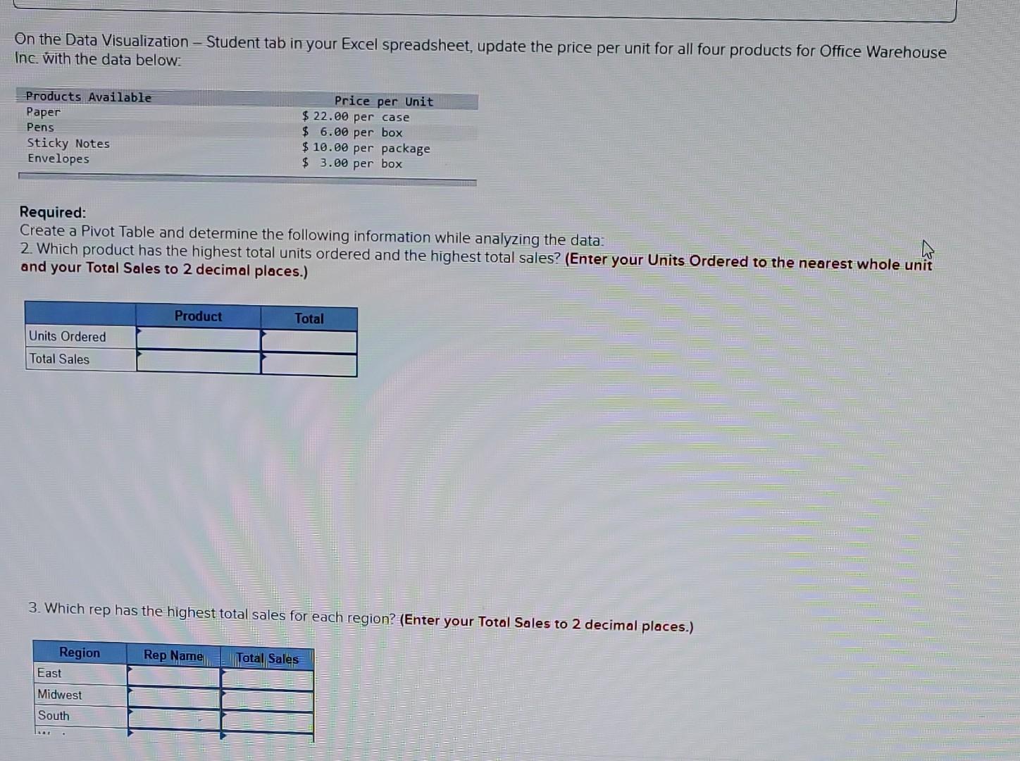
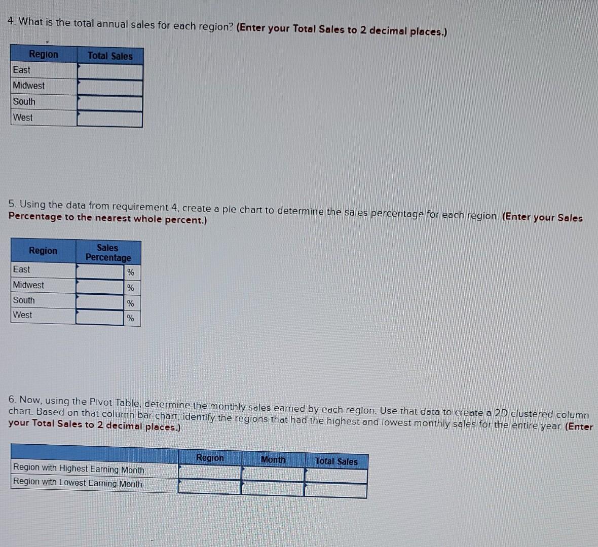
On the Data Visualization - Student tab in your Excel spreadsheet, update the price per unit for all four products for Office Warehouse Inc. with the data below: Required: Create a Pivot Table and determine the following information while analyzing the data: 2. Which product has the highest total units ordered and the highest total sales? (Enter your Units Ordered to the nearest whole unit and your Total Sales to 2 decimal places.) 3. Which rep has the highest total sales for each region? (Enter your Total Sales to 2 decimal places.) 4. What is the total annual sales for each region? (Enter your Total Sales to 2 decimal places.) 5. Using the data from requirement 4 , create a pie chart to determine the sales percentage for each region. (Enter your Sales Percentage to the nearest whole percent.) 6. Now, using the Pivot Table, determine the monthly sales earned by each region. Use that data to create a 2D clustered column chart Based on that column bar chart, identify the regions that had the highest and lowest monthly sales for the entire year (Enter your Total Sales to 2 decimal places.) On the Data Visualization - Student tab in your Excel spreadsheet, update the price per unit for all four products for Office Warehouse Inc. with the data below: Required: Create a Pivot Table and determine the following information while analyzing the data: 2. Which product has the highest total units ordered and the highest total sales? (Enter your Units Ordered to the nearest whole unit and your Total Sales to 2 decimal places.) 3. Which rep has the highest total sales for each region? (Enter your Total Sales to 2 decimal places.) 4. What is the total annual sales for each region? (Enter your Total Sales to 2 decimal places.) 5. Using the data from requirement 4 , create a pie chart to determine the sales percentage for each region. (Enter your Sales Percentage to the nearest whole percent.) 6. Now, using the Pivot Table, determine the monthly sales earned by each region. Use that data to create a 2D clustered column chart Based on that column bar chart, identify the regions that had the highest and lowest monthly sales for the entire year (Enter your Total Sales to 2 decimal places.)
Step by Step Solution
There are 3 Steps involved in it
Step: 1

Get Instant Access to Expert-Tailored Solutions
See step-by-step solutions with expert insights and AI powered tools for academic success
Step: 2

Step: 3
Ace Your Homework with AI
Get the answers you need in no time with our AI-driven, step-by-step assistance
Get Started
An Introduction To Statistical Sampling In Auditing
Authors: Dan M. Guy
1st Edition
0471042323, 978-0471042327