Question
please help (a) Summarize these data using both a stacked bar chart (of market share) and a mosaic plot. What message do these plots convey
please help
(a) Summarize these data using both a stacked bar chart (of market share) and a mosaic plot. What message do these plots convey about the changes in market share from 2010 to 2011?
Summarize these data using a stacked bar chart. Choose the correct chart below.
Summarize these data using a mosaic plot. Choose the correct chart below.
What message do these plots convey about the changes in market share from 2010 to 2011? Fill in the blanks:
In 2011, the five given companies (A through E). ------------- some market share when compared to the companies in the "Other" category (F). Of the given companies, A -------- market share but remains the ------------ company.
(b) Explain the differences between the two charts. One plot shows a feature of the data that the other does not show. What is it, and why is the difference subtle in this example?
Pick an option
A.The stacked bar chart compares the 2010 total to the 2011 total by using the width of the columns. However, since the totals are so close, the difference is subtle.
B.The mosaic plot compares the 2010 total to the 2011 total by using the width of the columns. However, since the totals are so close, the difference is subtle.
C. The mosaic plot compares the differences between the companies by changing the size of the white space between the regions. However, since there are no major differences between the companies, it is difficult to see on the mosaic plot.
D.The stacked bar chart compares the differences between the years by changing the size of the white space between the bars. However, since there are only two bars, this difference cannot be seen.
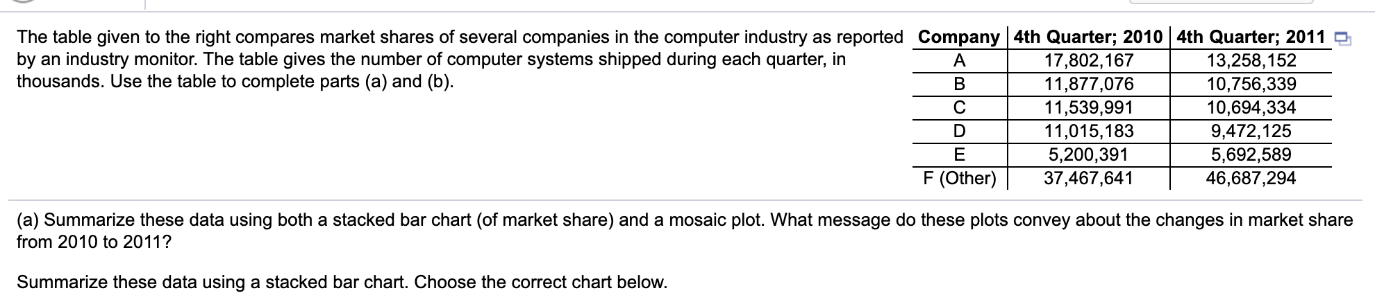
The table given to the right compares market shares of several companies in the computer industry as reported Company 4th Quarter; 2010 4th Quarter; 2011 O by an industry monitor. The table gives the number of computer systems shipped during each quarter, in A 17,802,167 13,258,152 thousands. Use the table to complete parts (a) and (b). B 11,877,076 10,756,339 C 11,539,991 10,694,334 D 11,015,183 9,472,125 E 5,200,391 5,692,589 F (Other) 37,467,641 46,687,294 (a) Summarize these data using both a stacked bar chart (of market share) and a mosaic plot. What message do these plots convey about the changes in market share from 2010 to 2011? Summarize these data using a stacked bar chart. Choose the correct chart below. The table given to the right compares market shares of several companies in the computer industry as reported Company 4th Quarter; 2010 4th Quarter; 2011 O by an industry monitor. The table gives the number of computer systems shipped during each quarter, in A 17,802,167 13,258,152 thousands. Use the table to complete parts (a) and (b). B 11,877,076 10,756,339 C 11,539,991 10,694,334 D 11,015,183 9,472,125 E 5,200,391 5,692,589 F (Other) 37,467,641 46,687,294 (a) Summarize these data using both a stacked bar chart (of market share) and a mosaic plot. What message do these plots convey about the changes in market share from 2010 to 2011? Summarize these data using a stacked bar chart. Choose the correct chart below
Step by Step Solution
There are 3 Steps involved in it
Step: 1

Get Instant Access to Expert-Tailored Solutions
See step-by-step solutions with expert insights and AI powered tools for academic success
Step: 2

Step: 3
Ace Your Homework with AI
Get the answers you need in no time with our AI-driven, step-by-step assistance
Get Started