

Question
Purpose Creating effective visuals requires basic knowledge of the principles of good design. Just like creating effective sentences and paragraphs requires a working knowledge of
| Purpose |
Creating effective visuals requires basic knowledge of the principles of good design. Just like creating effective sentences and paragraphs requires a working knowledge of the principles of good writing, creating effective visuals requires some knowledge of the principles of good design.
When you encounter visuals that you find appealing or unappealing, effective, or ineffective, stop and ask yourself what caused your response. Did a particular design grab you and practically force you to pay attention, or did you pass right by with hardly a notice? Did one chart reveal information quickly and easily, while another made you spend time decoding its confusing message? Did one photo appeal to you at an emotional level and therefore draw you into a document, whereas another was off-putting and caused you to lose interest? By thinking about your own reactions to various designs, you can become a more effective designer yourself.
LEARNING OBJECTIVES:
- Explain the power of business images, discuss six principles of graphic design that help ensure effective visuals, and explain how to avoid ethical lapses when using visuals.
- Explain how to choose which points in your message to illustrate.
- Describe the most common options for presenting your message to illustrate.
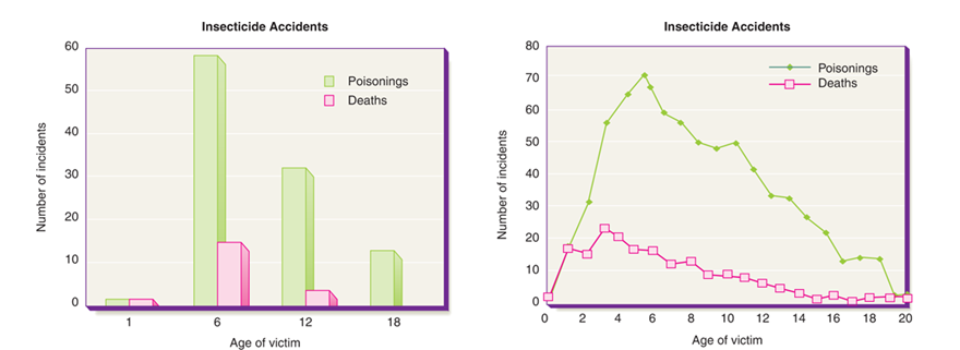
Your Case: Your team has been assigned to present the results of an industry wide study of the effects of insecticides. Your audience consists of the department heads in your company, whose experience and educational backgrounds vary widely, from chemical engineering to insurance law. Your team is convinced you need to keep your report as simple and jargon-free as possible.
The members of your team are not scientific experts on insecticides, but your supervisor has introduced the team to a scientist who works for a trade association that represents chemical producers, including your firm. The scientist is familiar with the study youll be reporting on, and she has experience in communicating technical subjects to diverse audiences. The team jumped at the chance to have such a knowledgeable person review the presentation for technical accuracy, but they are uncomfortable with some of her feedback. In particular, they question her advice to replace the line chart shown on the next page, which displays the number of insecticide poisonings and deaths by age.
The scientist suggests that this chart is too busy and too difficult for non-specialists to understand. As an alternative, she provides the bar chart that selects four specific ages from the entire range. She says this chart communicates the same basic idea as the line chart but is much easier to read.
Analysis: You agree with the scientist that the line chart is visually busy and takes more effort to process. Your team discusses the proposed change, but something bothers you about the bar chart. Does it present the insecticide situation accurately and honestly? Why or why not?
Using the information concerning the principles of design below, is the situation presented accurately and honestly? Remember that nearly every aspect of visual design is governed by conventions that set audience expectations. As you consider your reactions to the bar and line chart (on page 4 of this assignment) youll begin to see how the six fundamental principles below help distinguish ineffective and effective designs:
| Consistency | Audiences view a series of visuals as a whole and assume that design elements will be consistent from one page to the next. Think of consistency as visual parallelism,in the same way that textural parallelism helps audiences understand and compare a series of ideas. You can achieve visual parallelism in a variety of ways, including through consistent use of color, shape, size, texture, position, scale, or typeface. |
| Contrast | To emphasize differences, depict items in contrasting colors, shapes, or sizes. For example, to highlight the difference between two quantities in a chart, dont use two shades of blue; instead use blue for one and yellow or some other dramatically contrasting color for the other. |
| Balance | Balance can be either formal, in which the elements in the images are arranged symmetrically around a central point or axis, or informal, in which elements are not distributed evenly, but rather stronger and weaker elements are arranged in a way that achieves an overall effect of balance. A common approach to information balance is weighing one visually dominate element against several smaller or weaker elements. In general, formal balance is more calming and serious, whereas informal balance tends to seem more dynamic and engaging. |
| Emphasis | Audiences usually assume that the dominant element in a design is the most important, so make sure that the visually dominant element really does represent the most important information. For example, you can create the visually dominant element through color, position, size or placement. Conversely, be sure to visually downplay less important items. For instance, avoid using strong colors for minor support points, and deemphasize background features such as the grid lines on a chart. |
| Convention | Visual communication is guided by a variety of generally accepted rules or conventions, just as written communication is guided by an array of spelling grammar, punctuation, and usage conventions. These conventions dictate virtually every aspect of design. Moreover, many conventions are so ingrained that people dont even realize that they are following these rules. For example, if English is your native language, you assume that ideas progress across the page from left to right because thats the direction in which English text is written. If you are a native Arabic or Hebrew speaker, however, you might automatically assume that flow on a page or screen is from right to left because that is the direction in which those languages are written. Flouting contentions often causes breakdowns in communications, but in some cases can be used to great effect. For instance, flipping an organizational chart upside down to put the customers at the top, with front line employees directly beneath them and on down to the chief executive at the bottom, can be an effective way to emphasize that customers come first and that the managers are responsible for supporting their employees in their efforts to satisfy customers. |
| Simplicity | As a general rule, simple is better when it comes to visuals for business communication. Remember that youre conveying information, not expressing your creative flair. Limit the number of colors and design elements you use, and take care to avoid chartjunk, a term coined by the visual communication specialist Edward R. Turte for decorative elements that clutter documents that potentially confuse readers without adding any relevant information. Computers make it far too easy to add chartjunk, from clip art illustrations to three-dimensional charts that really display only two dimensions of data. |
Now consider the ethics of visual communication as you evaluate the bar and line charts. How ethical is it to use the bar chart and why? Remember that the power to communicate with visuals comes with the responsibility to communicate ethically. You can work to avoid ethical lapses in your visuals by following these rules:
| Consider all possible interpretations and misinterpretations. | Try to view your visuals from your audience members perspective. Will biases, beliefs, or backgrounds lead them to different conclusions than what youve intended? For instance, assume that you want to show how easy your product is to use, and the photograph youve chosen just happens to show an older person operating the product. Will anyone conclude that what you really mean to say is that your product is so simple that even an old person can use it? |
| Provide Context | Even when they are completely accurate, visuals can show only a partial view of reality. Part of your responsibility as a communicator is to provide not only accurate visuals but enough background information to help audiences interpret the visual correctly. |
| Dont hide or minimize negative information that runs counter to your argument. | Obscuring information prevents your audience from making fully informed decisions regarding your content.
|
| Dont exaggerate information that supports your argument. | Similarly, you have a responsibility not to oversell information in support of your argument. You should also resist the temptation to alter or enhance photographs and other images in order to support your arguments. |
| Dont oversimplify complex situations. | By their very nature, visuals tend to present simplified views of reality. This is usually a benefit and one of the key reasons for using visuals. However, take care not to mislead an audience by hiding complications that are important to the audiences understanding of the situation. |
| Dont imply cause-and-effect relationships without providing proof that they exist. | For example, if you create a line chart that shows how increasing sales seem to track with increasing advertising expenditures, you can claim a correlation but not necessarily a cause-and-effect relationship between the two. You can claim a causal relationship (meaning that the increase in advertising spending caused the increase in sales) only if you can isolate advertising spending as the only factor that can account for the increase in sales. |
| Avoid emotional manipulation or other forms of coercion. | For instance, a photograph of an unhappy child being treated as a social outcaste because he or she doesnt own the trendiest toys could be considered an unethical way to persuade parents to buy those products for their children. |
| Be careful with the way you aggregate data. | Preparing charts, graphs, and tables that present data often involves decisions about aggregating, or grouping, data. Such decisions can have a profound effect on the message your audience receives. For example of you aggregate daily production levels to show only a single data point for each week, you might be obscuring important variations that happen from day to day. |
The assignment: Each team should discuss the case and collaborate on the analysis they develop. Using the charts below and the information concerning the visual design elements and the ethics of visual communication from the previous pages reread the case on page 1 of this assignment. Next discuss your concerns as a team. Based on what we learned in Chapter 17 Enhancing Presentations with Slides and Other Visuals about the ethics of visual communication what is your specific concern(s) and why?
Finally: Each team will develop a 45-minute presentation for the class and share their concerns and ideas. Is there some other way to develop a visual than the two choices presented above to engage your audience and help them understand the situation? If not, why not and which of the two options would you use? Remember to tell us why you made the choice you did. Use the information you gained from Chapter 17 Enhancing Presentations with Slides and Other Visuals and from this assignment.
- You need to read the entire assignment then meet with your team.
- The team will need to create a Story Board which will act as your visual outline for the presentation.
- Utilizing the information in this assignment you will want to create a 4-to-5-minute presentation for the class using PowerPoint.
- You will need to do some research of your own on this issue.
- Next you will want to re-read Chapter 17 Enhancing Presentations with Slides and Other Visuals Once you have completed and compiled your presentation have one person go over all the information so that you create a presentation that has one-voice.
- Be sure to meet as a team and practice your presentation so that you can deliver flawlessly.
Insecticide Accidents Insecticide Accidents 60 80 70 Poisonings Deaths Poisonings Deaths 50 60 40 50 Number of incidents 30 40 Number of incidents 30 20 20 10 10 0 0 1 18 02 4 6 14 16 18 20 6 12 Age of victim 8 10 12 Age of victim Insecticide Accidents Insecticide Accidents 60 80 70 Poisonings Deaths Poisonings Deaths 50 60 40 50 Number of incidents 30 40 Number of incidents 30 20 20 10 10 0 0 1 18 02 4 6 14 16 18 20 6 12 Age of victim 8 10 12 Age of victim
Step by Step Solution
There are 3 Steps involved in it
Step: 1

Get Instant Access to Expert-Tailored Solutions
See step-by-step solutions with expert insights and AI powered tools for academic success
Step: 2

Step: 3
Ace Your Homework with AI
Get the answers you need in no time with our AI-driven, step-by-step assistance
Get Started
Finance And Economics Discussion Series Monetary Policy And The Housing Bubble
Authors: United States Federal Reserve Board, Jane Dokko
1st Edition
1288704682, 9781288704682