

Answered step by step
Verified Expert Solution
Question
1 Approved Answer
Q10 Histogram 2 Points The histograms below show the 'Age' distributions of citizens who survived (left plot) and citizens who died (right plot). Both plots
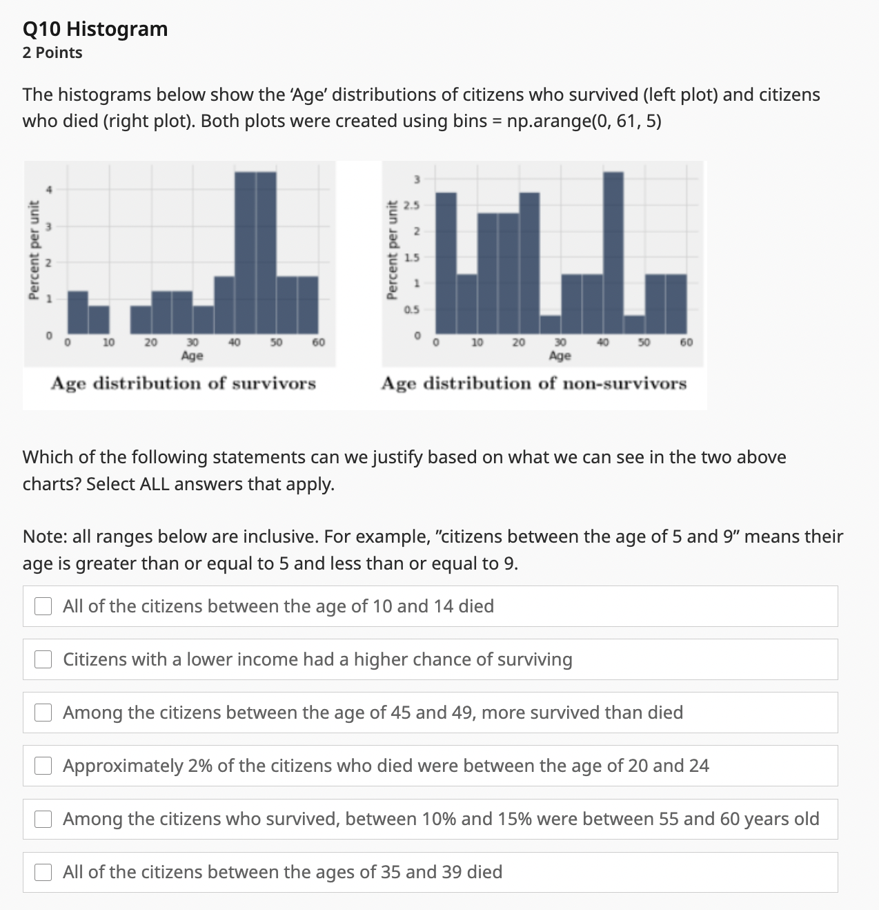 Q10 Histogram 2 Points The histograms below show the 'Age' distributions of citizens who survived (left plot) and citizens who died (right plot). Both plots were created using bins = np.arange (0,61,5) Which of the following statements can we justify based on what we can see in the two above charts? Select ALL answers that apply. Note: all ranges below are inclusive. For example, "citizens between the age of 5 and 9" means their age is greater than or equal to 5 and less than or equal to 9 . All of the citizens between the age of 10 and 14 died Citizens with a lower income had a higher chance of surviving Among the citizens between the age of 45 and 49 , more survived than died Approximately 2% of the citizens who died were between the age of 20 and 24 Among the citizens who survived, between 10% and 15% were between 55 and 60 years old All of the citizens between the ages of 35 and 39 died
 Step by Step Solution
There are 3 Steps involved in it
Step: 1

Get Instant Access to Expert-Tailored Solutions
See step-by-step solutions with expert insights and AI powered tools for academic success
Step: 2

Step: 3
Ace Your Homework with AI
Get the answers you need in no time with our AI-driven, step-by-step assistance
Get Started
Building The Data Lakehouse
Authors: Bill Inmon ,Mary Levins ,Ranjeet Srivastava
1st Edition
1634629663, 978-1634629669