Answered step by step
Verified Expert Solution
Question
1 Approved Answer
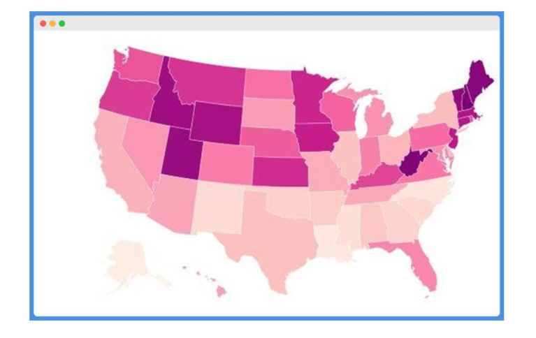
The graph below is the rate of infection of AIDS disease in US for year 2020, where the lighter the shaded area, the more serious
The graph below is the rate of infection of AIDS disease in US for year 2020, where the lighter the shaded area, the more serious and higher (in percentage term) infection rates.
Using the theories and lessons learnt from Storytelling with Data, describe what is wrong with the following graph and how it can be improved.

Step by Step Solution
There are 3 Steps involved in it
Step: 1

Get Instant Access to Expert-Tailored Solutions
See step-by-step solutions with expert insights and AI powered tools for academic success
Step: 2

Step: 3

Ace Your Homework with AI
Get the answers you need in no time with our AI-driven, step-by-step assistance
Get Started


