

Answered step by step
Verified Expert Solution
Question
1 Approved Answer
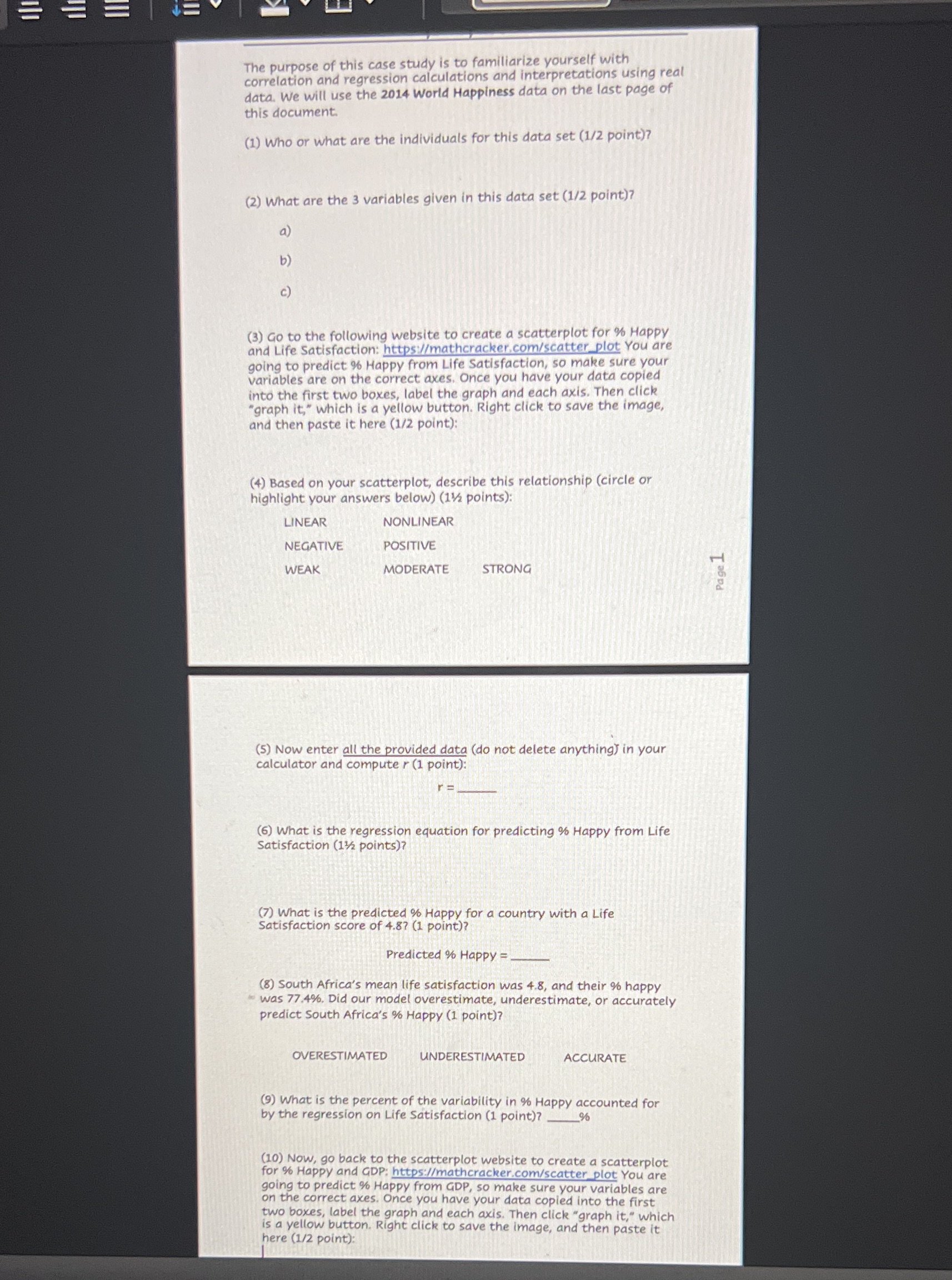
The purpose of this case study is to familiarize yourself with correlation and regression calculations and interpretations using real data. We will use the 2014
Step by Step Solution
There are 3 Steps involved in it
Step: 1

Get Instant Access to Expert-Tailored Solutions
See step-by-step solutions with expert insights and AI powered tools for academic success
Step: 2

Step: 3
Ace Your Homework with AI
Get the answers you need in no time with our AI-driven, step-by-step assistance
Get Started
Graphical Approach To Precalculus With Limits A Unit Circle Approach, A
Authors: John E Hornsby, Margaret L Lial, Gary K Rockswold
5th Edition
0321899806, 9780321899804