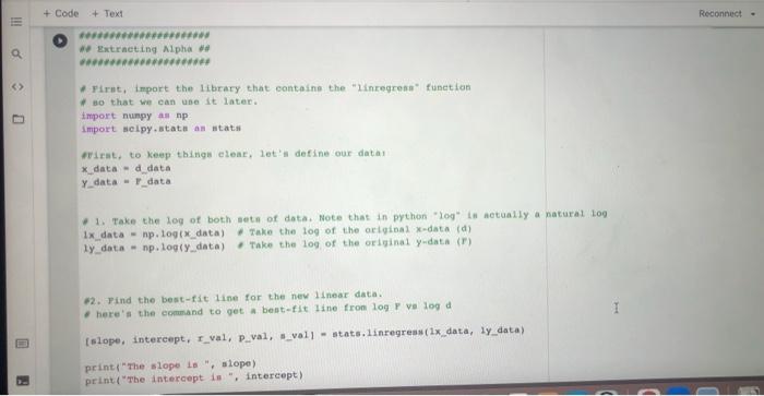
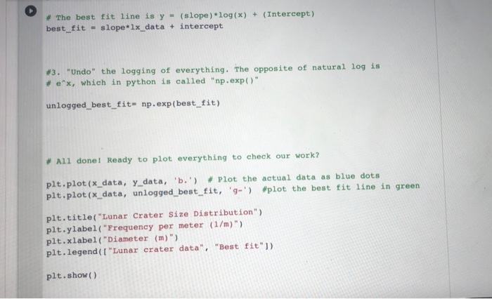
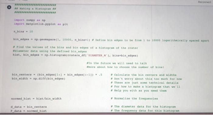
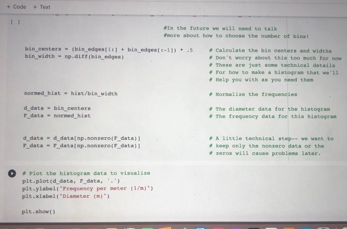
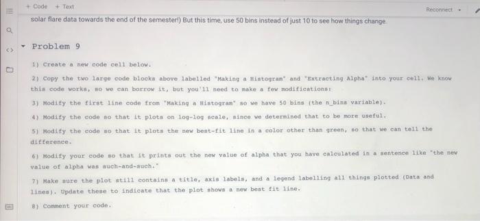
This is google colab. please solve problem 9 and 10 using the codes attached.

+ Code + Text Reconnect * Extracting Alpha ## First, import the library that contain the inregresa function so that we can use it later. import numpy amp import solpy.stats am stats First, to keep things clear, let's define our data X_data-d_data Y data - _data 1. Take the log of both sets of data. Note that in python "log" is actually a natural log 1x data - np.logix_data). Take the log of the original data (d) Ty data - np.logiydata) Take the log of the original y.data (7) #2. Pind the best fit line for the new linear data here's the command to get a best-fit line from log vs log d Islope, intercept, r_val, P val, -_vall - stats.linregress(1x data, ly_data) print"The slope Ls ", slope) print("The intercept is ", intercept) # The best fit line is y = (slope) * log(x) + (Intercept) best_fit = slope*1x_data + intercept #3. "Undo" the logging of everything. The opposite of natural log is e'x, which in python is called "np.exp()" unlogged_best_fit= np.exp(best_fit) # All done! Ready to plot everything to check our work? plt.plot(x_data, y_data, 'b.') W plot the actual data as blue dots pit.plot(x_data, unlogged_best_fit, '-') plot the best fit line in green plt.title{ "Lunar Crater Size Distribution") plt.ylabel("Frequency per meter (1/m)") plt.xlabel("Diameter (m)") plt.legend ( ["Lunar crater data", "Best fit")) plt.show() Reconnect W ## Making a Histogram import numpy a np import matplotlib.pyplot as plt n_bins - 10 bin edgen - np.geomapace(, 10000, n binn+1) Detine bin edges to be from 1 to 10000 logarithmically spaced apart Find the values of the bine and bin edges of a histogram of the crater #diameter data using the defined bin edges hist, bin_edges - np.histogramerateru_df 'DIAMETER_M', binabin_edges) In the future we will need to talk more about how to choose the number of binot bin_centers - (bin_edges [1:] + bin_edges[:-11)..5 - Calculate the bin centers and width bin_width = np.diff(bin_edges) Don't worry about this too much for now These are just some technical details Por how to make a histogram that we'll . Help you with as you need them normed histhist/bin width # Normalize the frequencies d data-bin centers F_data = normed_hist # The diameter data for the histogram # The frequency data for this histogram + Code + Text In the future we will need to talk Wmore about how to choose the number of bins! bin_centers (bin edges[11] + bin_edges[:-11) .5 bin width = np.diff(bin_edges) # Calculate the bin centers and widths # Don't worry about this too much for now # These are just some technical details # For how to make a histogram that we'll # Help you with as you need them normed_hist - hist/bin_width # Normalize the frequencies d_data- bin_centers F_data - normed_hist # The diameter data for the histogram # The frequency data for this histogram d_data - d_data[np.nonzero(F_data) F_data = P_data[ np.nonzero(F_data)] * A little technical step-- we want to # keep only the nonzero data or the # zeros will cause problems later. # plot the histogram data to visualize plt.plot(d_data, F_data, '.') plt.ylabel("Frequency per meter (1/m)"> plt.xlabel("Diameter (m)") plt.show() + Code + Text Reconnect solar flare data towards the end of the semester) But this time, use 50 bins instead of just 10 to see how things change O Problem 9 1) Create a new code cell below. 2) Copy the two large code blocks above labelled "Making a Histogram" and "Extracting Alpha" into your cell, we know this code works, Ho we can borrow it, but you'll need to make a few modifications: 3) Modify the first line code from making a stogram" so we have 50 bins the n_bine variable). 4) Modify the code so that it plots on log-log neale, since we determined that to be more useful. 5) Modify the code so that it plots the new best-fit Line in a color other than green, so that we can tell the difference 6) Modify your code so that it prints out the new value of alpha that you have calculated in a sentence like the new value of alpha was such-and-such." 7) Make sure the plot still contains a title, axis labels, and a legend labelling all things plotted (Data and lines). Update these to indicate that the plot shows a new best fit line B) Comment your code nomme 100 Buchanges saved + Code + Text Recon Problem 10 1) Create a new text cell below and give the final value as YOU computed it. Describe the differences between your plot with 50 bine verus the one above with 10. Which do you think is better for fitting the data, and why? + Code + Text Reconnect * Extracting Alpha ## First, import the library that contain the inregresa function so that we can use it later. import numpy amp import solpy.stats am stats First, to keep things clear, let's define our data X_data-d_data Y data - _data 1. Take the log of both sets of data. Note that in python "log" is actually a natural log 1x data - np.logix_data). Take the log of the original data (d) Ty data - np.logiydata) Take the log of the original y.data (7) #2. Pind the best fit line for the new linear data here's the command to get a best-fit line from log vs log d Islope, intercept, r_val, P val, -_vall - stats.linregress(1x data, ly_data) print"The slope Ls ", slope) print("The intercept is ", intercept) # The best fit line is y = (slope) * log(x) + (Intercept) best_fit = slope*1x_data + intercept #3. "Undo" the logging of everything. The opposite of natural log is e'x, which in python is called "np.exp()" unlogged_best_fit= np.exp(best_fit) # All done! Ready to plot everything to check our work? plt.plot(x_data, y_data, 'b.') W plot the actual data as blue dots pit.plot(x_data, unlogged_best_fit, '-') plot the best fit line in green plt.title{ "Lunar Crater Size Distribution") plt.ylabel("Frequency per meter (1/m)") plt.xlabel("Diameter (m)") plt.legend ( ["Lunar crater data", "Best fit")) plt.show() Reconnect W ## Making a Histogram import numpy a np import matplotlib.pyplot as plt n_bins - 10 bin edgen - np.geomapace(, 10000, n binn+1) Detine bin edges to be from 1 to 10000 logarithmically spaced apart Find the values of the bine and bin edges of a histogram of the crater #diameter data using the defined bin edges hist, bin_edges - np.histogramerateru_df 'DIAMETER_M', binabin_edges) In the future we will need to talk more about how to choose the number of binot bin_centers - (bin_edges [1:] + bin_edges[:-11)..5 - Calculate the bin centers and width bin_width = np.diff(bin_edges) Don't worry about this too much for now These are just some technical details Por how to make a histogram that we'll . Help you with as you need them normed histhist/bin width # Normalize the frequencies d data-bin centers F_data = normed_hist # The diameter data for the histogram # The frequency data for this histogram + Code + Text In the future we will need to talk Wmore about how to choose the number of bins! bin_centers (bin edges[11] + bin_edges[:-11) .5 bin width = np.diff(bin_edges) # Calculate the bin centers and widths # Don't worry about this too much for now # These are just some technical details # For how to make a histogram that we'll # Help you with as you need them normed_hist - hist/bin_width # Normalize the frequencies d_data- bin_centers F_data - normed_hist # The diameter data for the histogram # The frequency data for this histogram d_data - d_data[np.nonzero(F_data) F_data = P_data[ np.nonzero(F_data)] * A little technical step-- we want to # keep only the nonzero data or the # zeros will cause problems later. # plot the histogram data to visualize plt.plot(d_data, F_data, '.') plt.ylabel("Frequency per meter (1/m)"> plt.xlabel("Diameter (m)") plt.show() + Code + Text Reconnect solar flare data towards the end of the semester) But this time, use 50 bins instead of just 10 to see how things change O Problem 9 1) Create a new code cell below. 2) Copy the two large code blocks above labelled "Making a Histogram" and "Extracting Alpha" into your cell, we know this code works, Ho we can borrow it, but you'll need to make a few modifications: 3) Modify the first line code from making a stogram" so we have 50 bins the n_bine variable). 4) Modify the code so that it plots on log-log neale, since we determined that to be more useful. 5) Modify the code so that it plots the new best-fit Line in a color other than green, so that we can tell the difference 6) Modify your code so that it prints out the new value of alpha that you have calculated in a sentence like the new value of alpha was such-and-such." 7) Make sure the plot still contains a title, axis labels, and a legend labelling all things plotted (Data and lines). Update these to indicate that the plot shows a new best fit line B) Comment your code nomme 100 Buchanges saved + Code + Text Recon Problem 10 1) Create a new text cell below and give the final value as YOU computed it. Describe the differences between your plot with 50 bine verus the one above with 10. Which do you think is better for fitting the data, and why
