Question
We will se a dataset toxins.and.cancer from library nutshell Using dplyr , create 2 new vectors in the data frame: cancer.rate = number of cancer
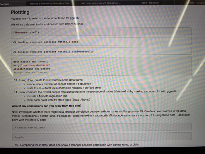
We will se a dataset toxins.and.cancer from library nutshell
- Using dplyr, create 2 new vectors in the data frame:
- cancer.rate = number of cancer deaths / population
- state.toxins = (total toxic chemicals released / surface area)
- Now, compare the overall cancer rate (cancer.rate) to the presence of toxins (state.toxins) by making a scatter plot with ggplot2
- include a smooth regression line
- label each point with its state code (State_Abbrev)
What if any conclusions can you draw from this plot?
Next, investigate whether there might be a stronger correlation between airborn toxins and lung cancer 15. Create a new columns in the data frame: - lung.deaths = deaths_lung / Population - airborne.toxins = air_on_site /Surface_Area - create a scatter plot using these data - label each point with the State ID code
- Comparing the 2 plots, does one show a stronger possible correlation with cancer rates, explain.
One more data set to explore. Again, from library nutshell, well now look at birthweight data. Recall from BIOL 1308 that birthweight is under stabilizing selection.
Load the data, and save it to the variable, births
Lets reduce the size of the data to make it easier to work with. 17. subset the data to contain just the first 10000 rows, and store this in births2
- First, First set up our plot with the reduced dataset, births2
- Second, starting with the base plot p, create a barchart (geom_bar) of the number of births per day of the week (DOB_WK) using births2 and ggplot
- x axis is DOB_WK
- note: we have to tell R that these values are factors, so define: aes(x=factor(DOB_WK)
- store this as p1 - our starting point
- x axis is DOB_WK
- The data are rich enough, so lets add more aesthetics.
- Fill each bar with different colors corresponding to what type of birth it was (C-section, Vaginal, or Unknown).
- Start with our 1st plot (p), but add a barchart with the x-axis DOB_WK, and also fill columns using different colors corresponding to what type of birth it was (DMETH_REC).
- store this as plot p2
- Now, lets make a histogram where the x axis is of all womens ages (x=MAGER), to get an idea of what this overall distribution looks like.
- start with base plot (p)
- create a histogram (geom_histogram)
- color by what type of birth it was (DMETH_REC)
- set the binwidth = 1 to set the width of the bins
- Now we want to look more deeply at the data.
- In ggplot itt is easy to facet this single graph to make multiple graphs along a dimension.
- Facet (facet_wrap) based on the dimension of day of birth DOB_WK .
- Lastly, lets tease apart date of birth (DOB_WK) by the sex (SEX) of the child.
- Accomplish this using facet_grid
- you want to facet DOB_WK by SEX
- Accomplish this using facet_grid

Step by Step Solution
There are 3 Steps involved in it
Step: 1

Get Instant Access to Expert-Tailored Solutions
See step-by-step solutions with expert insights and AI powered tools for academic success
Step: 2

Step: 3

Ace Your Homework with AI
Get the answers you need in no time with our AI-driven, step-by-step assistance
Get Started


