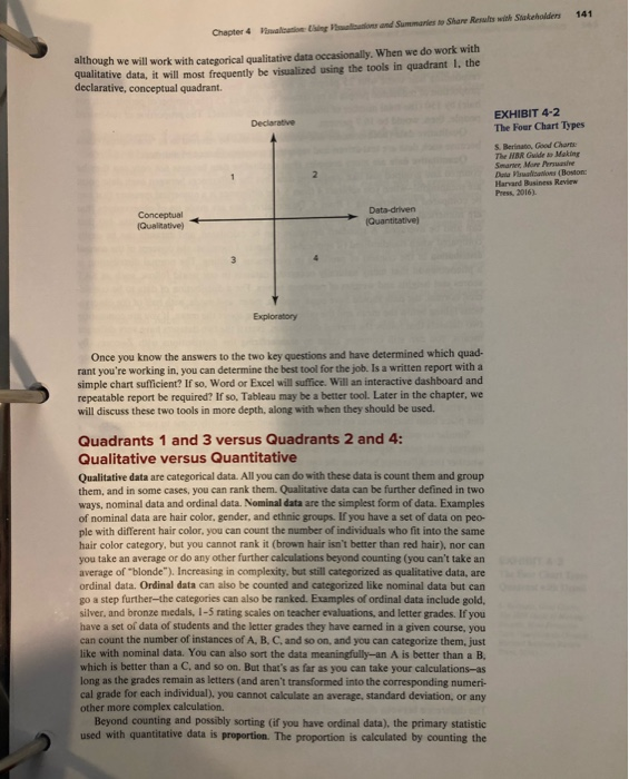
Question: What is the difference between training data sets and test (or testing) data sets? Explain Exhibit 4-2 and why there four dimensions are helpful in


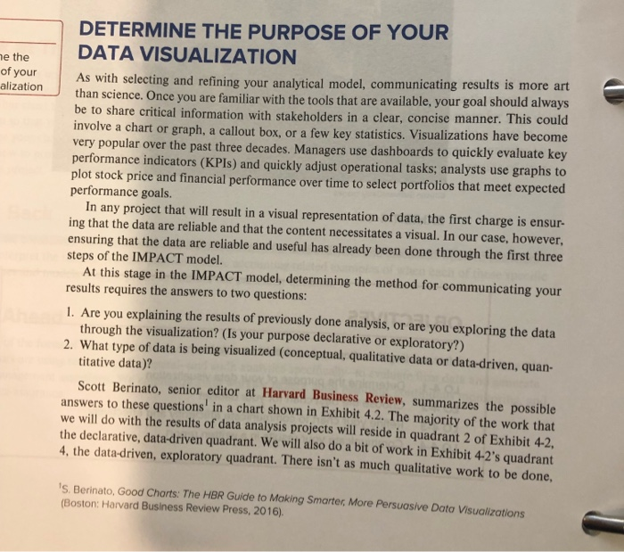
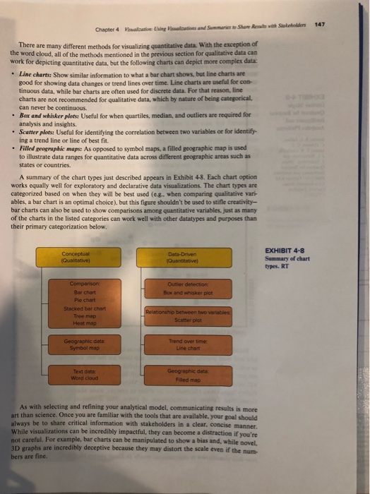
DETERMINE THE PURPOSE OF YOUR DATA VISUALIZATION e the of your alization As with selecting and refining your analytical model, communicating results is more art than science. Once you are familiar with the tools that are available, your goal should always be to share critical information with stakeholders in a clear, concise manner. This could involve a chart or graph, a callout box, or a few key statistics. Visualizations have become very popular over the past three decades. Managers performance indicators (KPIS) and quickly adjust operational tasks; analysts use graphs to plot stock price and financial performance over time to select portfolios that meet expected performance goals. In any project that will result in a visual representation of data, the first charge is ensur- ing that the data are reliable and that the content necessitates a visual. In our case, however, ensuring that the data are reliable and useful has already been done through the first three steps of the IMPACT model. At this stage in the IMPACT model, determining the method for communicating your results requires the answers to two questions: use dashboards to quickly evaluate key 1.Are you explaining the results of previously done analysis, or are you exploring the data through the visualization? (Is your purpose declarative or exploratory?) 2. What type of data is being visualized (conceptual, qualitative data or data-driven, quan- titative data)? Scott Berinato, senior editor at Harvard Business Review, summarizes the possible answers to these questions' in a chart shown in Exhibit 4.2. The majority of the work that we will do with the results of data analysis projects will reside in quadrant 2 of Exhibit 4-2, the declarative, data-driven quadrant. We will also do a bit of work in Exhibit 4-2's quadrant 4, the data-driven, exploratory quadrant. There isn't as much qualitative work to be done, is, Berinato, Good Charts: The HBR Guide to Making Smarter, More Persuasive Data Visualizations (Boston: Harvard Business Review Press, 2016). 141 alcation Cing Phalbions and Summaries to Share Results with Stakeholders Chapter 4 although we will work with categorical qualitative data occasionally, When we do work with qualitative data, it will most frequently be visualized using the tools in quadrant 1, the declarative, conceptual quadrant. EXHIBIT 4-2 The Four Chart Types Declarative S. Berinato, Good Chart The HBR Guide a Making Smaree More Persuasihes Data ualisations (Boston Harvard Business Review Press, 2016). 2 Data-driven (Quantitative) Conceptual (Qualitative) Exploratory Once you know the answers to the two key questions and have determined which quad- rant you're working in, you can determine the best tool for the job. Is a written report with a simple chart sufficient? If so, Word or Excel will suffice. Will an interactive dashboard and repeatable report be required? If so, Tableau may be a better tool. Later in the chapter, we will discuss these two tools in more depth, along with when they should be used. Quadrants 1 and 3 versus Quad rants 2 and 4: Qualitative versus Quantitative Qualitative data are categorical data. All you can do with these data is count them and group them, and in some cases, you can rank them. Qualitative data can be further defined in two ways, nominal data and ordinal data. Nominal data are the simplest form of data. Examples of nominal data are hair color, gender, and ethnic groups. If you have a set of data on peo- ple with different hair color, you can count the number of individuals who fit into the same hair color category, but you cannot rank it (brown hair isn't better than red hair), nor can you take an average or do any other further calculations beyond counting (you can't take an average of "blonde"). Increasing in complexity, but still categorized as qualitative data, are ordinal data. Ordinal data can also be counted and categorized like nominal data but can go a step further-the categories can also be ranked. Examples of ordinal data include gold, silver, and bronze medals, 1-5 rating scales on teacher evaluations, and letter grades. If you have a set of data of students and the letter grades they have earned in a given course, you can count the number of instances of A. B, C, and so on, and you can categorize them, just like with nominal data. You can also sort the data meaningfully-an A is better than a B, which is better than a C, and so on. But that's as far as you can take your calculations-as long as the grades remain as letters (and aren't transformed into the corresponding numeri- cal grade for each individual), you cannot calculate an average, standard deviation, or any other more complex calculation, Beyond counting and possibly sorting (if you have ordinal data), the primary statistic used with quantitative data is proportion. The proportion is calculated by counting the 147 ualcation Using altations and Smmaries to Shar Resals with Stakeholders Chapter 4 There are many different methods for visualizing quantitative data. With the exception of the word cloud, all of the methods mentioned in the previous section for qualitative data can work for depicting quantitative data, but the following charts can depict more complex data Line charts: Show similar information to what a bar chart shows, but line charts are good for showing data changes or trend lines over time. Line charts are useful for con- tinuous data, while bar charts are often used for discrete data. For that reason, line charts are not recommended for qualitative data, which by nature of being categorical, can never be continuous. Bax and whisker plots: Useful for when quartiles, median, and outliers are required for analysis and insights. Scatter plots: Useful for identifying the correlation between two variables or for identify ing a trend line or line of best fit. Filled geographic maps: As opposed to symbol maps, a filled geographic map is used to illustrate data ranges for quantitative data across different geographic areas such as states or countries. A summary of the chart types just described appears in Exhibit 4-8. Each chart option works equally well for exploratory and declarative data visualizations. The chart types are categorized based on when they will be best used (e.g. when comparing qualitative vari- ables, a bar chart is an optimal choice), but this figure shouldn't be used to stifle creativity- bar charts can also be used to show comparisons among quantitative variables, just as many of the charts in the listed categories can work well with other datatypes and purposes than their primary categorization below EXHIBIT 4-8 Summary of chart types. RT Conceptual (Qualtative) Data-Driven (Quantitative) Comparison Outlier detection: Bar chart Box and whisker piot Pie chart Stacked T chart Relationship between two variables Tree map Heat map Scatter plot Geographic data: Symbol map Trend over time Line chart Geographic data. Text data: Word cloud Filed map As with selecting and refining your analytical model, communicating results is more art than science. Once you are familiar with the tools that are available, your goal should always be to share critical information with stakeholders in a clear. concise manner. While visualizations can be incredibly impactful, they can become a distraction if vou're not careful. For example, bar charts can be manipulated to show a bias and, while novel. 3D graphs are incredibly deceptive because they may distort the scale even if the num. bers are fine. DETERMINE THE PURPOSE OF YOUR DATA VISUALIZATION e the of your alization As with selecting and refining your analytical model, communicating results is more art than science. Once you are familiar with the tools that are available, your goal should always be to share critical information with stakeholders in a clear, concise manner. This could involve a chart or graph, a callout box, or a few key statistics. Visualizations have become very popular over the past three decades. Managers performance indicators (KPIS) and quickly adjust operational tasks; analysts use graphs to plot stock price and financial performance over time to select portfolios that meet expected performance goals. In any project that will result in a visual representation of data, the first charge is ensur- ing that the data are reliable and that the content necessitates a visual. In our case, however, ensuring that the data are reliable and useful has already been done through the first three steps of the IMPACT model. At this stage in the IMPACT model, determining the method for communicating your results requires the answers to two questions: use dashboards to quickly evaluate key 1.Are you explaining the results of previously done analysis, or are you exploring the data through the visualization? (Is your purpose declarative or exploratory?) 2. What type of data is being visualized (conceptual, qualitative data or data-driven, quan- titative data)? Scott Berinato, senior editor at Harvard Business Review, summarizes the possible answers to these questions' in a chart shown in Exhibit 4.2. The majority of the work that we will do with the results of data analysis projects will reside in quadrant 2 of Exhibit 4-2, the declarative, data-driven quadrant. We will also do a bit of work in Exhibit 4-2's quadrant 4, the data-driven, exploratory quadrant. There isn't as much qualitative work to be done, is, Berinato, Good Charts: The HBR Guide to Making Smarter, More Persuasive Data Visualizations (Boston: Harvard Business Review Press, 2016). 141 alcation Cing Phalbions and Summaries to Share Results with Stakeholders Chapter 4 although we will work with categorical qualitative data occasionally, When we do work with qualitative data, it will most frequently be visualized using the tools in quadrant 1, the declarative, conceptual quadrant. EXHIBIT 4-2 The Four Chart Types Declarative S. Berinato, Good Chart The HBR Guide a Making Smaree More Persuasihes Data ualisations (Boston Harvard Business Review Press, 2016). 2 Data-driven (Quantitative) Conceptual (Qualitative) Exploratory Once you know the answers to the two key questions and have determined which quad- rant you're working in, you can determine the best tool for the job. Is a written report with a simple chart sufficient? If so, Word or Excel will suffice. Will an interactive dashboard and repeatable report be required? If so, Tableau may be a better tool. Later in the chapter, we will discuss these two tools in more depth, along with when they should be used. Quadrants 1 and 3 versus Quad rants 2 and 4: Qualitative versus Quantitative Qualitative data are categorical data. All you can do with these data is count them and group them, and in some cases, you can rank them. Qualitative data can be further defined in two ways, nominal data and ordinal data. Nominal data are the simplest form of data. Examples of nominal data are hair color, gender, and ethnic groups. If you have a set of data on peo- ple with different hair color, you can count the number of individuals who fit into the same hair color category, but you cannot rank it (brown hair isn't better than red hair), nor can you take an average or do any other further calculations beyond counting (you can't take an average of "blonde"). Increasing in complexity, but still categorized as qualitative data, are ordinal data. Ordinal data can also be counted and categorized like nominal data but can go a step further-the categories can also be ranked. Examples of ordinal data include gold, silver, and bronze medals, 1-5 rating scales on teacher evaluations, and letter grades. If you have a set of data of students and the letter grades they have earned in a given course, you can count the number of instances of A. B, C, and so on, and you can categorize them, just like with nominal data. You can also sort the data meaningfully-an A is better than a B, which is better than a C, and so on. But that's as far as you can take your calculations-as long as the grades remain as letters (and aren't transformed into the corresponding numeri- cal grade for each individual), you cannot calculate an average, standard deviation, or any other more complex calculation, Beyond counting and possibly sorting (if you have ordinal data), the primary statistic used with quantitative data is proportion. The proportion is calculated by counting the 147 ualcation Using altations and Smmaries to Shar Resals with Stakeholders Chapter 4 There are many different methods for visualizing quantitative data. With the exception of the word cloud, all of the methods mentioned in the previous section for qualitative data can work for depicting quantitative data, but the following charts can depict more complex data Line charts: Show similar information to what a bar chart shows, but line charts are good for showing data changes or trend lines over time. Line charts are useful for con- tinuous data, while bar charts are often used for discrete data. For that reason, line charts are not recommended for qualitative data, which by nature of being categorical, can never be continuous. Bax and whisker plots: Useful for when quartiles, median, and outliers are required for analysis and insights. Scatter plots: Useful for identifying the correlation between two variables or for identify ing a trend line or line of best fit. Filled geographic maps: As opposed to symbol maps, a filled geographic map is used to illustrate data ranges for quantitative data across different geographic areas such as states or countries. A summary of the chart types just described appears in Exhibit 4-8. Each chart option works equally well for exploratory and declarative data visualizations. The chart types are categorized based on when they will be best used (e.g. when comparing qualitative vari- ables, a bar chart is an optimal choice), but this figure shouldn't be used to stifle creativity- bar charts can also be used to show comparisons among quantitative variables, just as many of the charts in the listed categories can work well with other datatypes and purposes than their primary categorization below EXHIBIT 4-8 Summary of chart types. RT Conceptual (Qualtative) Data-Driven (Quantitative) Comparison Outlier detection: Bar chart Box and whisker piot Pie chart Stacked T chart Relationship between two variables Tree map Heat map Scatter plot Geographic data: Symbol map Trend over time Line chart Geographic data. Text data: Word cloud Filed map As with selecting and refining your analytical model, communicating results is more art than science. Once you are familiar with the tools that are available, your goal should always be to share critical information with stakeholders in a clear. concise manner. While visualizations can be incredibly impactful, they can become a distraction if vou're not careful. For example, bar charts can be manipulated to show a bias and, while novel. 3D graphs are incredibly deceptive because they may distort the scale even if the num. bers are fine
Step by Step Solution
There are 3 Steps involved in it

Get step-by-step solutions from verified subject matter experts


