

The following three graphs illustrate the sales of two productsSeries 1 and Series 2for each quarter of
Question:
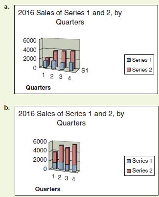
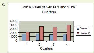
The following three graphs illustrate the sales of two products—Series 1 and Series 2—for each quarter of 2016. Which is the most effective in conveying the information? Which is the least effective? What additional information would make the most-effective graph better?
Step by Step Answer:

This question has not been answered yet.
You can Ask your question!
Related Book For 

Practical Strategies For Technical Communication
ISBN: 9781319003364
2nd Edition
Authors: Mike Markel
Question Posted:
