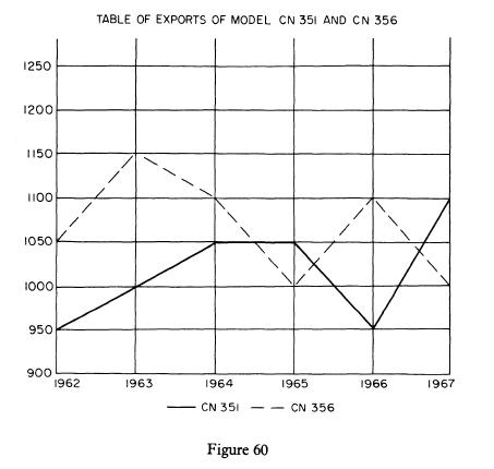
The graph in Figure 60 shows the quantity of exports of two items of equipment over a
Question:
The graph in Figure 60 shows the quantity of exports of two items of equipment over a period of years. You are required to:
(a) show the statistics given on the graph in suitable tabular form
(b) indicate any conclusions that can be inferred from the graph
(c) state any advantages there are in graphical against tabular presentation of data
Step by Step Answer:
Related Book For 

Communication For Business And Secretarial Students
ISBN: 9780333261750
1st Edition
Authors: Lysbeth A Woolcott, Wendy R Unwin
Question Posted:


