

Comparative Line and Bar Charts Suppose that the 105 students whose status was tabulated in Example 1.17
Question:
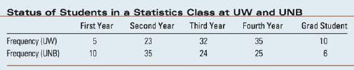
Comparative Line and Bar Charts Suppose that the 105 students whose status was tabulated in Example 1.17 were from the University of Windsor (UW), and that an- other 100 students from an introductory statistics class at the University of New Bruns- wick (UNB) were also interviewed. Table 3.8 shows the status distribution for both sets of students.
1. Enter the data into a MINITAB worksheet as you did in Exercise 1.17, using your Chapter 1 project as a base if you have saved it. Column C1 will contain the 10 "Frequencies" and column C2 will contain the student "Status" corre- sponding to each frequency. Create a third column C3 called "University," and enter either UW or UNB as appropriate. You can use the familiar Windows cut-and-paste commands if you like. 2. To graphically describe the UW/UNB student data, you can use comparative pie charts one for each school (see Chapter 1). Alternatively, you can use either stacked or side-by-side bar charts. Use Graph Bar Chart. 3. In the "Bar Charts" dialogue box (Figure 3.15(a)), select Values from a Table in the drop-down list and click either Stack or Cluster in the row marked "One Column of Values." Click OK. In the next dialogue box (Figure 3.15(b)), select "Frequency" for the Graph variables box and "Status" and "University" for the Categorical variable for grouping box. Click OK. 4. Once the bar chart is displayed (Figure 3.16), you can right-click on various items in the bar chart to edit. If you right-click on the bars and select Update Graph Automatically, the bar chart will automatically update when you change the data in the MINITAB worksheet.
Step by Step Answer:

This question has not been answered yet.
You can Ask your question!


Introduction To Probability And Statistics
ISBN: 9780176509804
3rd Edition
Authors: William Mendenhall
