

Question: Below is an image of my code and bar charts. (There are 4 charts but not all are displayed in the image). How can I
Below is an image of my code and bar charts. (There are 4 charts but not all are displayed in the image). How can I display the y axis labels in the format "1,000,000", with commas separating the thousands. And how can I add a title for each subplot?
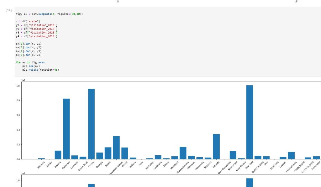
[94 fig, ax = plt.subplots(4, figsize=(30,28)) x = df['state'] y = df[ 'visitation_2016'] yz = df['visitation_2017') y3 = df['visitation_2018'] y4 = df['visitation_2019') ax[@] bar(x, y2) ax[2]. bar(x, y2) ax[2] .bar(x, y3) ax[3].bar(x, y) for ax in fie. axes: pat.sca(ax) pit.xticks (rotation-45) le7 10 0.8 06 ILL. 02 0.0 Florida Connecticut Guam Maryland schuse Arizona Maine Ohio Indiana Georgia Nevada Tingis Hawaiian Islands Hiew Mexico Kentucky Louisiana Alabama Alaska New York California Colorado le? Michigan Minnesota Missouri North Carolina Oklahoma Oregon New Hampshire New Jersey Pennsylvania thode Island South Carolina Tennessee 10
Step by Step Solution
There are 3 Steps involved in it

Get step-by-step solutions from verified subject matter experts