Answered step by step
Verified Expert Solution
Question
1 Approved Answer
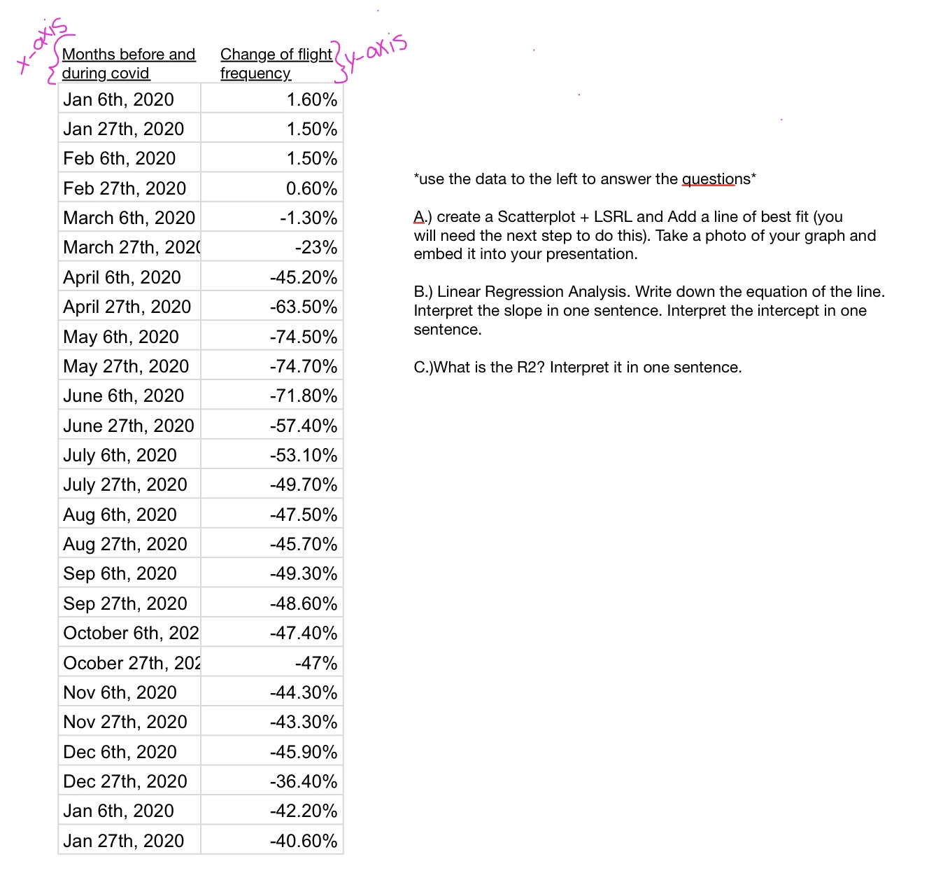
Months before and during covid Jan 6th, 2020 Jan 27th, 2020 Feb 6th, 2020 Change of flight frequency y-axis 1.60% 1.50% 1.50% Feb 27th,

Months before and during covid Jan 6th, 2020 Jan 27th, 2020 Feb 6th, 2020 Change of flight frequency y-axis 1.60% 1.50% 1.50% Feb 27th, 2020 0.60% *use the data to the left to answer the questions* March 6th, 2020 -1.30% March 27th, 2020 -23% April 6th, 2020 -45.20% April 27th, 2020 -63.50% May 6th, 2020 -74.50% May 27th, 2020 -74.70% A.) create a Scatterplot + LSRL and Add a line of best fit (you will need the next step to do this). Take a photo of your graph and embed it into your presentation. B.) Linear Regression Analysis. Write down the equation of the line. Interpret the slope in one sentence. Interpret the intercept in one sentence. C.) What is the R2? Interpret it in one sentence. June 6th, 2020 -71.80% June 27th, 2020 -57.40% July 6th, 2020 -53.10% July 27th, 2020 -49.70% Aug 6th, 2020 -47.50% Aug 27th, 2020 -45.70% Sep 6th, 2020 -49.30% Sep 27th, 2020 -48.60% October 6th, 202 -47.40% Ocober 27th, 202 -47% Nov 6th, 2020 -44.30% Nov 27th, 2020 -43.30% Dec 6th, 2020 -45.90% Dec 27th, 2020 -36.40% Jan 6th, 2020 -42.20% Jan 27th, 2020 -40.60% Sixb-x
Step by Step Solution
There are 3 Steps involved in it
Step: 1

Get Instant Access to Expert-Tailored Solutions
See step-by-step solutions with expert insights and AI powered tools for academic success
Step: 2

Step: 3

Ace Your Homework with AI
Get the answers you need in no time with our AI-driven, step-by-step assistance
Get Started


