

Question
Plot the graph for the actual and implied new prices in each of the two instances (fall and rise in yields) using question 1 as
Plot the graph for the actual and implied new prices in each of the two instances (fall and rise in yields) using question 1 as the starting point.
Make an Excel spreadsheet with this graph. Make sure to label your axes, and that you have a title for the graph. Insert a statement (no more than 2 sentences) about what you observe from the graph as to the relationship between actual and implied price volatility (hint: consider how well IPV estimates APV (Actual Price Volatility) when you go from 50 basis point changes to 500 basis point changes). I need help putting these answers above into a graph. Can you help me please?
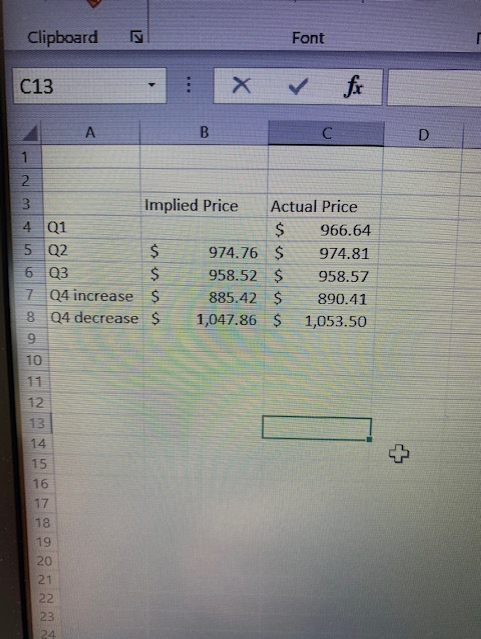
Clipboard Font C13 : X & fx D B C 1 2 3 Implied Price Actual Price 4 Q1 $ 966.64 5 Q2 $ 974.76 $ 974.81 6 Q3 $ 958.52 $ 958.57 7 Q4 increase $ 885.42 $ 890.41 8 Q4 decrease $ 1,047.86 $ 1,053.50 9 10 + 1 12. 13 14 15 16 17 18 19 20 21 22 23 24Step by Step Solution
There are 3 Steps involved in it
Step: 1

Get Instant Access to Expert-Tailored Solutions
See step-by-step solutions with expert insights and AI powered tools for academic success
Step: 2

Step: 3
Ace Your Homework with AI
Get the answers you need in no time with our AI-driven, step-by-step assistance
Get Started
Forex This Book Includes Forex Beginners Forex
Authors: Jordon Sykes
1st Edition
154063180X, 978-1540631800